Megah
Sophistication
without elitism.
- Industry
Personal authority method
- Location
São Paulo, Brazil
- Year
2025
- Scope
Visual identity

The challenge
The audience wanted to see themselves as a reference, not feel left out.
Megah is a method that turns life stories into authority positioning for coaches, consultants and authors, through training programs, books and events. The brand needed authority and sophistication, without seeming out of reach for that audience.
The idea
Three bands, three pillars.
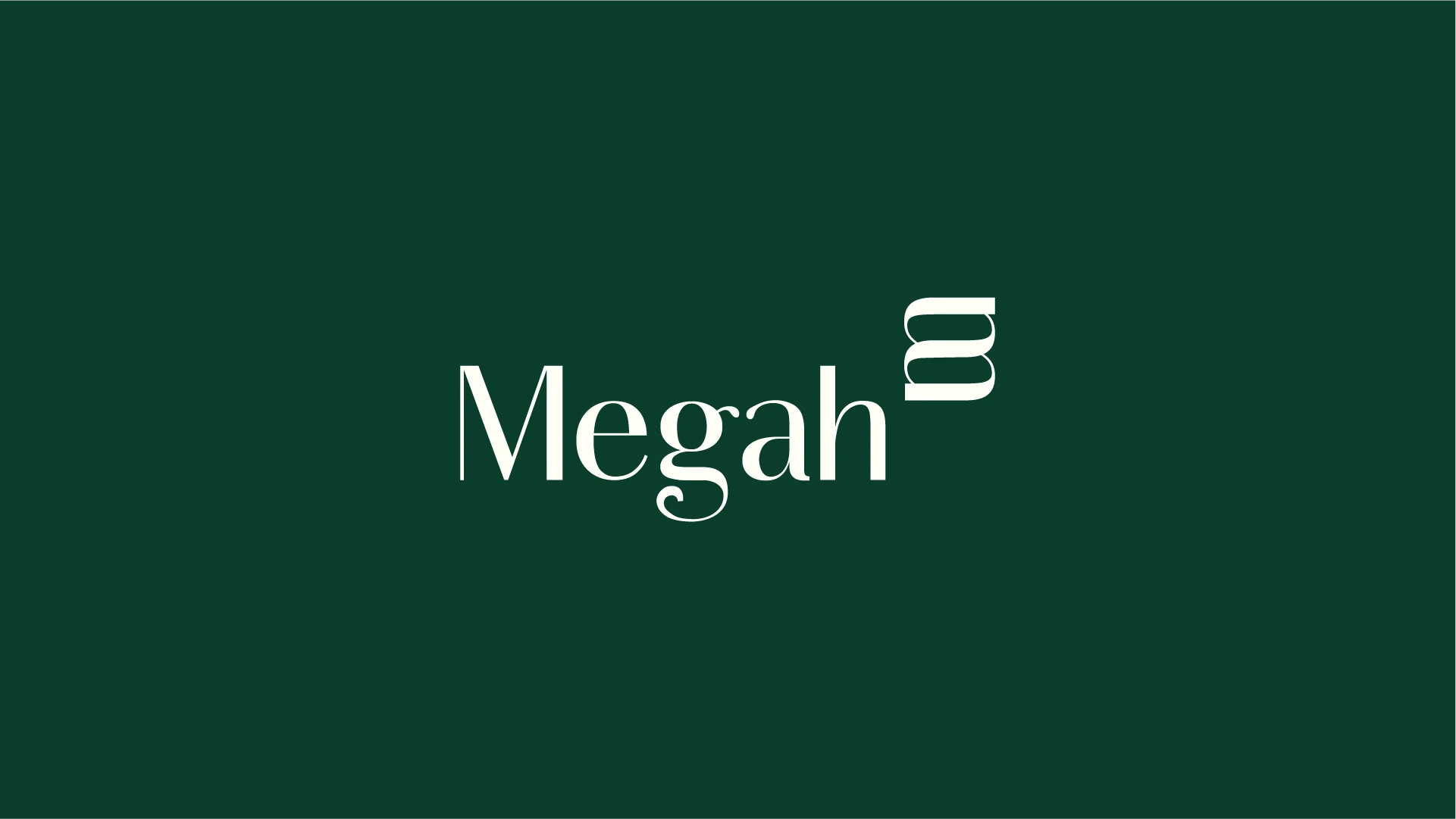
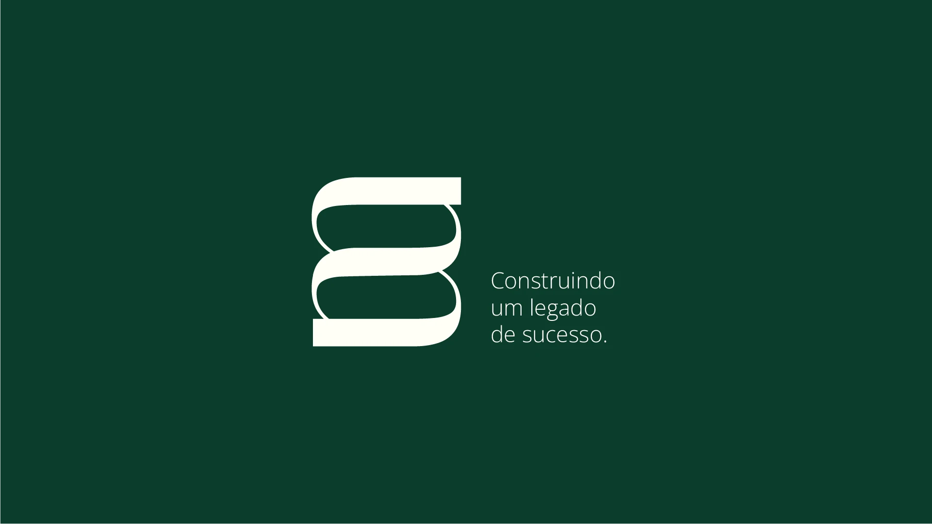
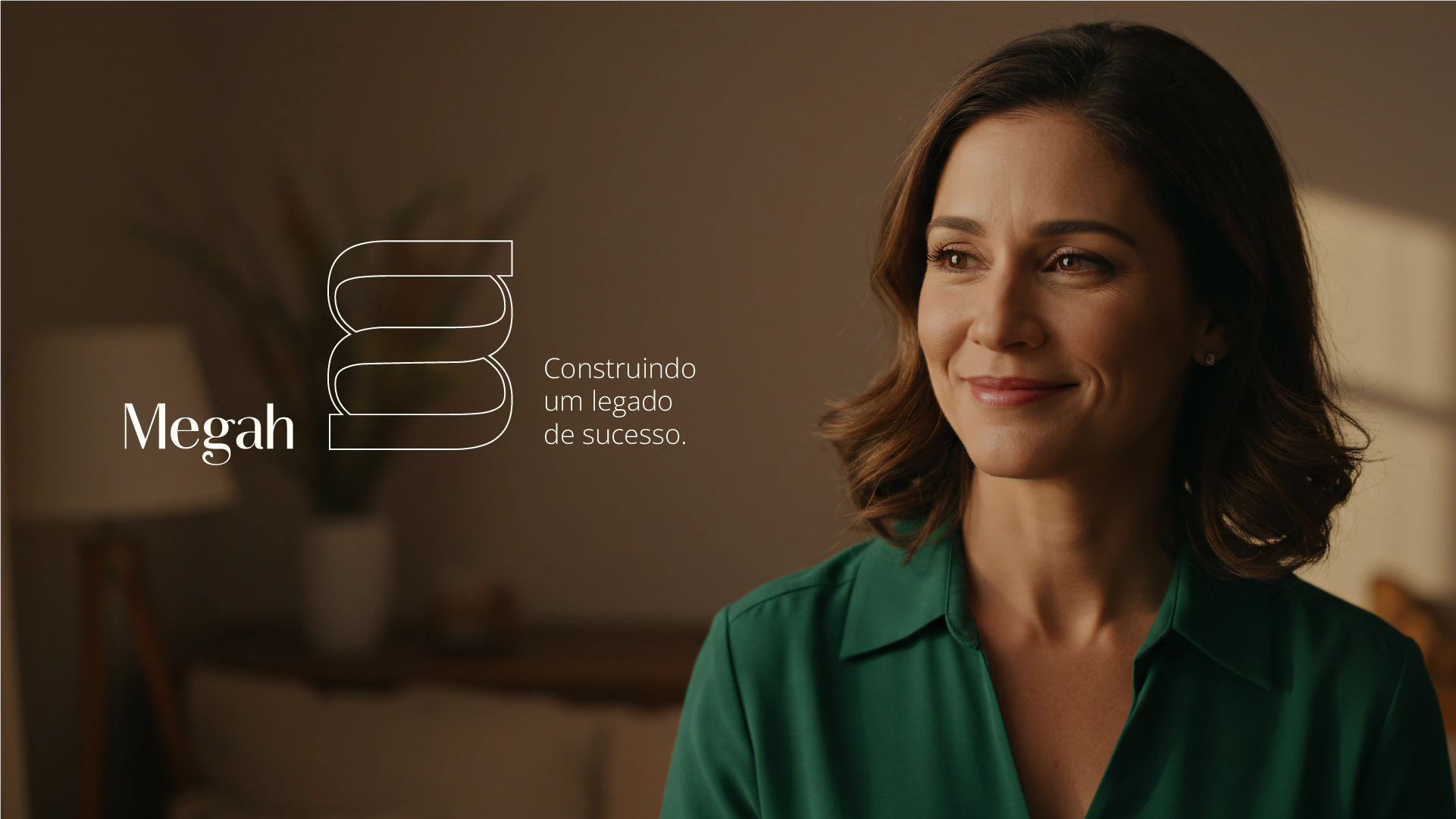
The bands intertwine in the symbol and also speak of human connection. The tagline completes the idea: “Construindo um legado de sucesso.” (Building a legacy of success.)
- The typeface.The capital M brings solidity, the lowercase letters bring closeness. The variation in stroke weight adds elegance without stiffness.
- The colors.Deep green, warm white, graphite and gold.

The applications
From the stage to the book.
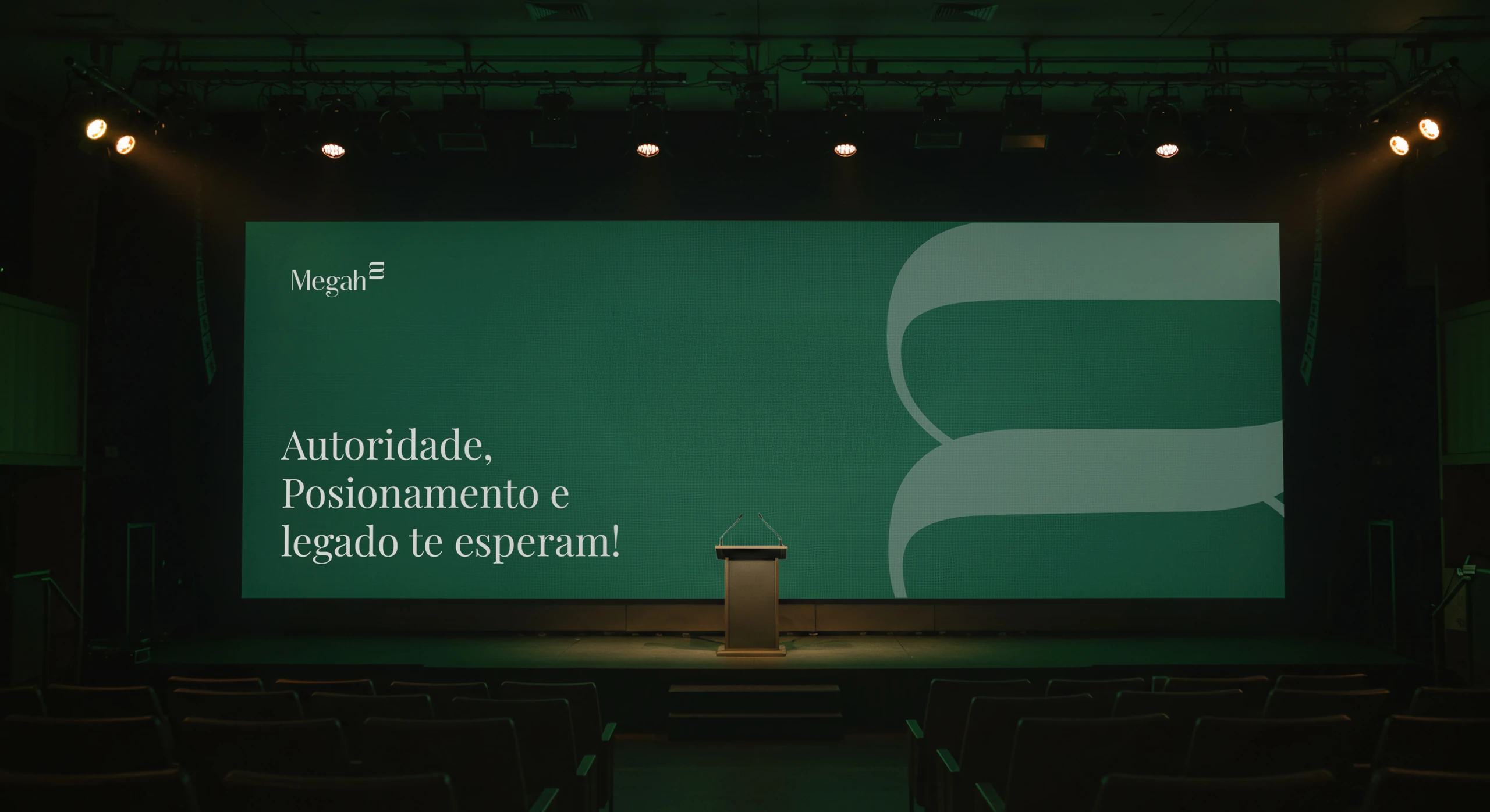
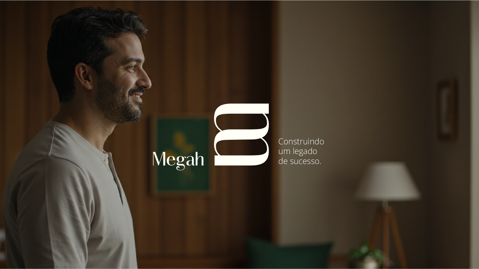
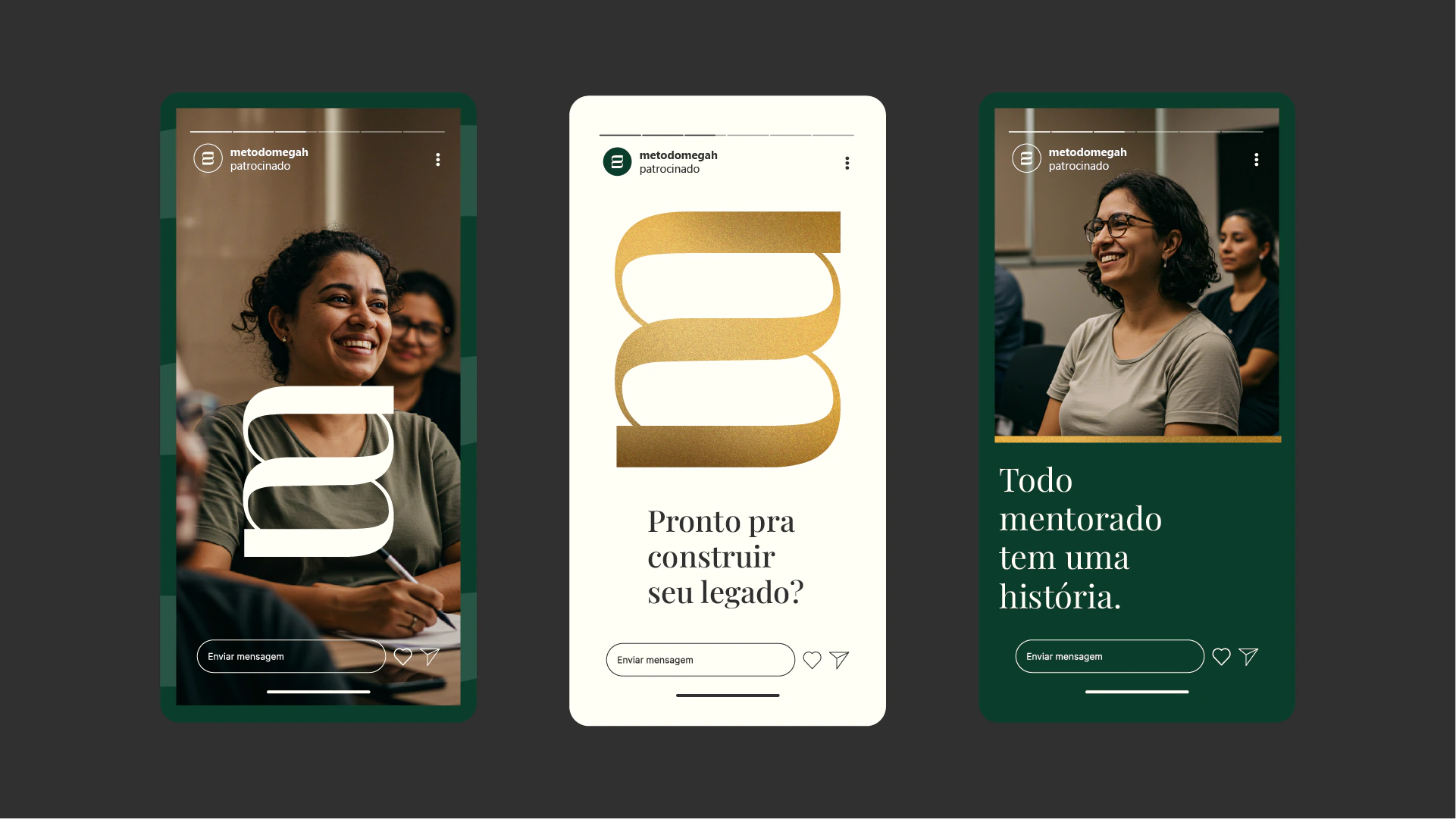
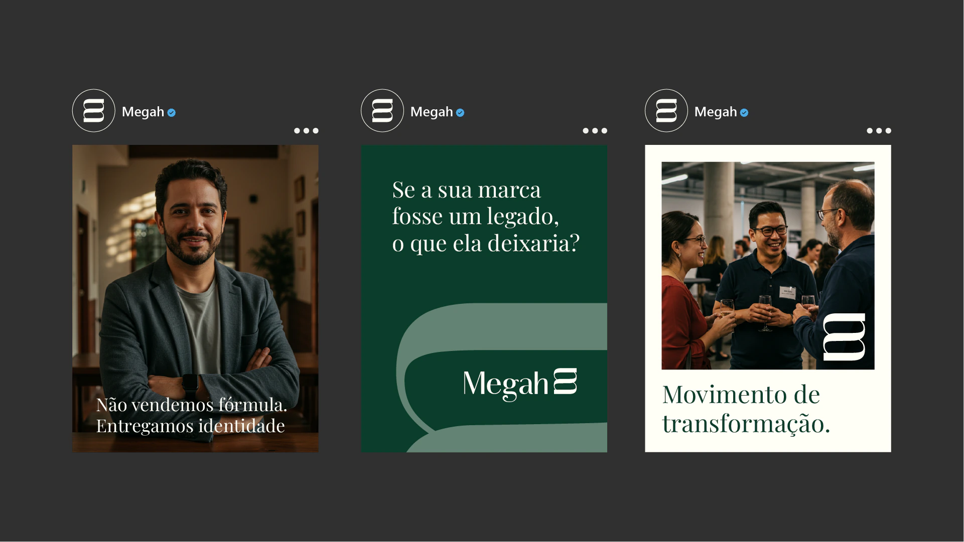
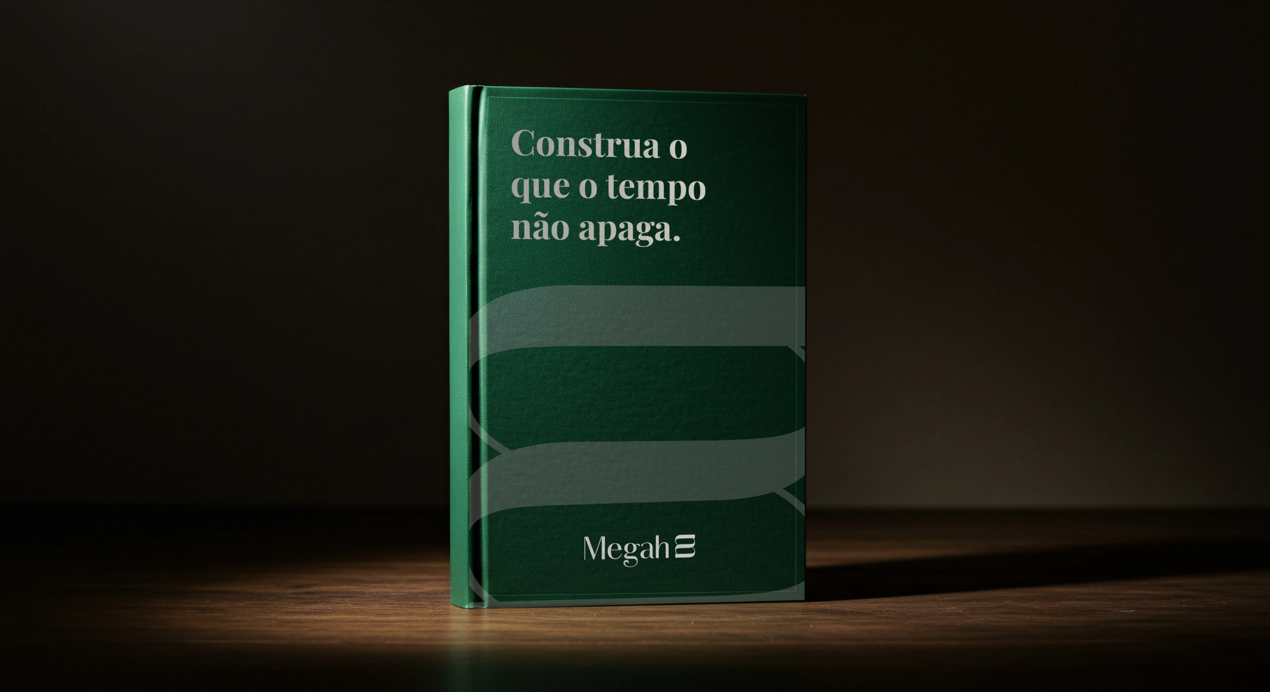
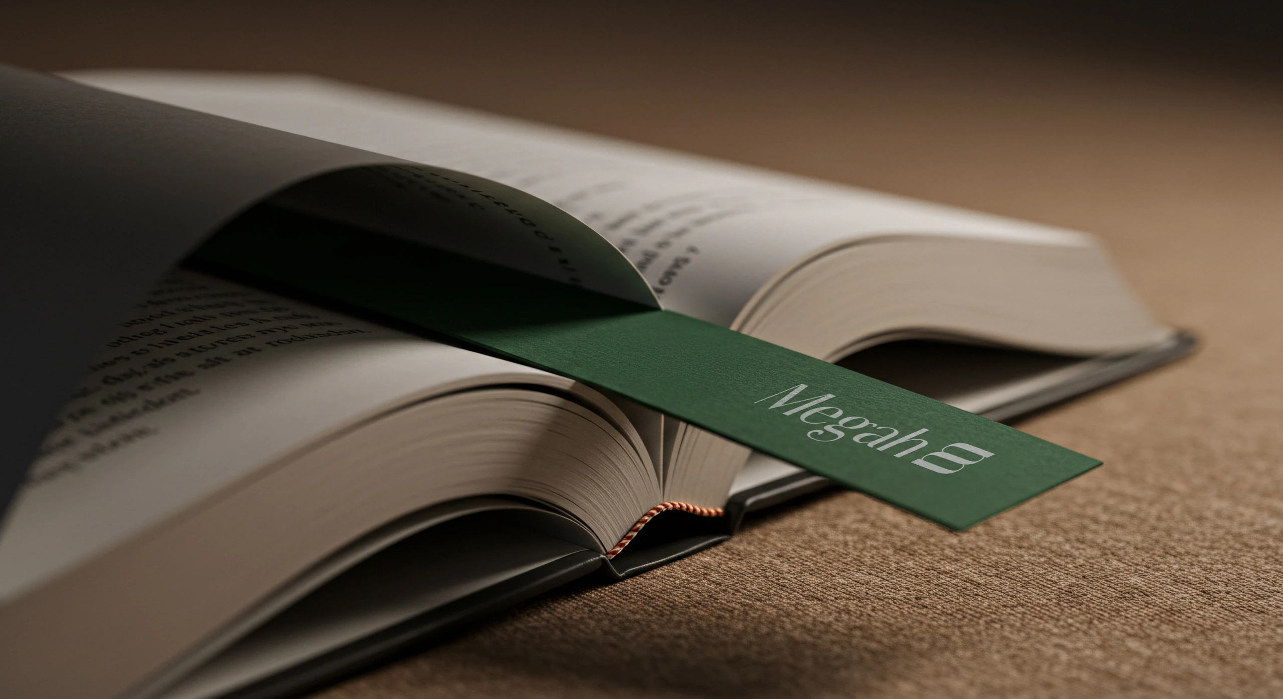
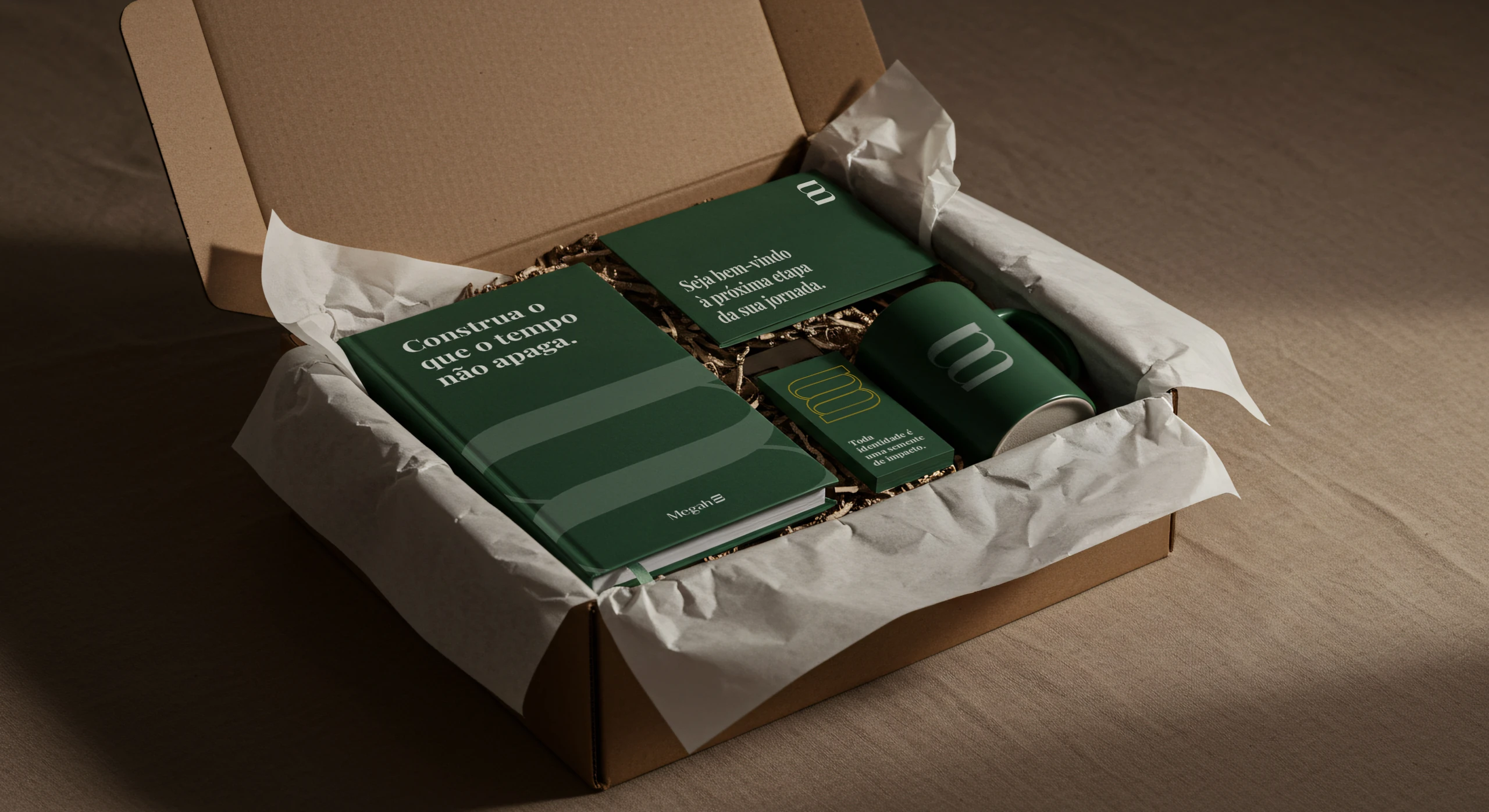
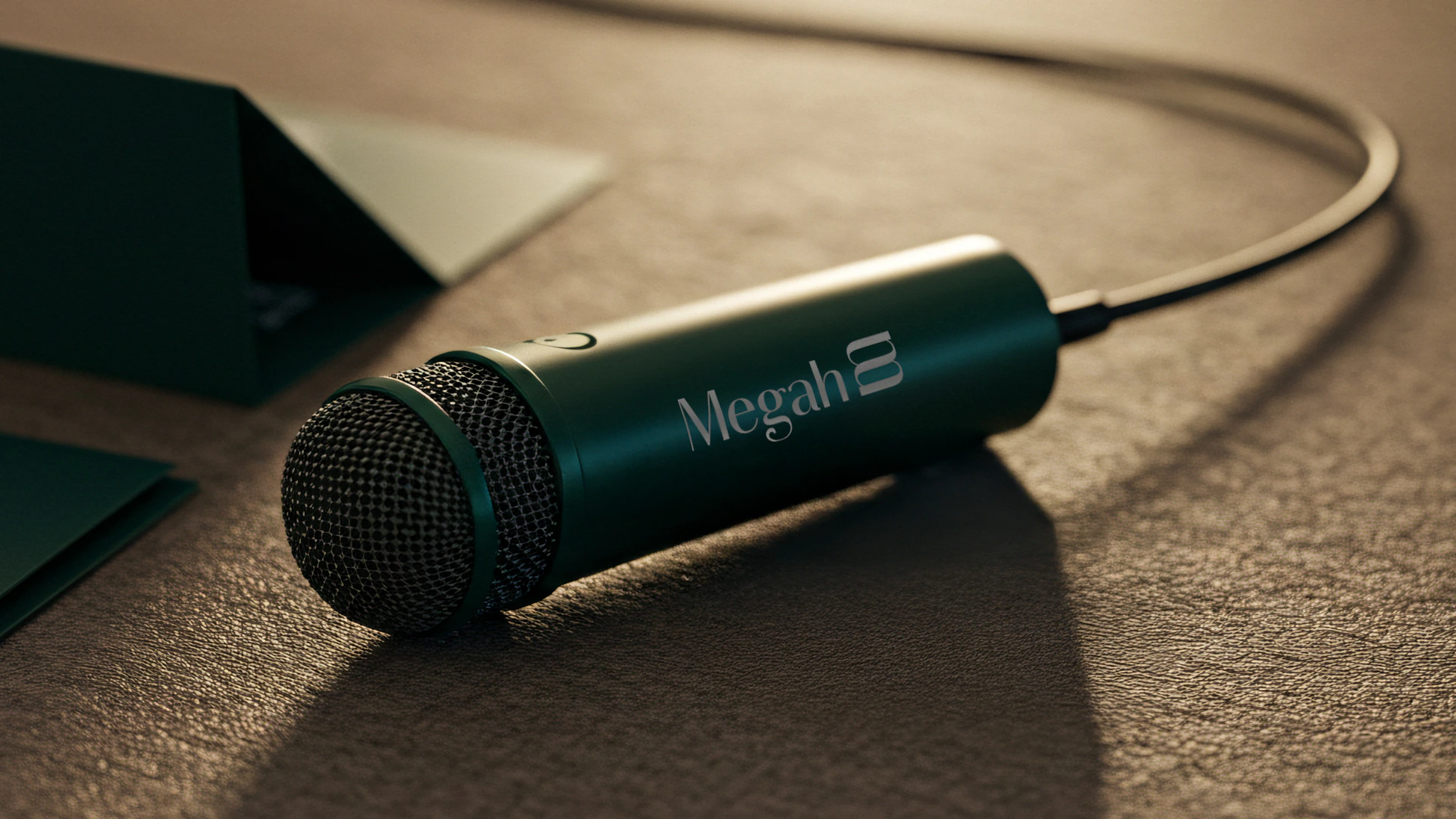
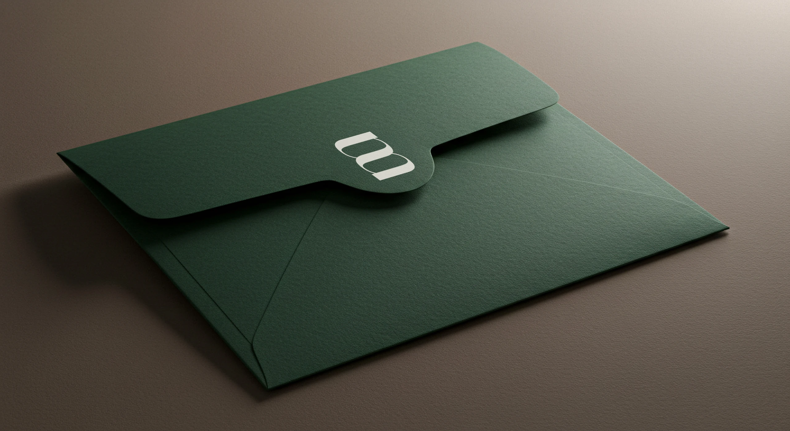
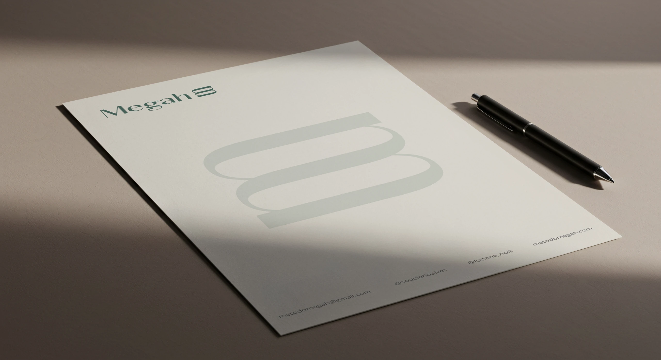
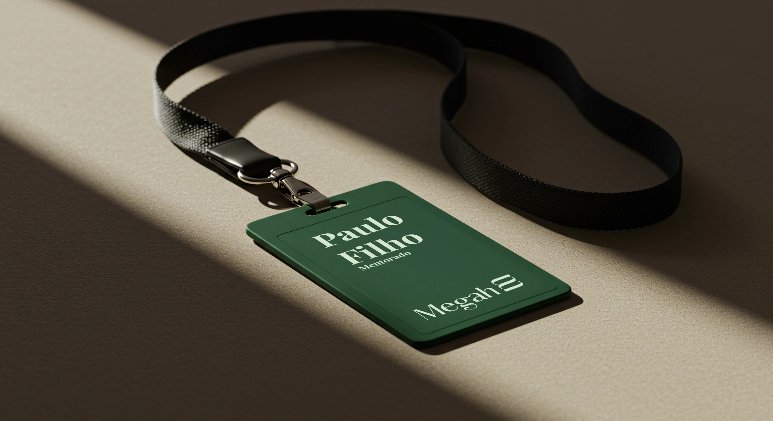
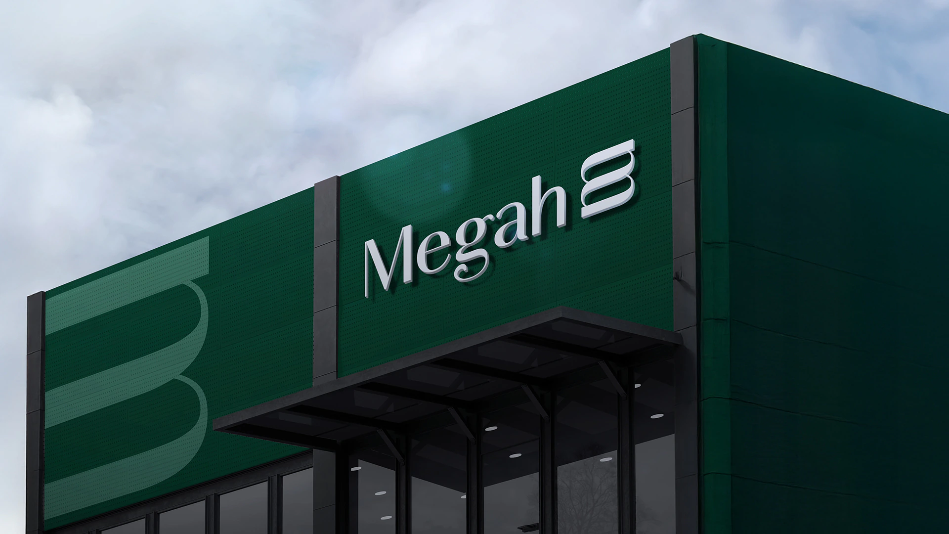
The system was designed for events, books, training programs and social media, plus stationery and the welcome kit for mentees.



Does your brand convey authority without pushing away the people you want to attract?
 Next projectAquarela
Shall we take
a look at
your brand?
The review is a free online conversation. We'll get in touch within 1 business day.