DMV
Protection
without fear.
- Industry
Pest control
- Location
Belo Horizonte, Brazil
- Year
2026
- Scope
Concept, visual and verbal identity, photography direction and motion
The challenge
The whole industry talked about bugs and poison. The brand needed to talk about protection, without fear.
DMV has done pest control in Belo Horizonte since 1999. It had technical strength, but it communicated like the rest of the industry: pests, poison, extermination. The thing is, nobody hires pest control thinking about cockroaches. They think about their kid playing on the floor. About a home at peace.
The concept
Show what's being preserved, not what's being fought.
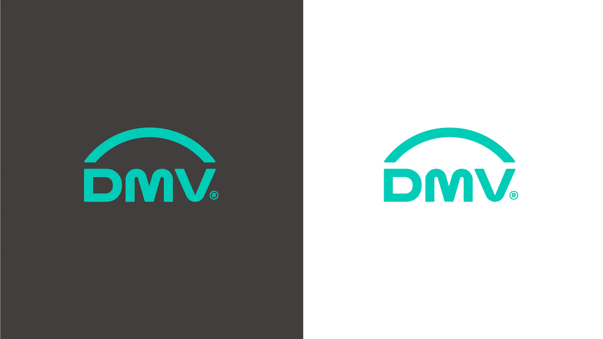
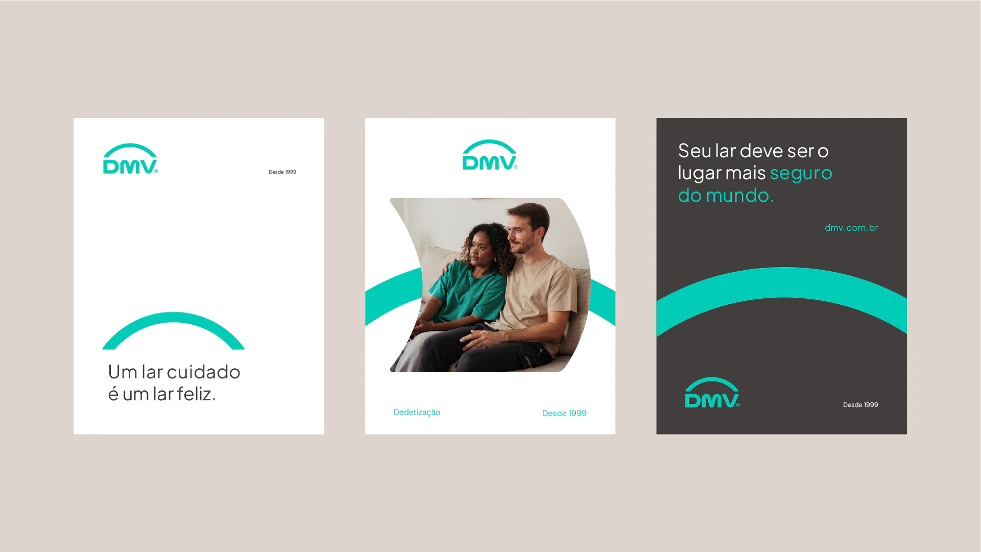
The symbol is an arch: a shape that shelters and covers before any threat appears. It isn't a shield against something. It's shelter for someone.
The typeface is clear and welcoming, with no technical stiffness. The teal conveys care without feeling clinical.


The voice and the imagery
The brand never names the fear.
It talks about the people you love and a home at peace. The problem stays implied: whoever gets in touch already knows why they're there.
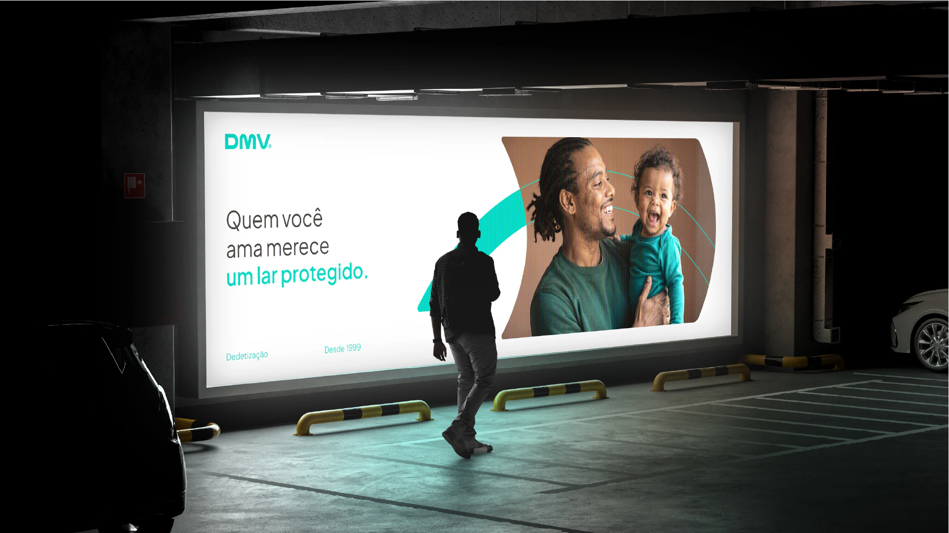
“Quem você ama merece um lar protegido.” (The ones you love deserve a protected home.)
“Cuidar da casa é cuidar de quem importa.” (Caring for your home is caring for the ones who matter.)
“Eles merecem um lar seguro.” (They deserve a safe home.)
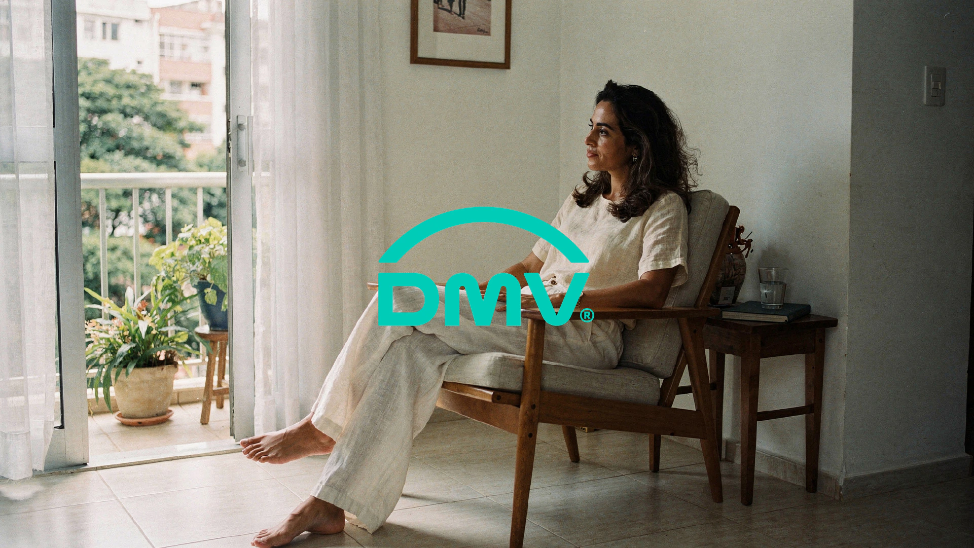
The photography direction follows the same logic: natural light, warm tones and people at home. No gloves, no bugs, no chemicals.



The applications
In its communication, DMV doesn't show up fixing an infestation. It shows up preserving a peace that was already there.
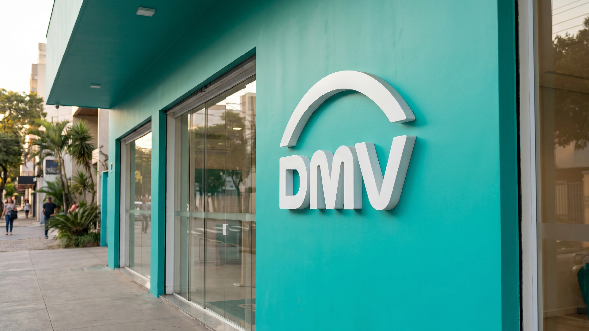
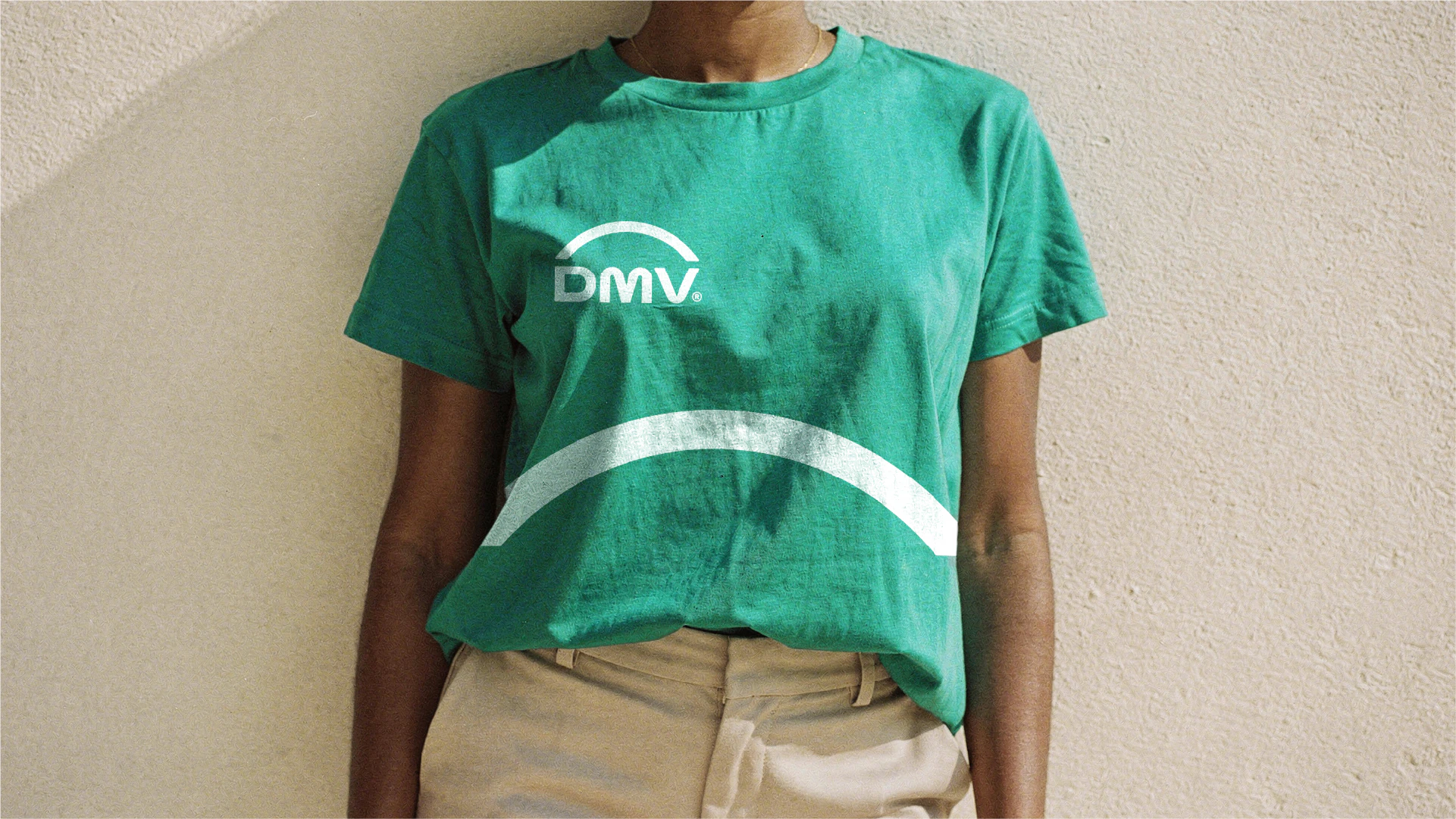
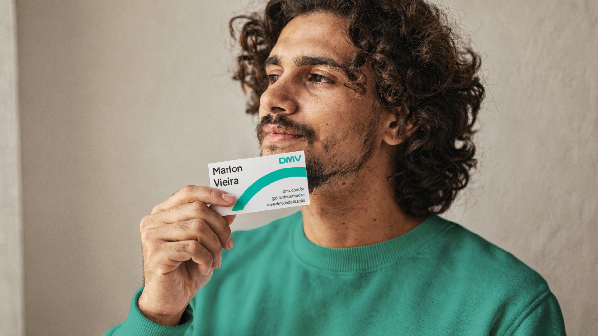
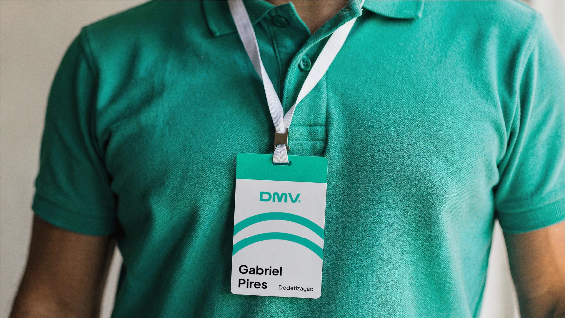
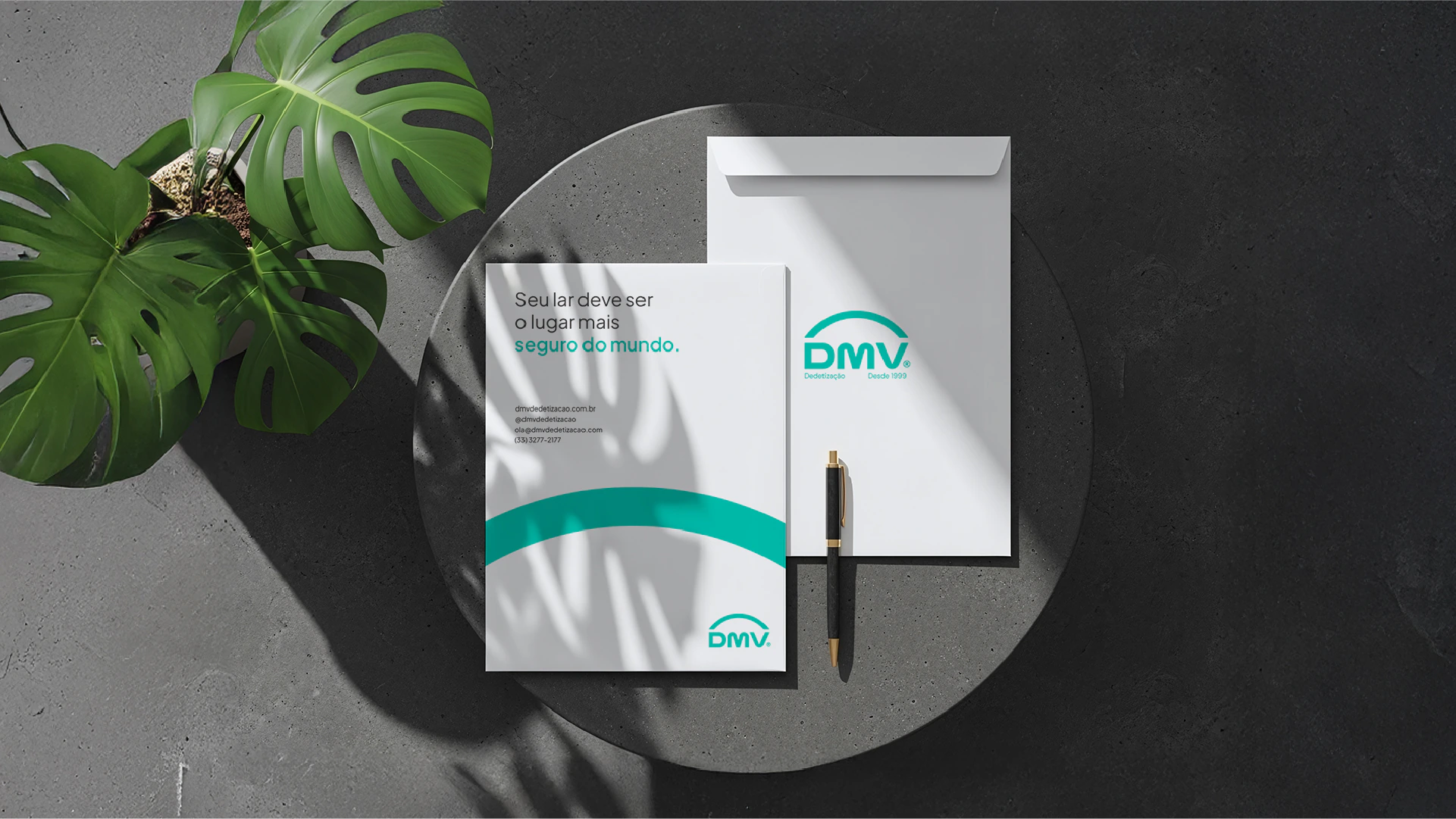
The system was also designed with the physical world in mind: facade, uniforms, stationery and billboards, alongside digital.

Does your brand speak the same language as the rest of the industry?
 Next projectTrusteo
Shall we take
a look at
your brand?
The review is a free online conversation. We'll get in touch within 1 business day.