Trusteo
The brand had to stop
depending on one face.
- Industry
Management advisory
- Location
Ipatinga, Brazil
- Year
2025
- Scope
Visual identity, visual universe and tagline
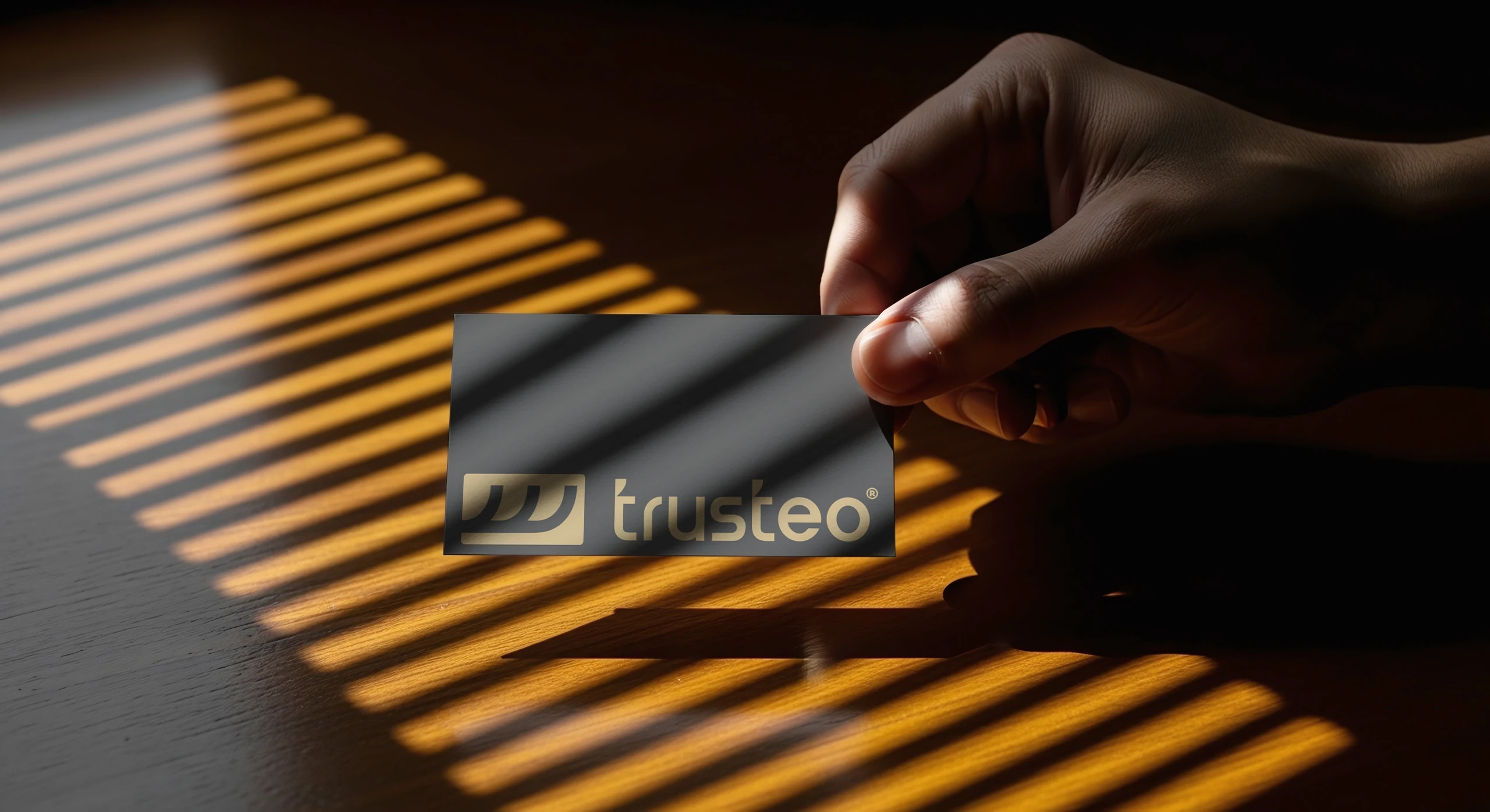
The challenge
The company was growing, but the brand was still the founder's face.
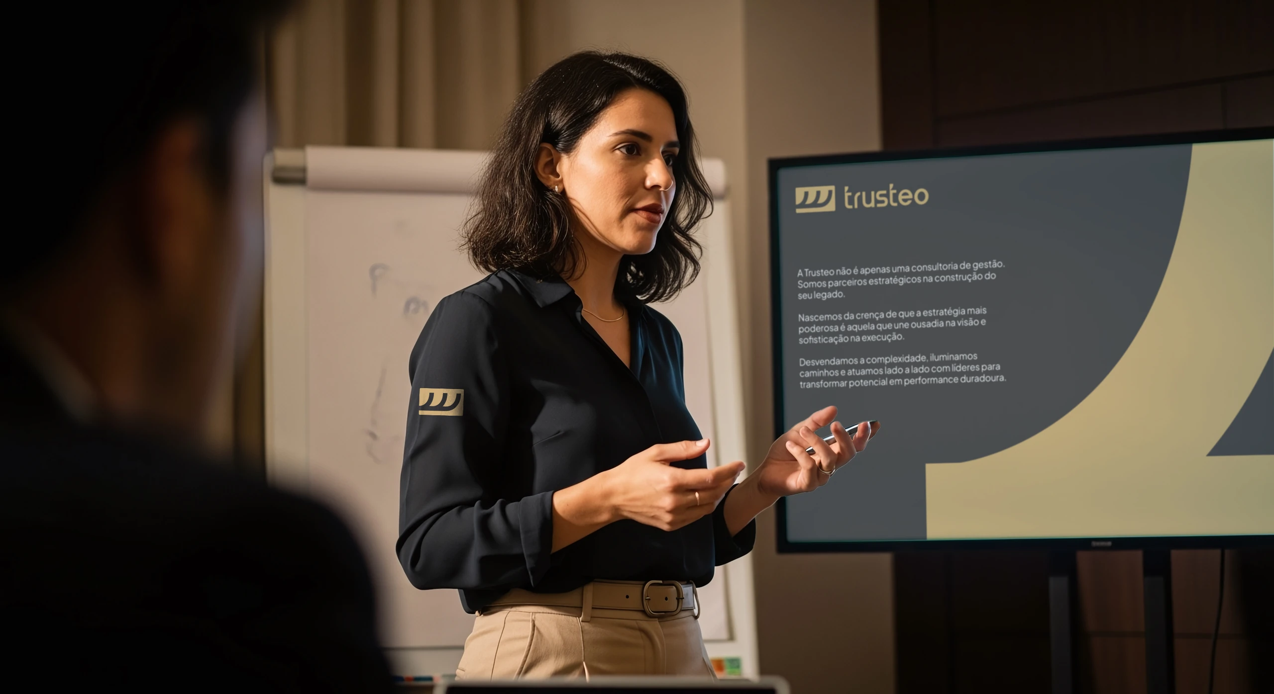
Trusteo is a management advisory firm for small and mid-sized businesses in Ipatinga, Brazil. To keep growing, the brand needed to look like a company and stand on its own, without depending on one person.
The idea
Before the design, the personality.
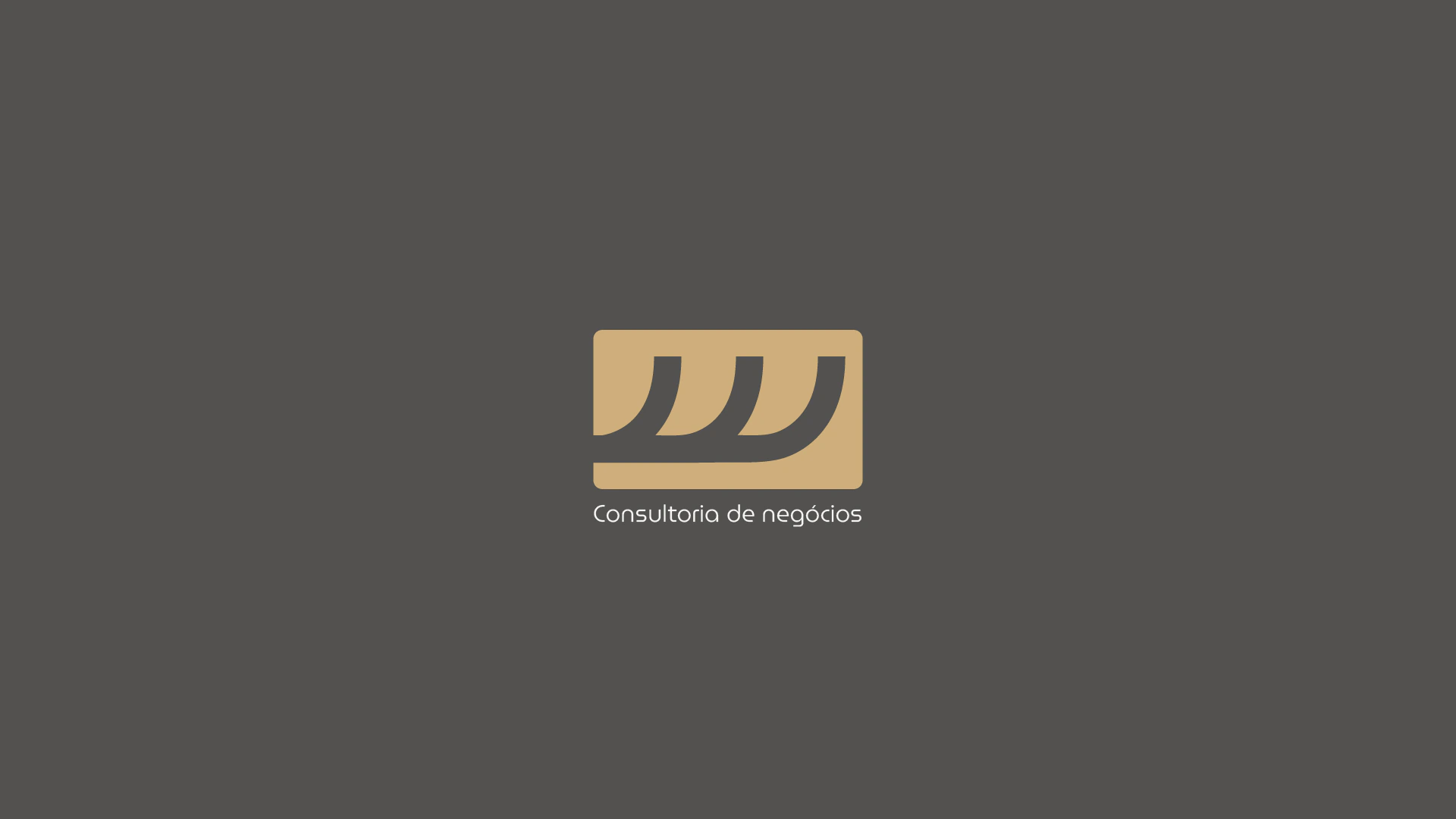
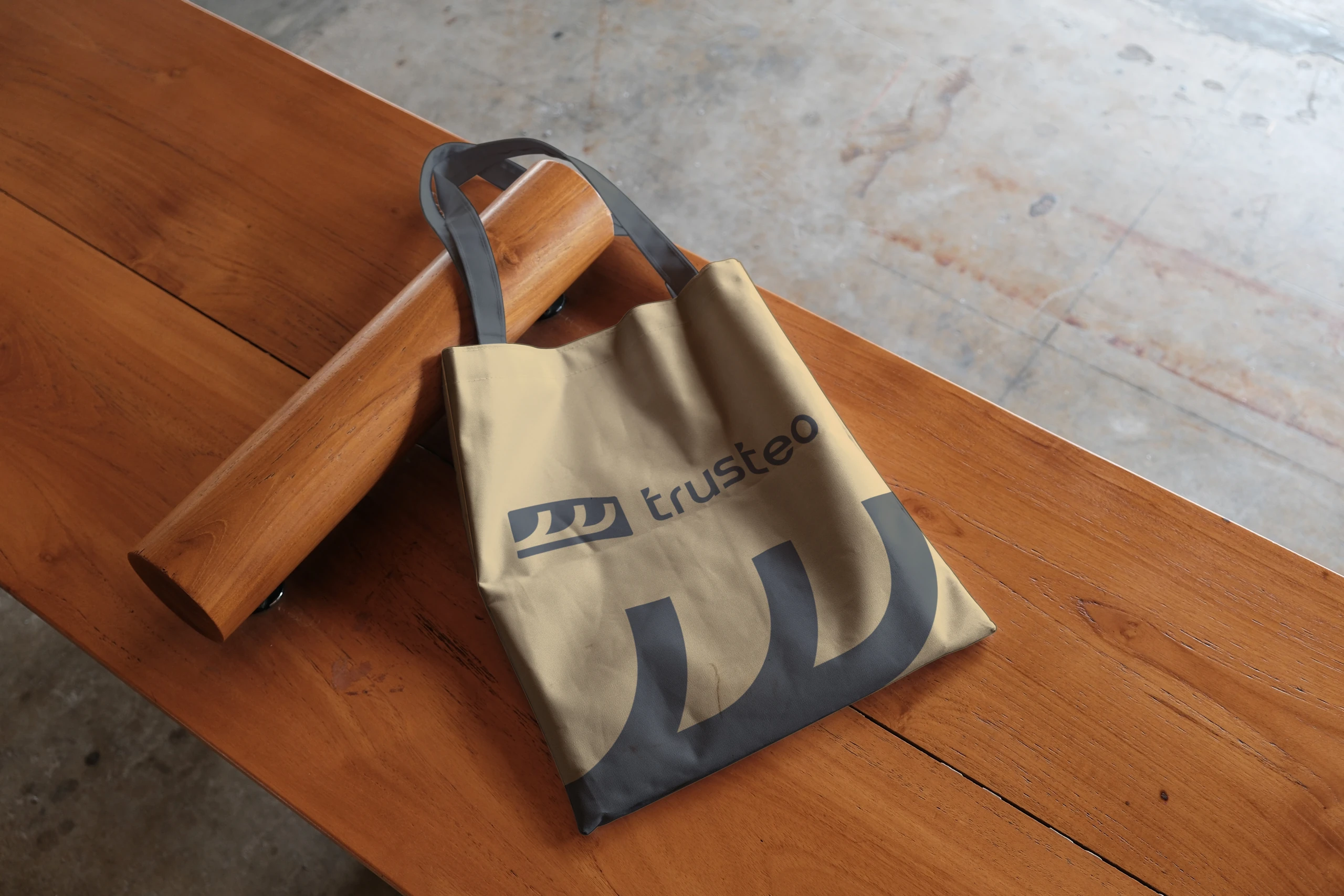
The symbol translates the method: three lines rising together. Trusteo, the client and the method, in the same movement.


The identity
Away from the blue that dominates the industry.
Category research showed a consulting market that was almost entirely blue and very much alike. Trusteo took another path:
- The typeface.Lowercase, sans serif, semibold. An existing font adjusted for the brand, with tighter letters and organic shapes: approachable without losing firmness.
- The badge.Rounded corners holding the symbol, a device rarely used among consultancies.
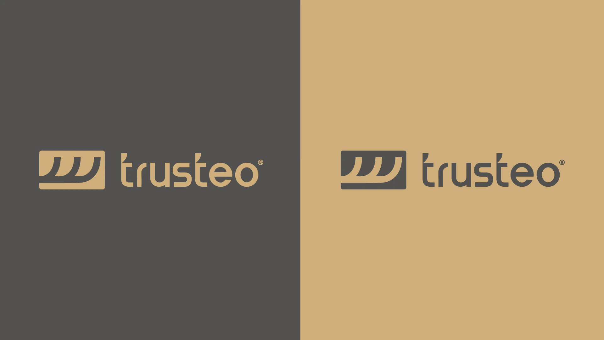
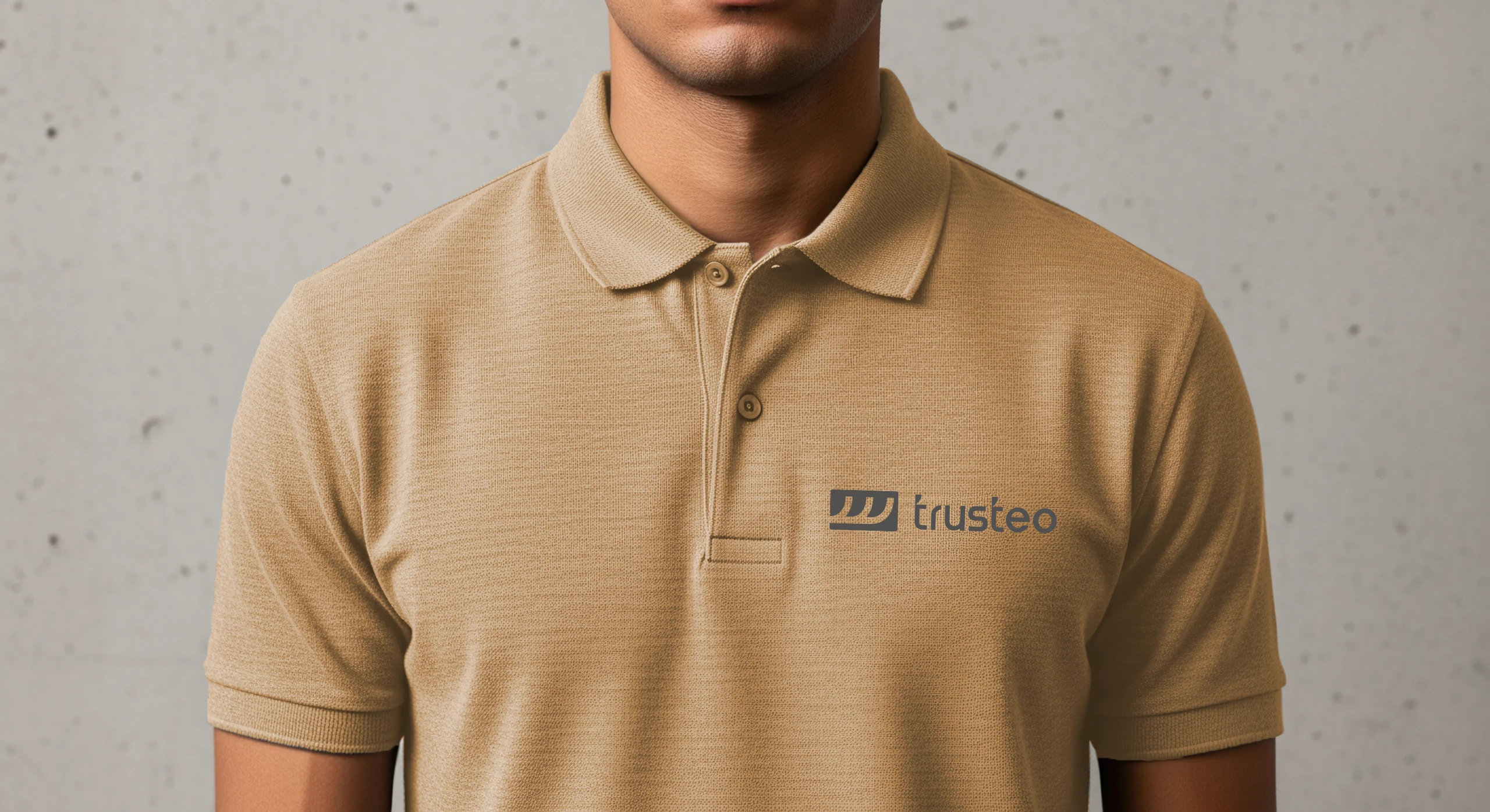
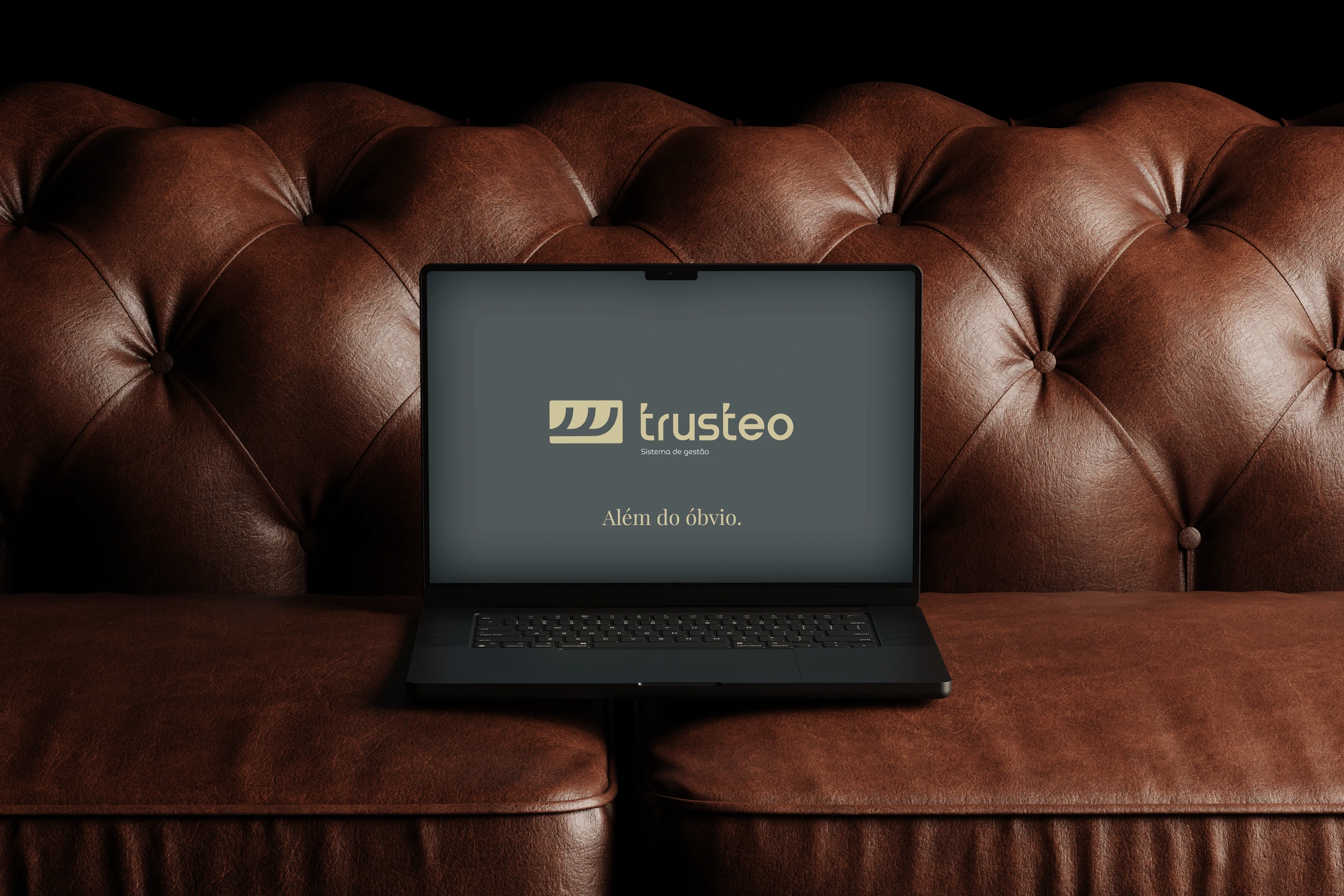
- The colors.Soft gold, graphite gray and warm white. Sophistication without coldness.
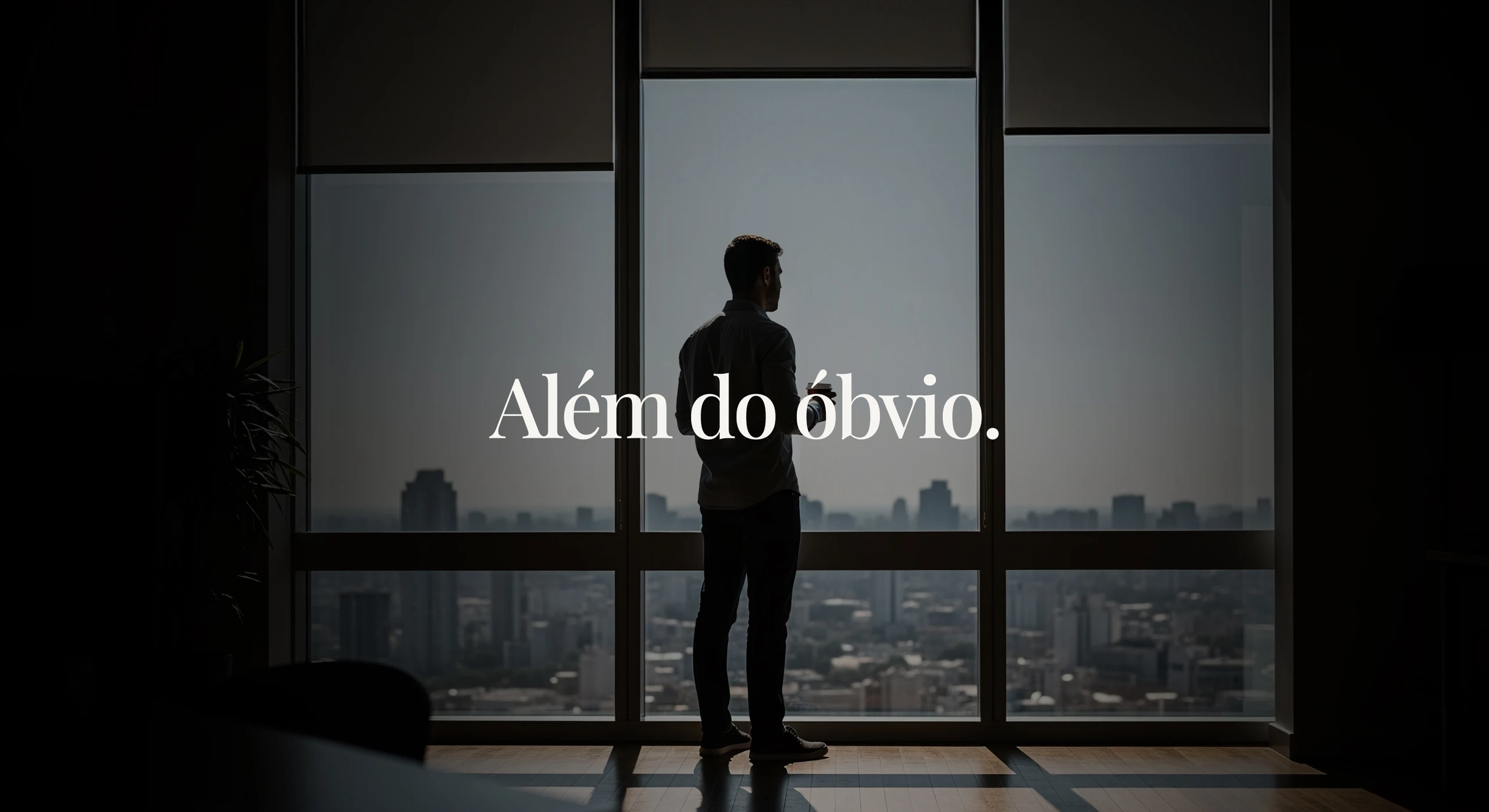
The tagline “Além do óbvio.” (Beyond the obvious.) became the company's slogan.

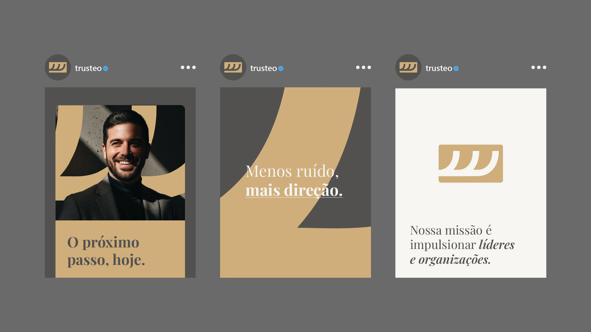
The visual universe
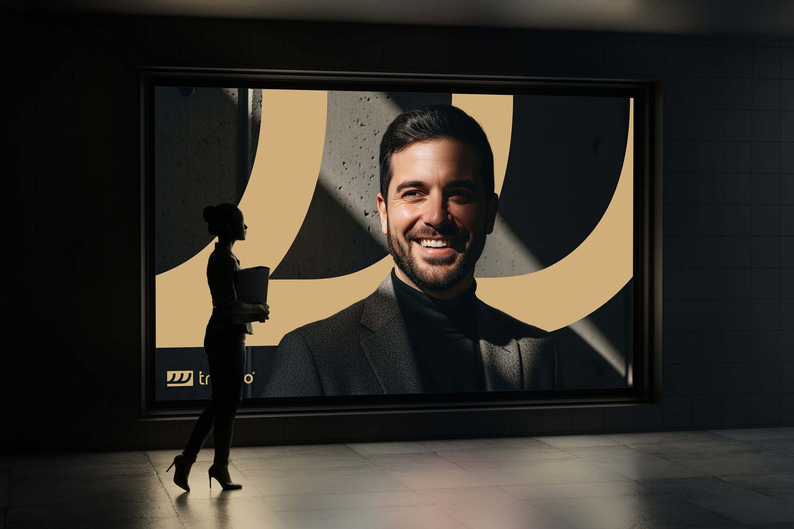
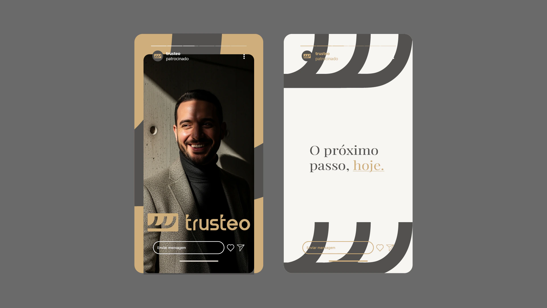
A whole system grew out of the symbol.
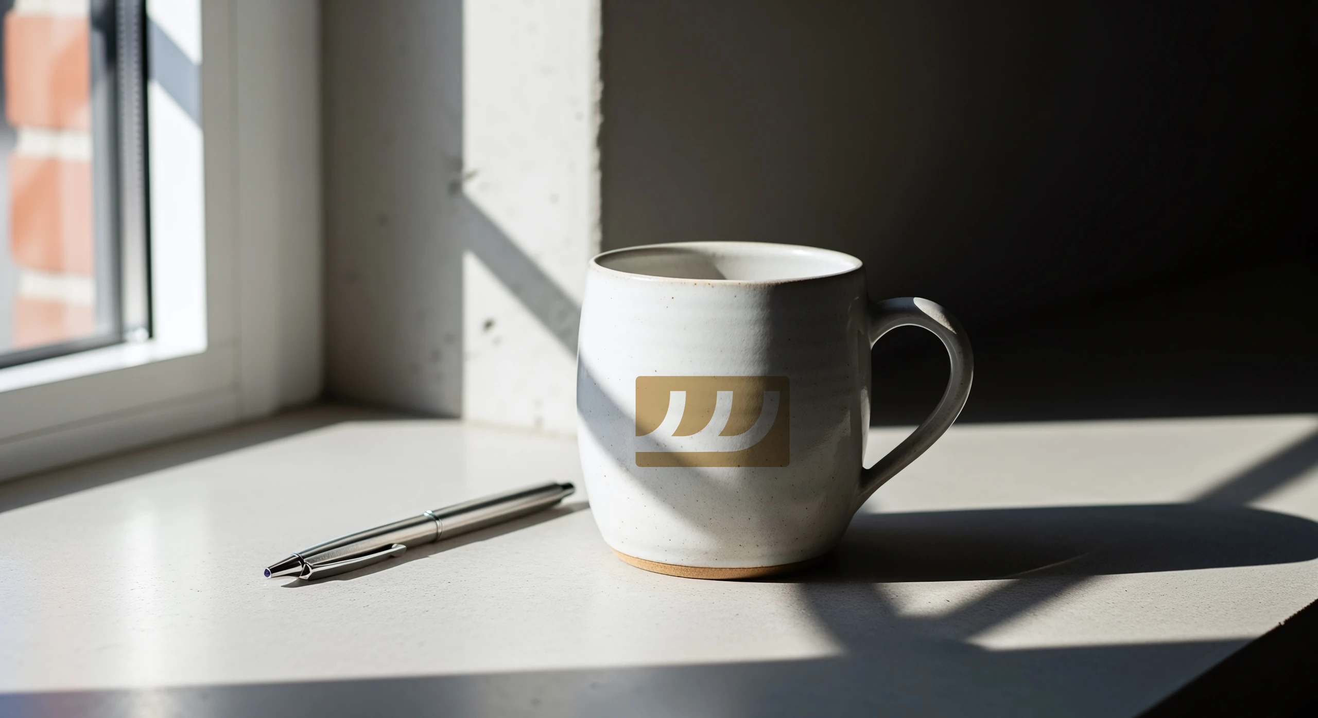
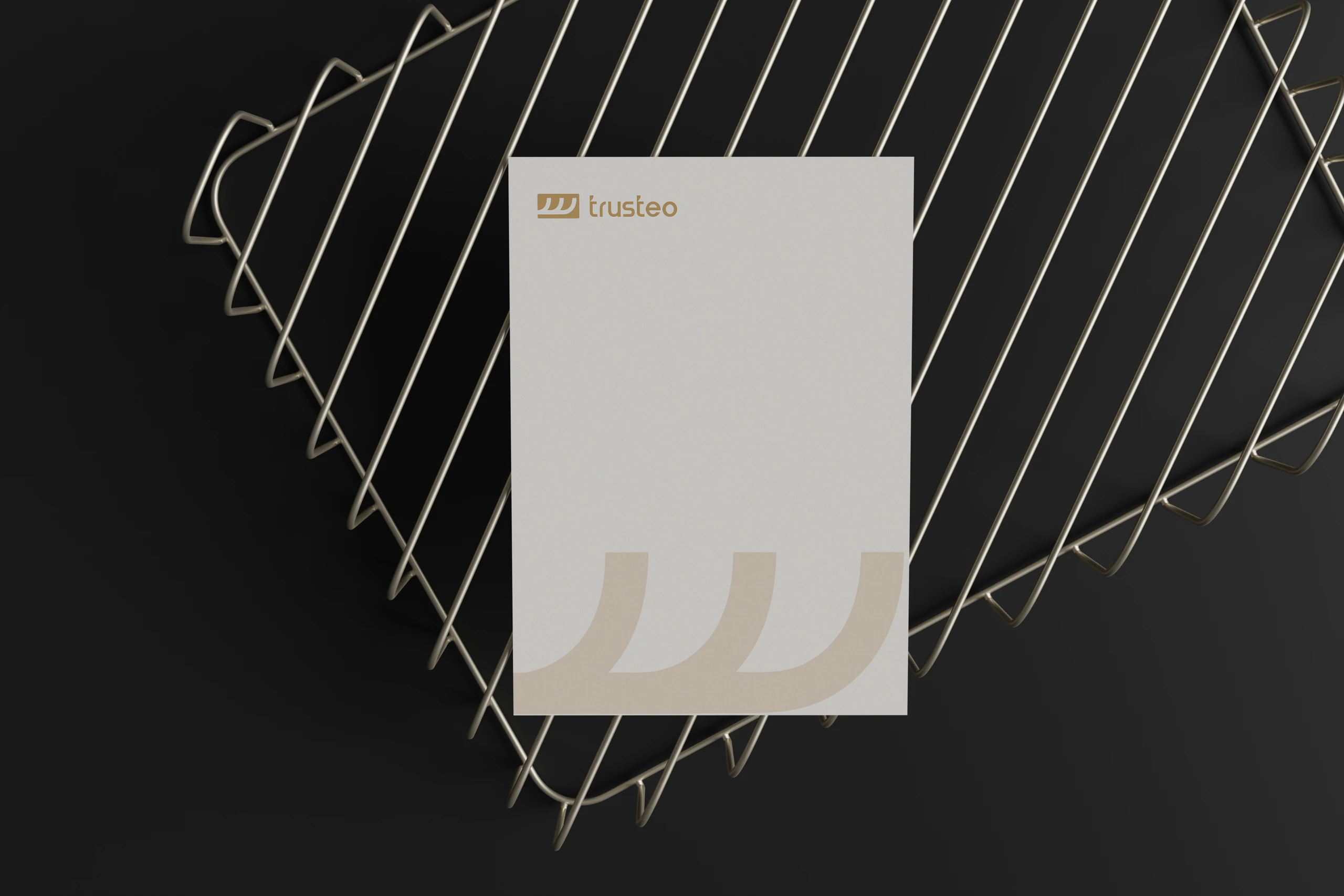
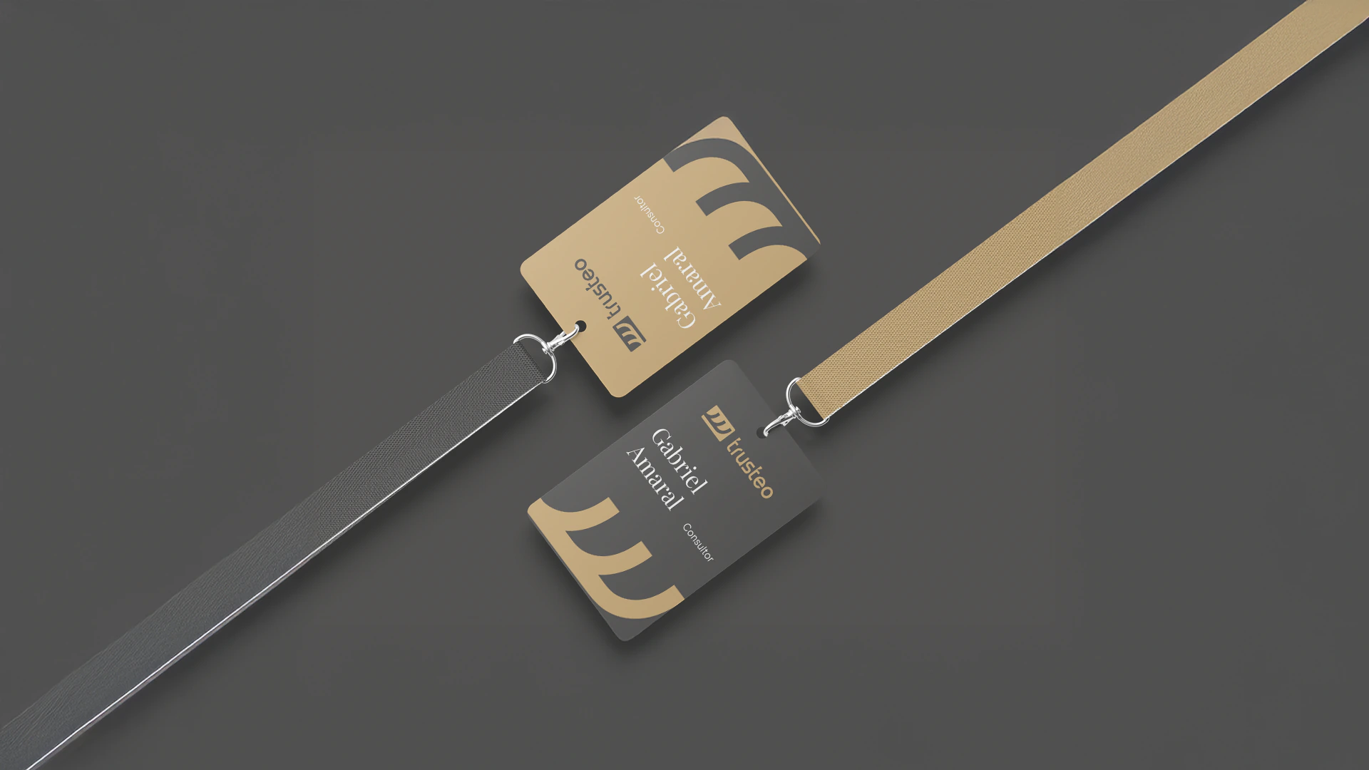
The graphics come from the three lines and follow the brand across social media, stationery and the company's materials.
This was a visual identity project. Brand positioning was out of scope, and that was agreed from the start.




Does your company's brand still depend on the person who founded it?
 Next projectEstevan Hara
Shall we take
a look at
your brand?
The review is a free online conversation. We'll get in touch within 1 business day.