Diamantino
A pioneer that looks like
it's always been here.
- Industry
Clinical lab
- Location
Marilac, Brazil
- Year
2026
- Scope
Visual identity and image direction
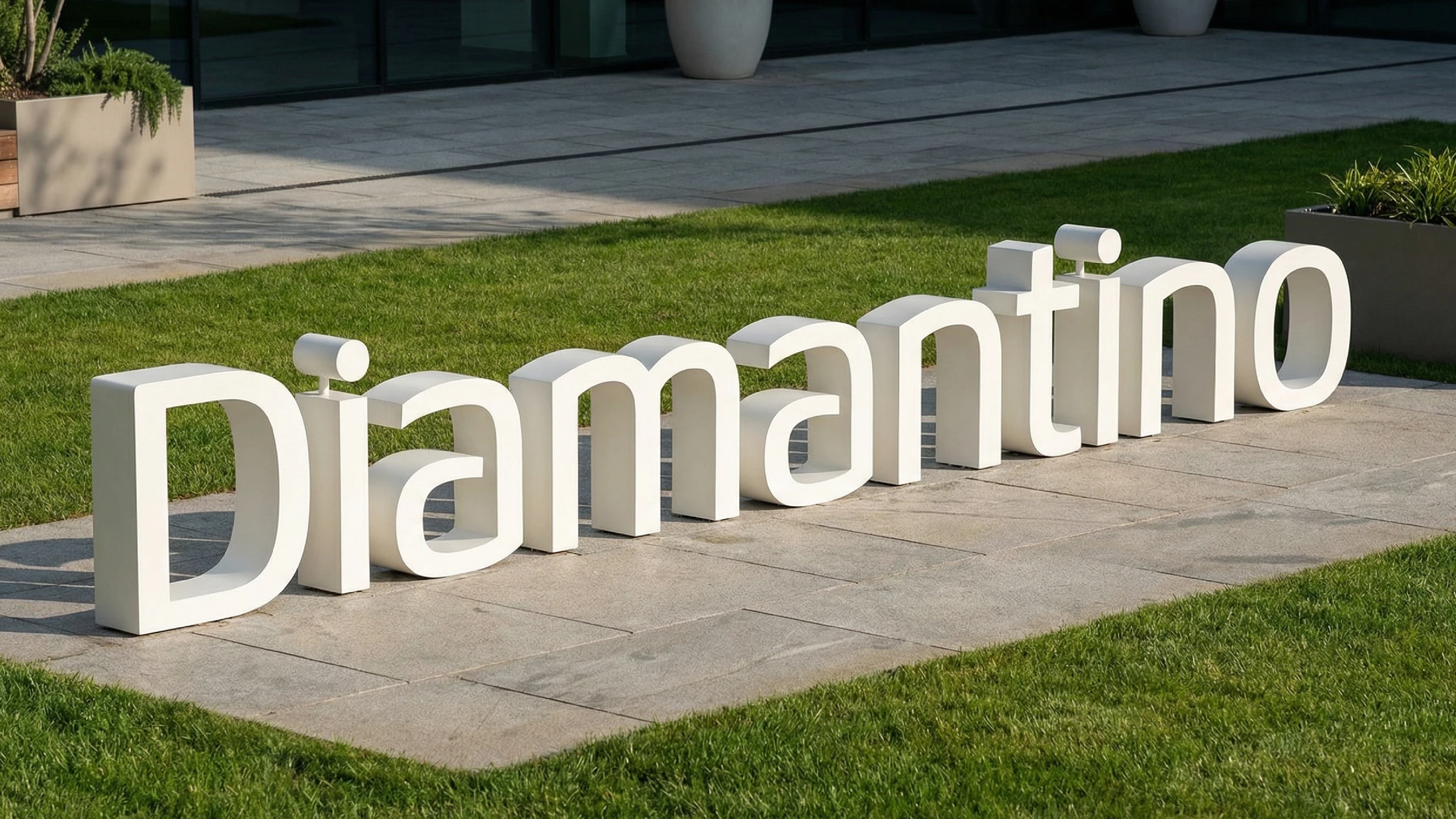
The challenge
The town's first lab had to look established from day one.
Marilac, in Minas Gerais, has about 4,000 residents, and until then anyone who needed a test had to travel to Governador Valadares. The brand had to earn instant trust from a population with no local reference, with a wide range of profiles and incomes, many of whom also come through the city's public health agreement.
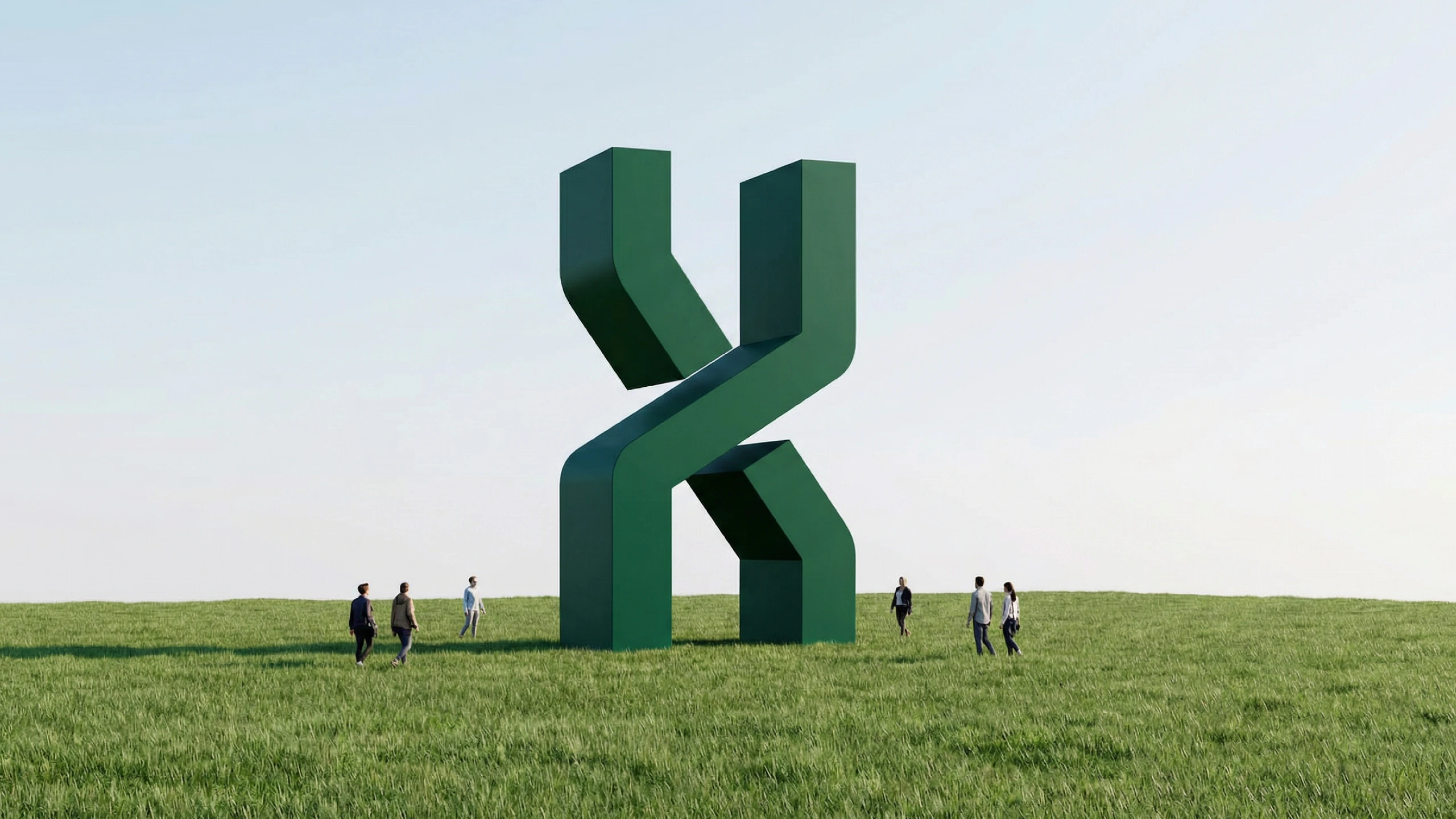
The idea
Simple on purpose.
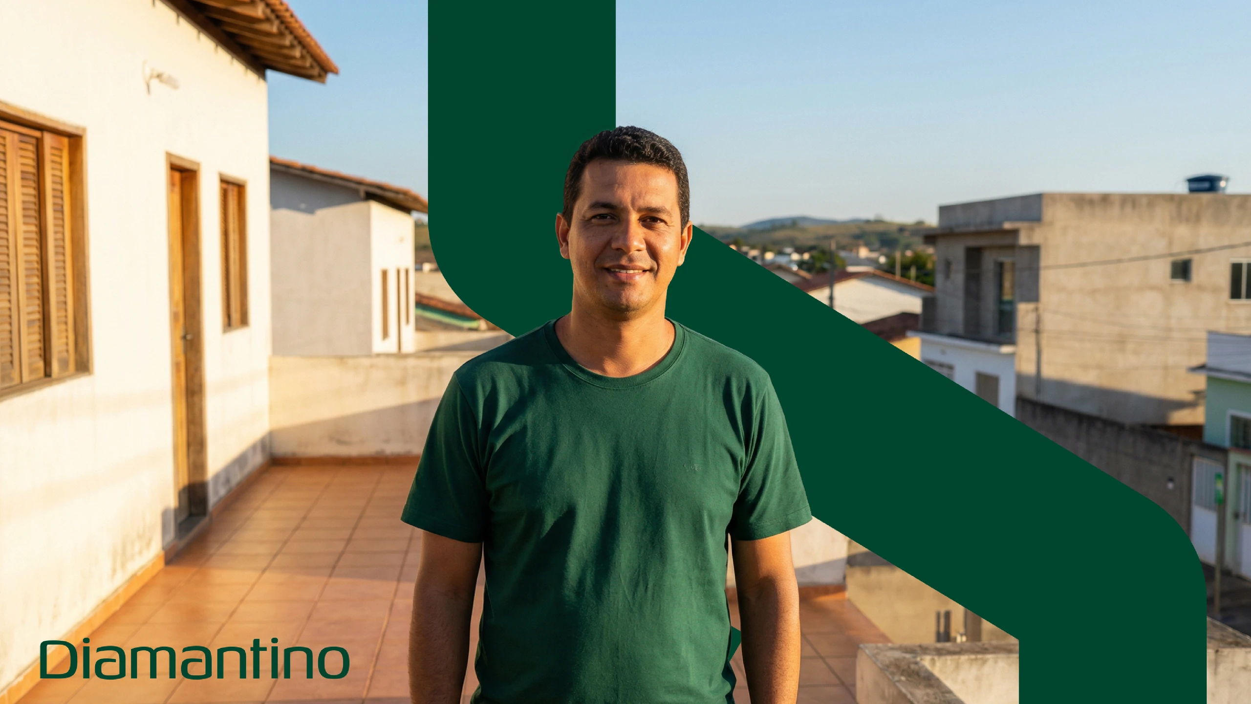
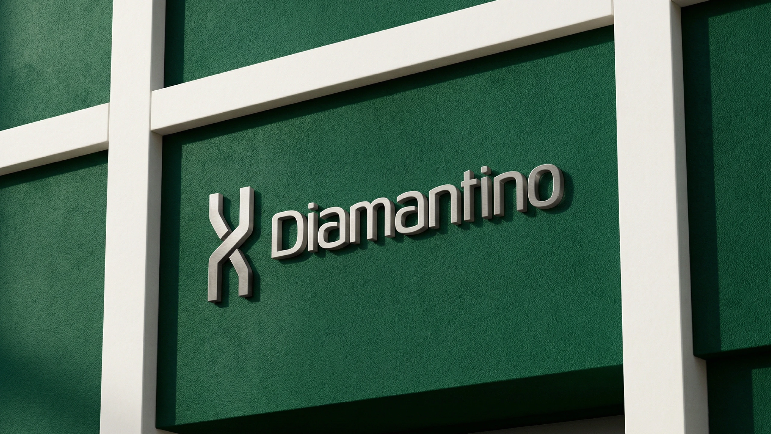
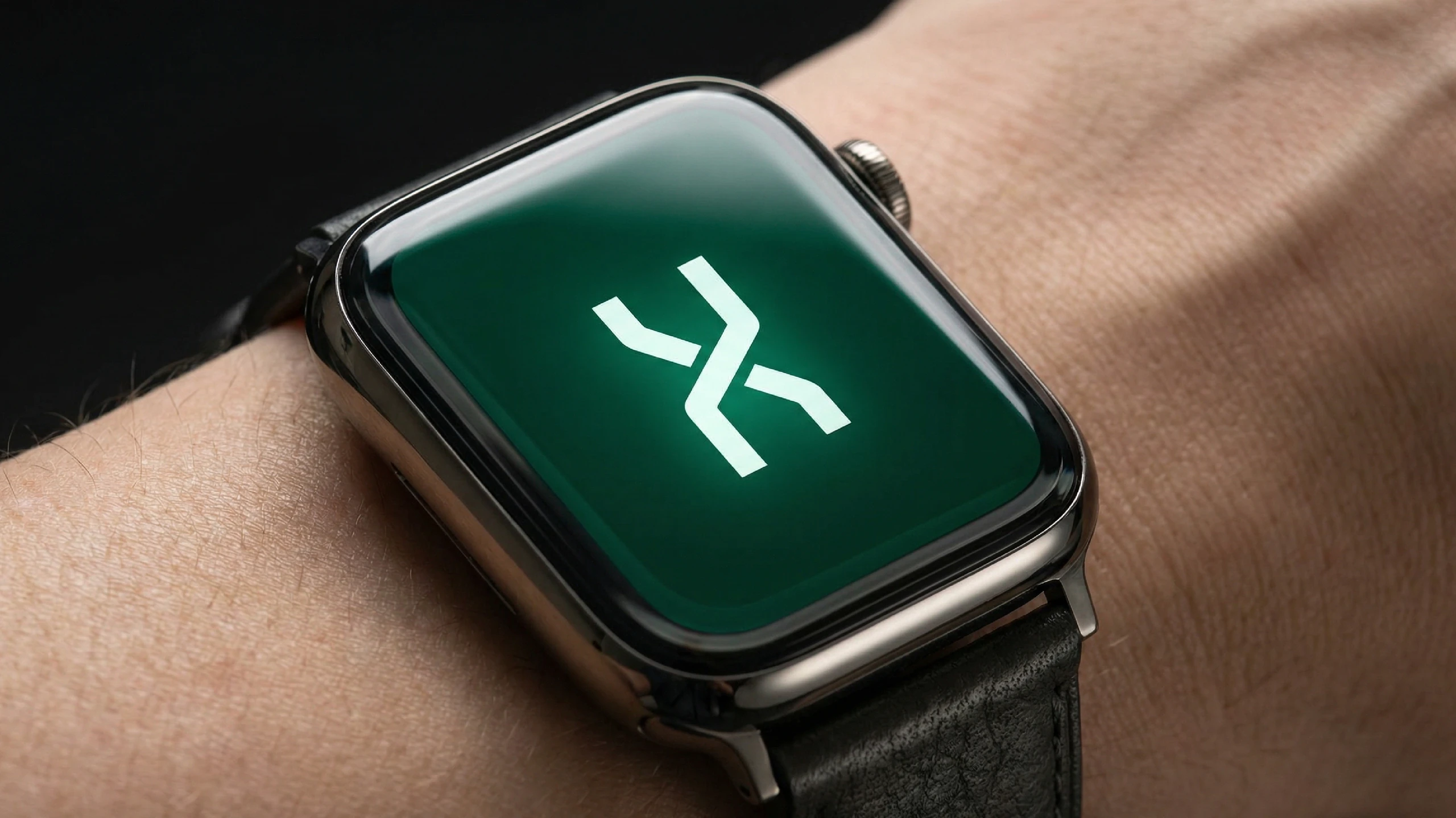
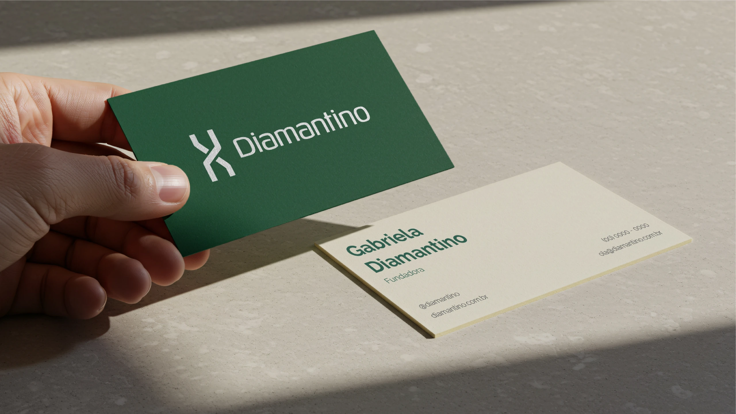
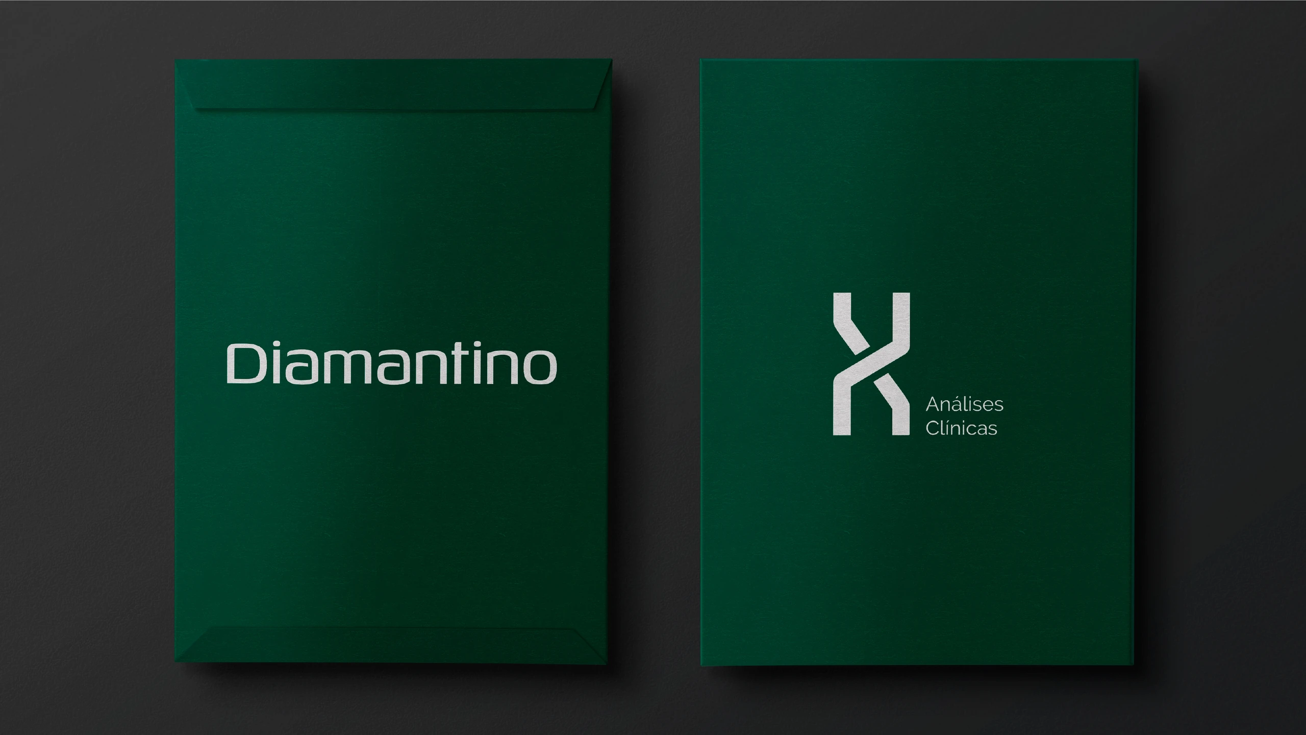
The symbol is geometric and comes from the DNA double helix: science, without the complication. Moss green steps away from the industry's clinical blues and brings the brand closer to the region's landscape.




The imagery
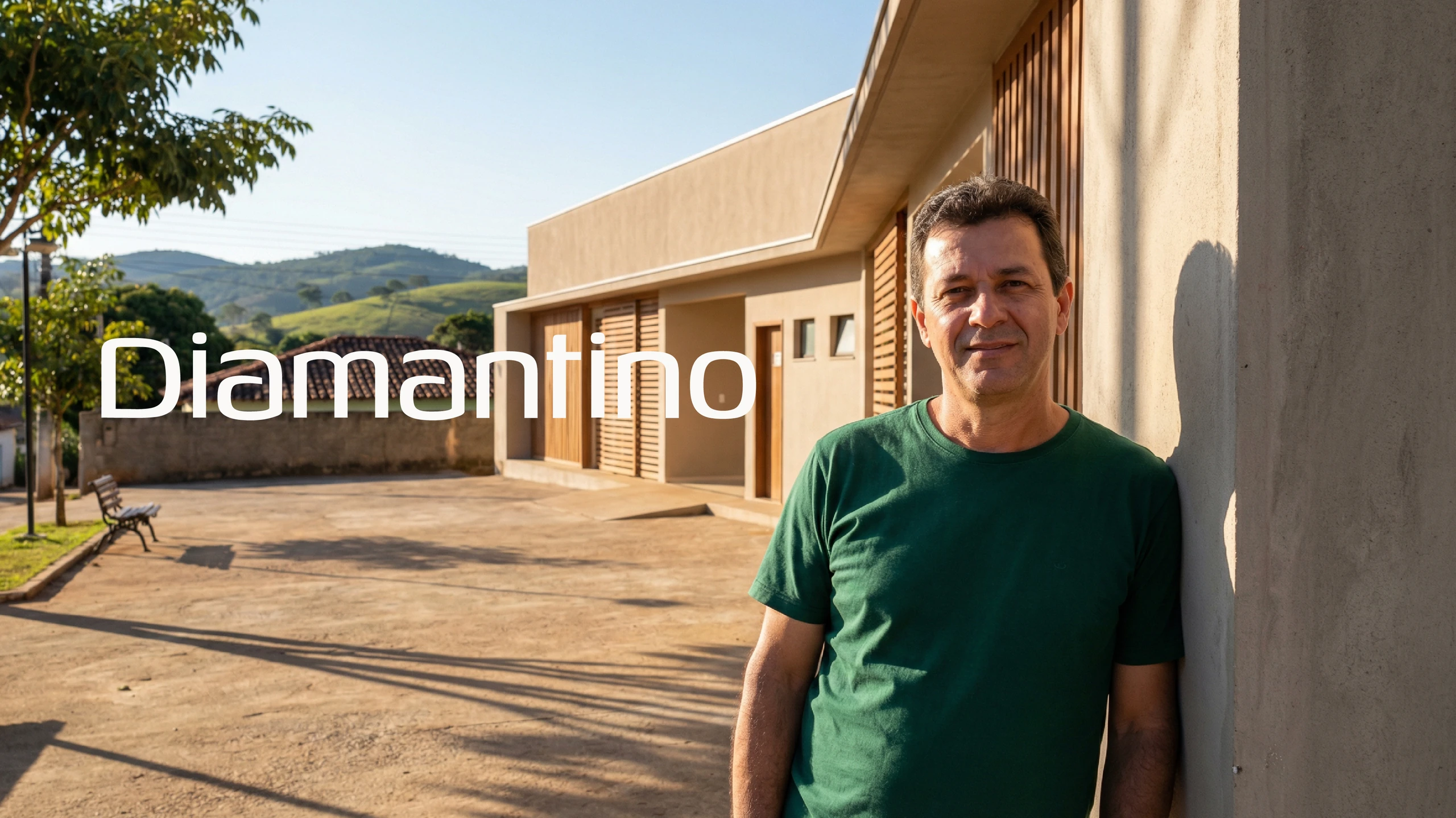
A lab that looks like it belongs here.
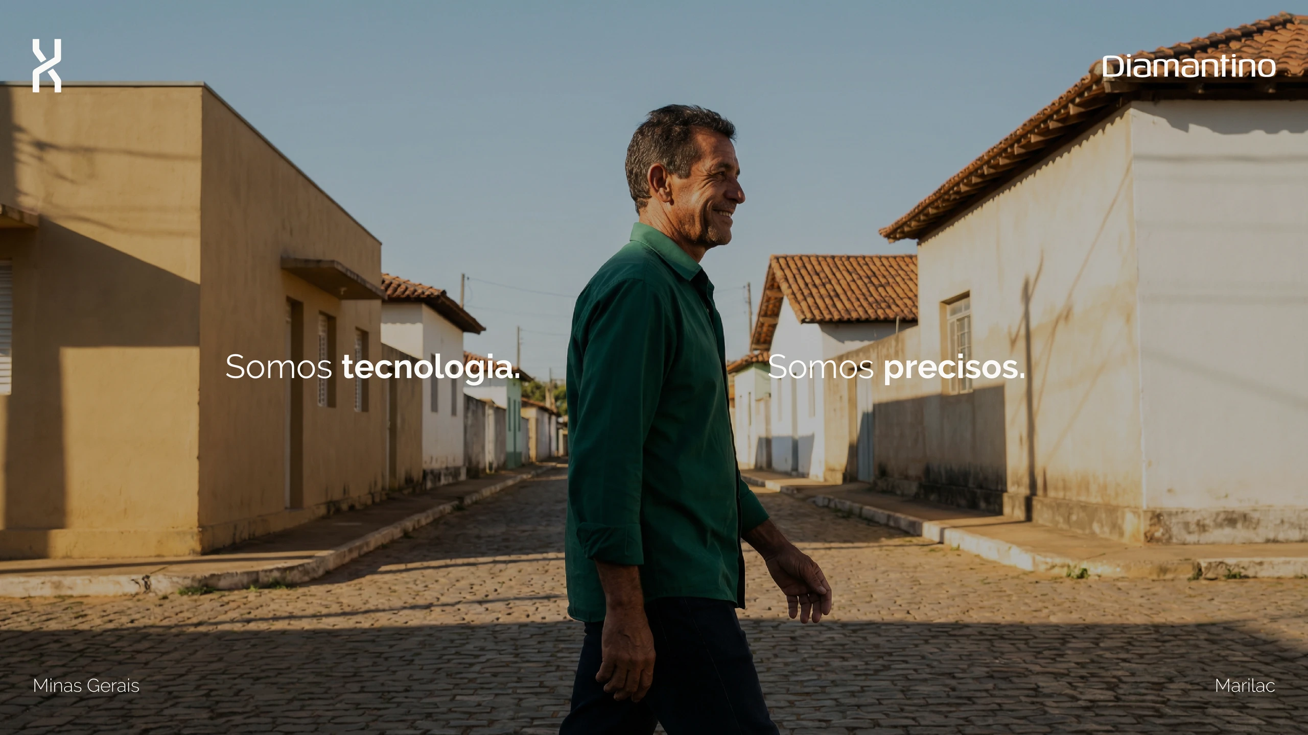
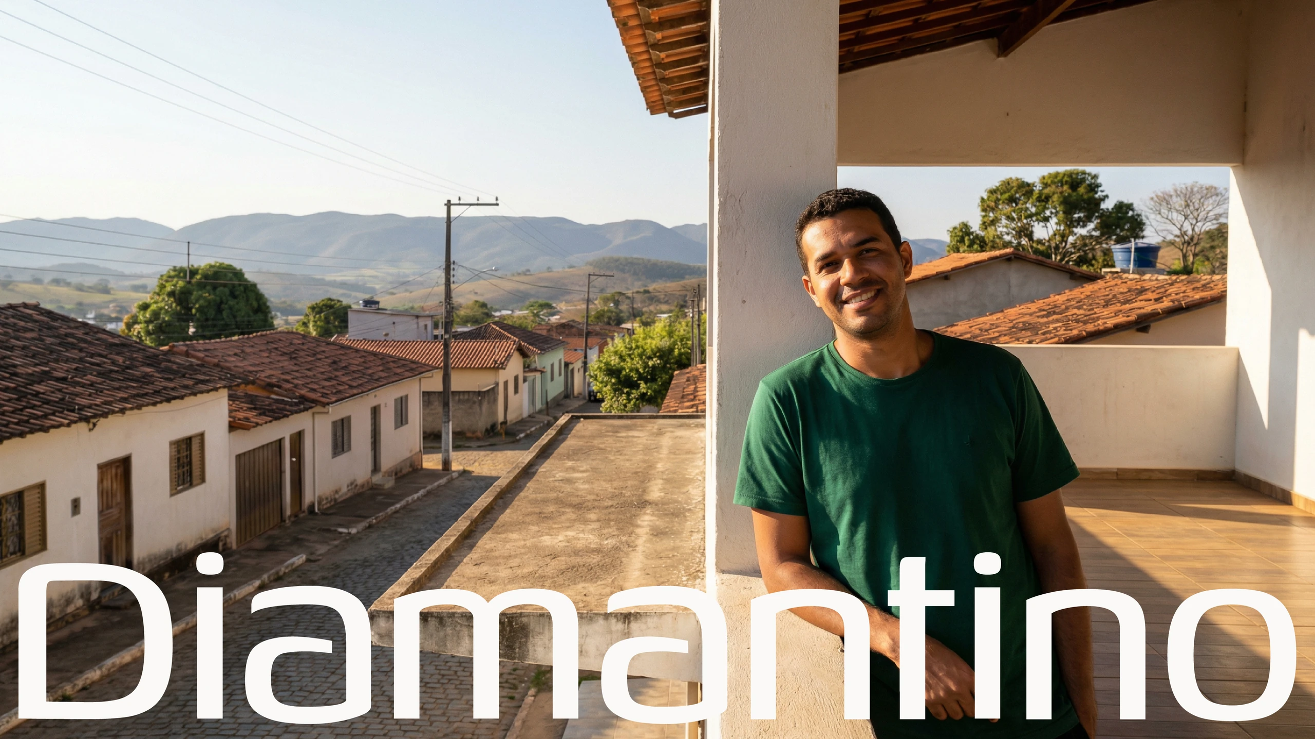
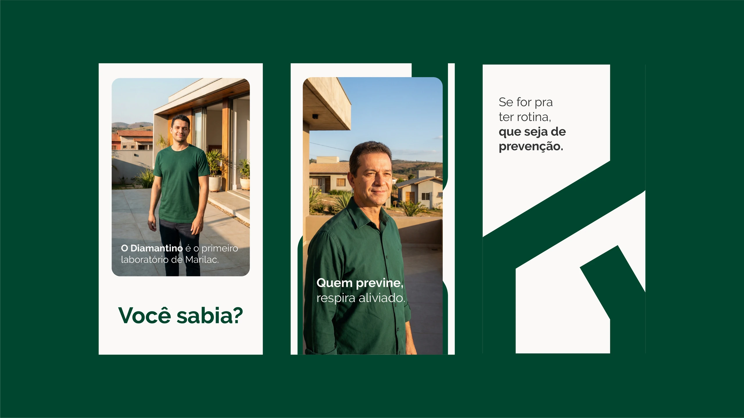
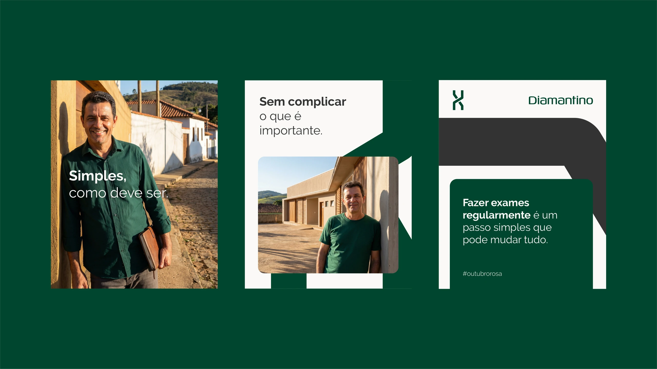
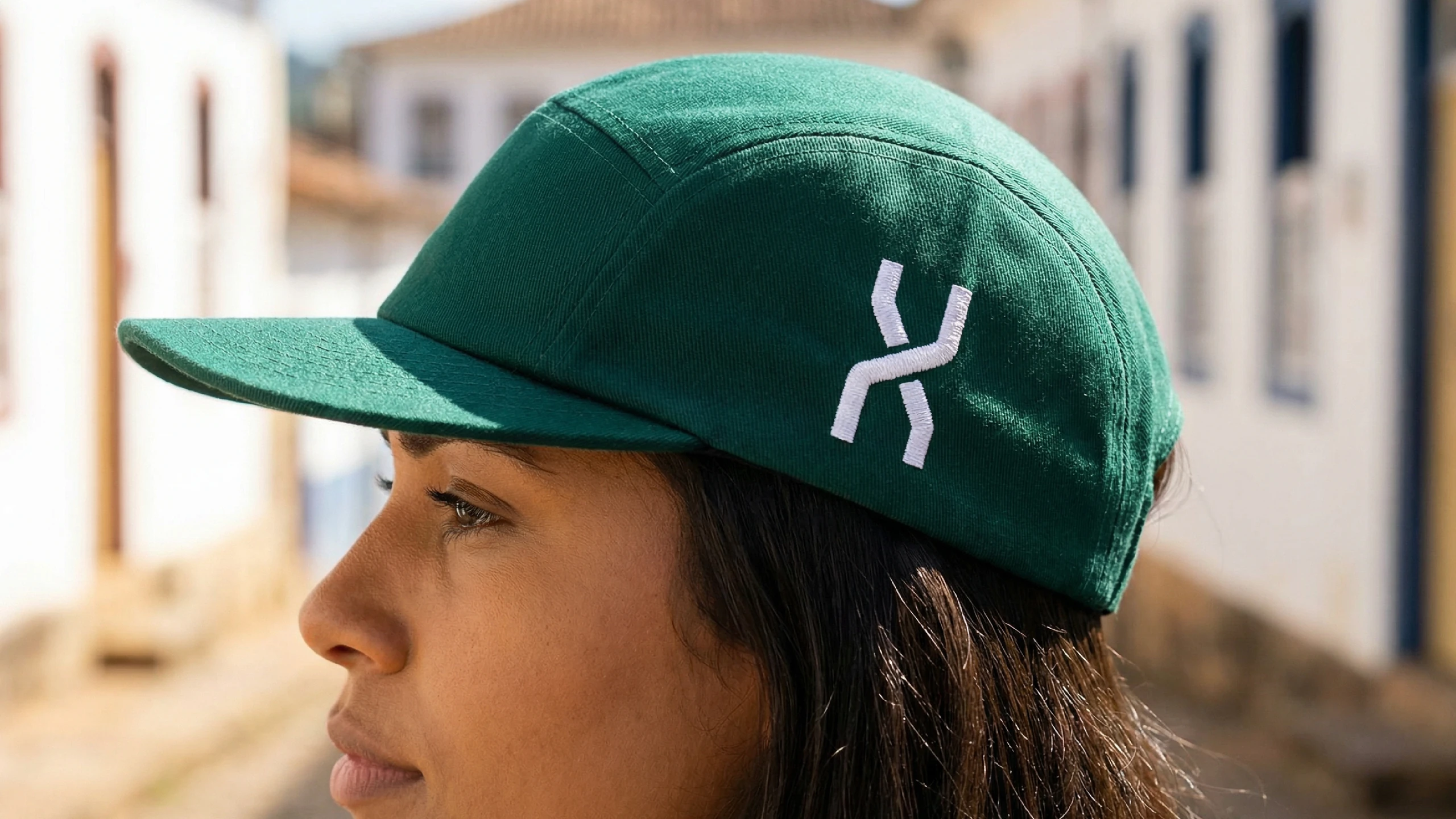
The image direction uses landscapes and scenes from rural Minas Gerais, with people from the region. The tone of the pieces follows the same idea:
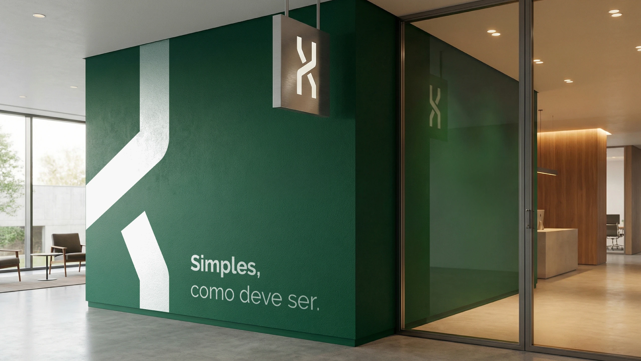
“Simples, como deve ser.” (Simple, as it should be.)
“Somos tecnologia. Somos modernos. Somos precisos.” (We are technology. We are modern. We are precise.)
The applications
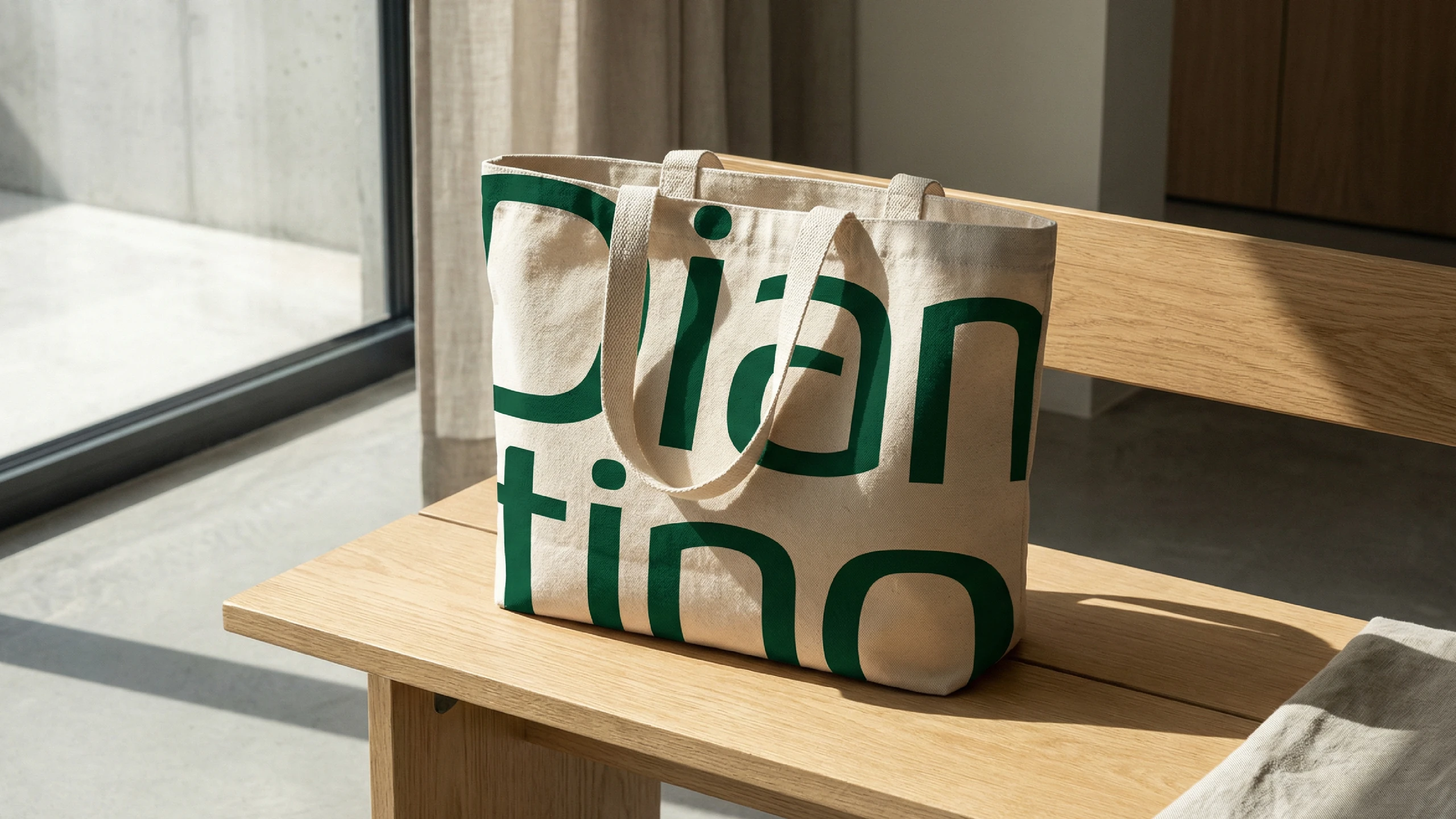
From the facade to the cap.
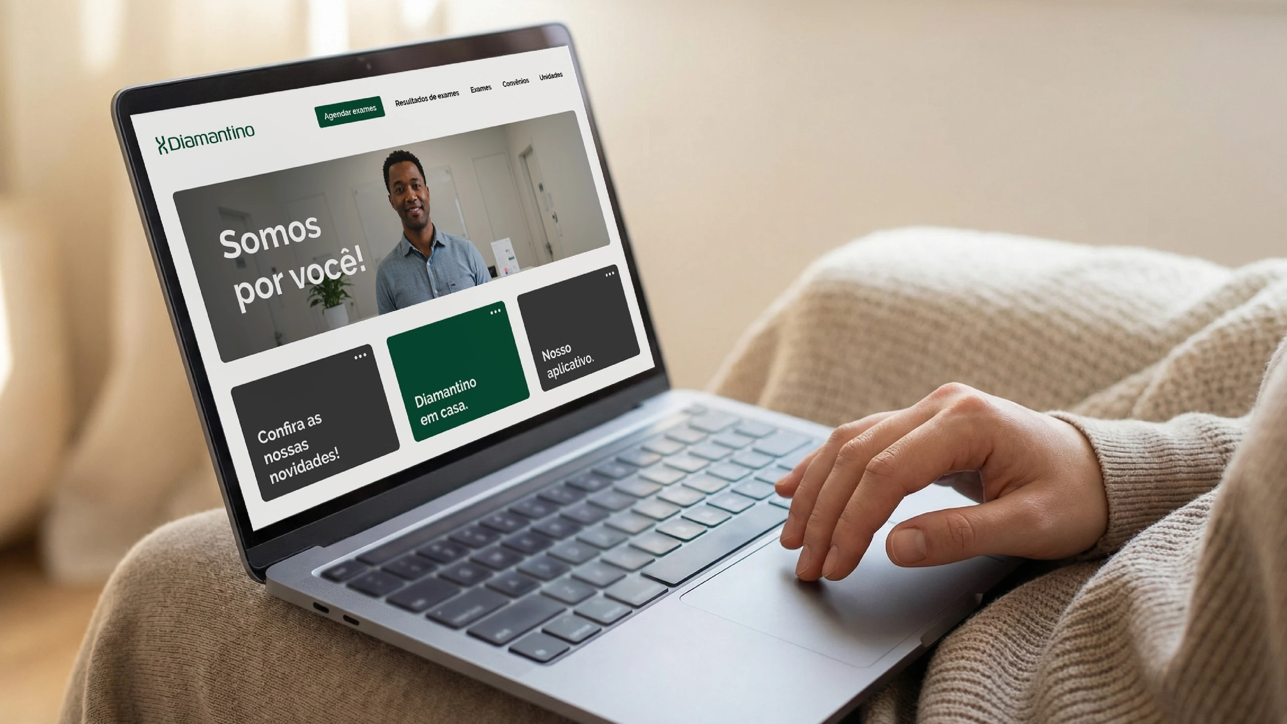
The system was designed for the facade, interior, uniforms, stationery, website and social media.
Does your brand already convey the trust your company deserves?
 Next projectLivser
Shall we take
a look at
your brand?
The review is a free online conversation. We'll get in touch within 1 business day.