Livser
Science
without the chill.
- Industry
Compounding pharmacy
- Location
Tijucas, Brazil
- Year
2026
- Scope
Visual identity
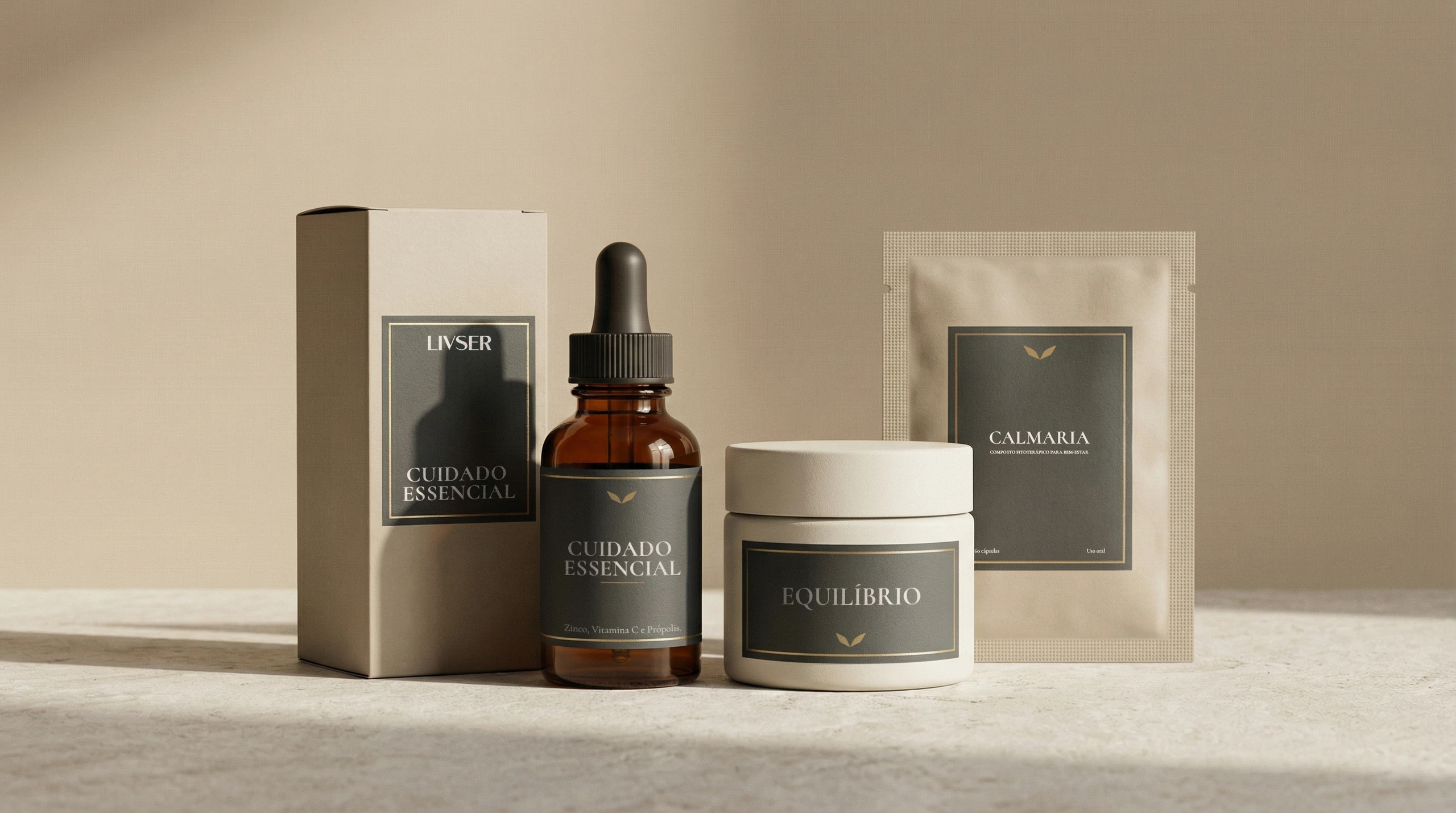
The challenge
In this industry, almost every compounding pharmacy looks like a clinic. Livser needed to look like care.
Livser is a compounding pharmacy in Tijucas, Brazil. It needed a personality of its own, sophisticated and easy to remember, able to say two things at once: the precision of every formula and the human, botanical care behind it.
The idea
Trust, without the chill.
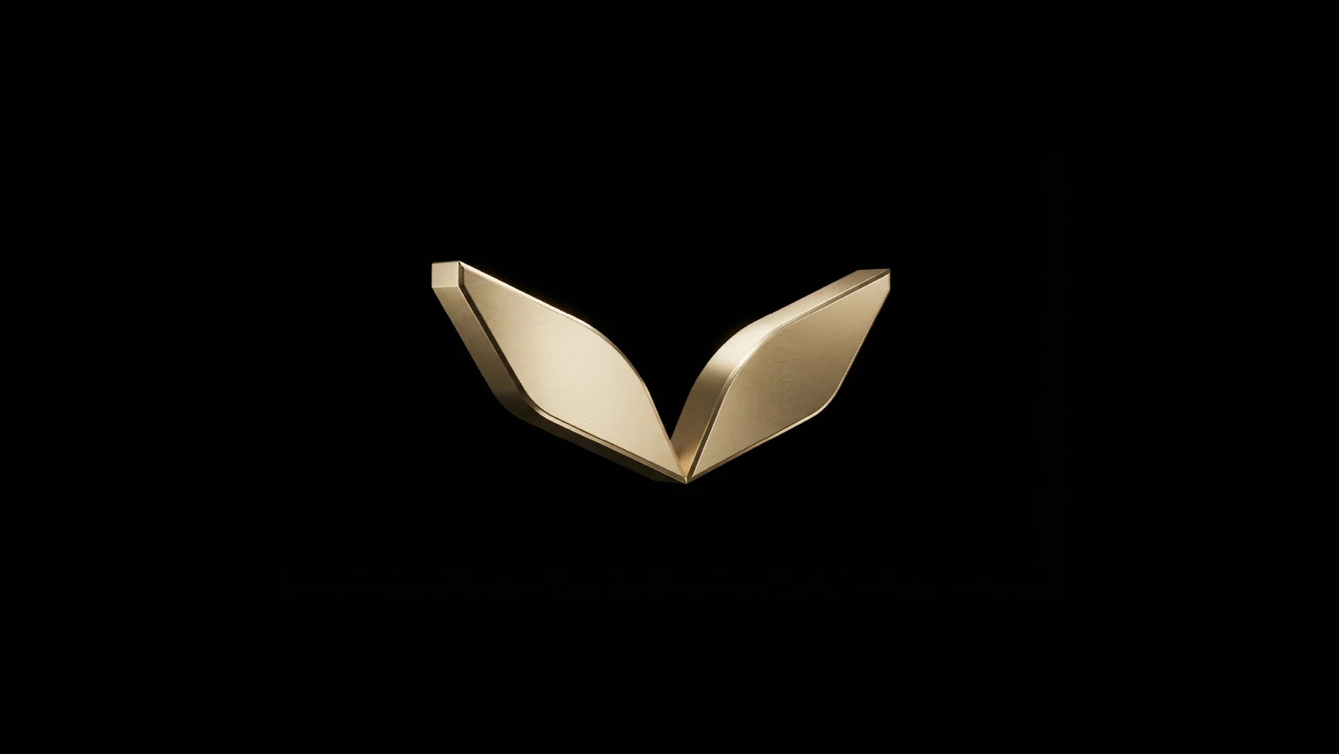
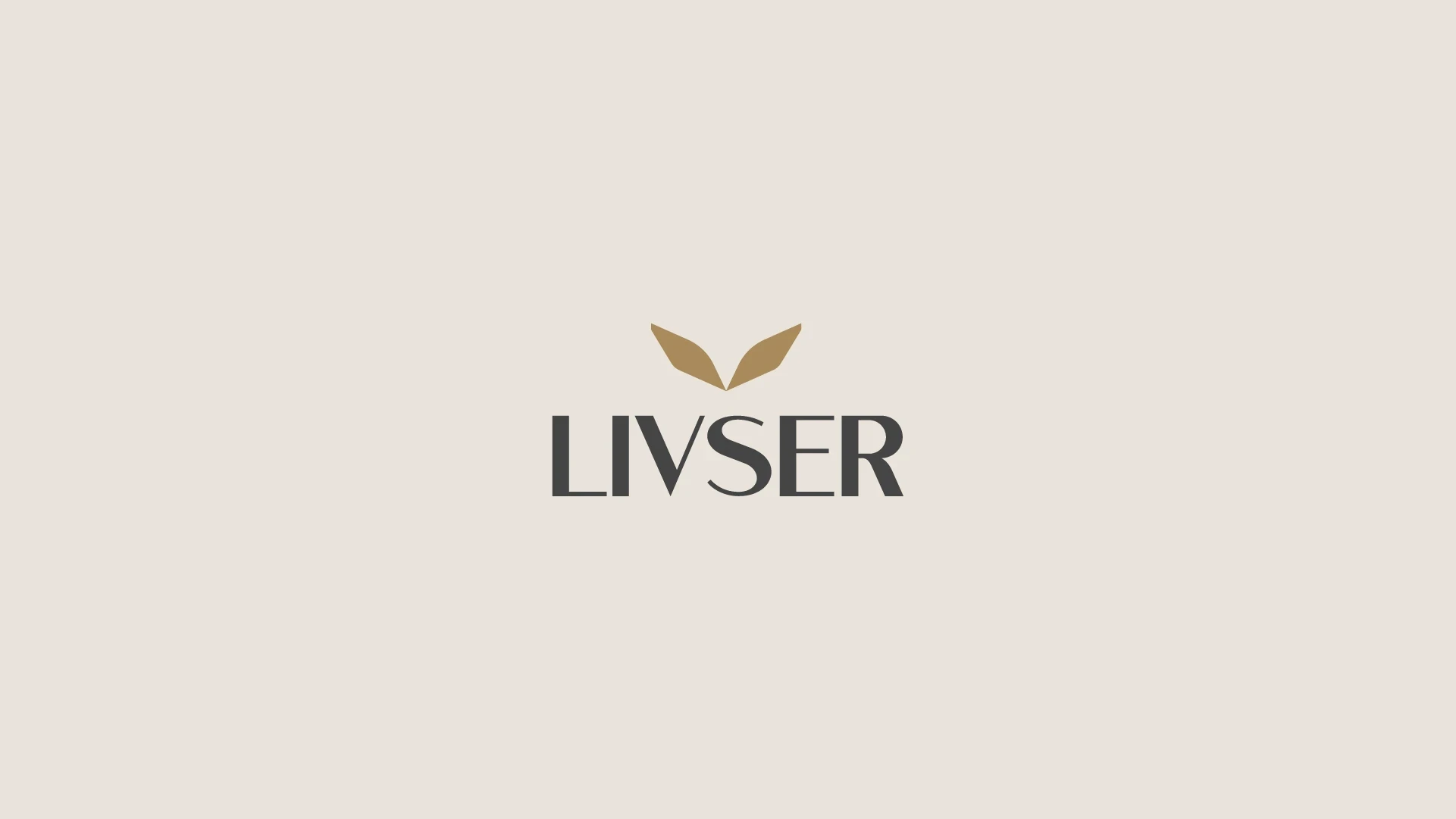
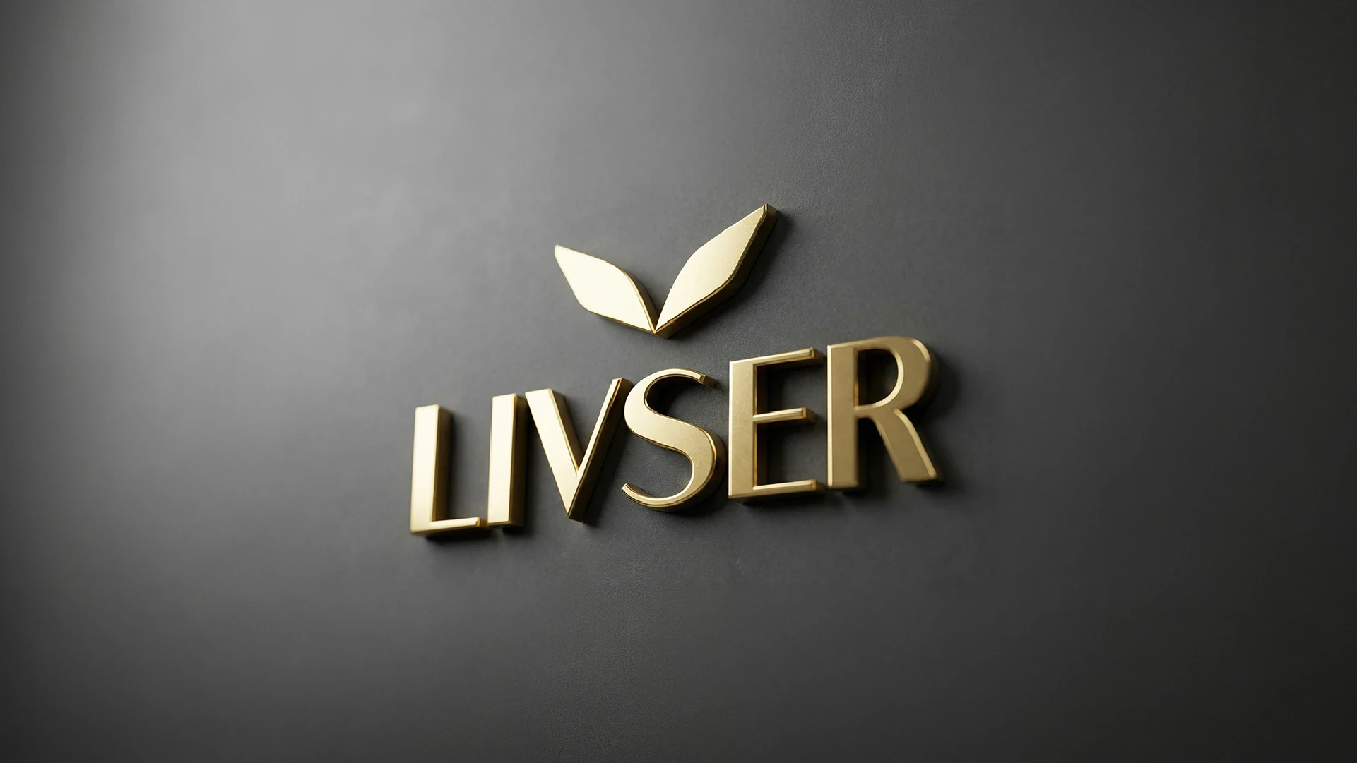
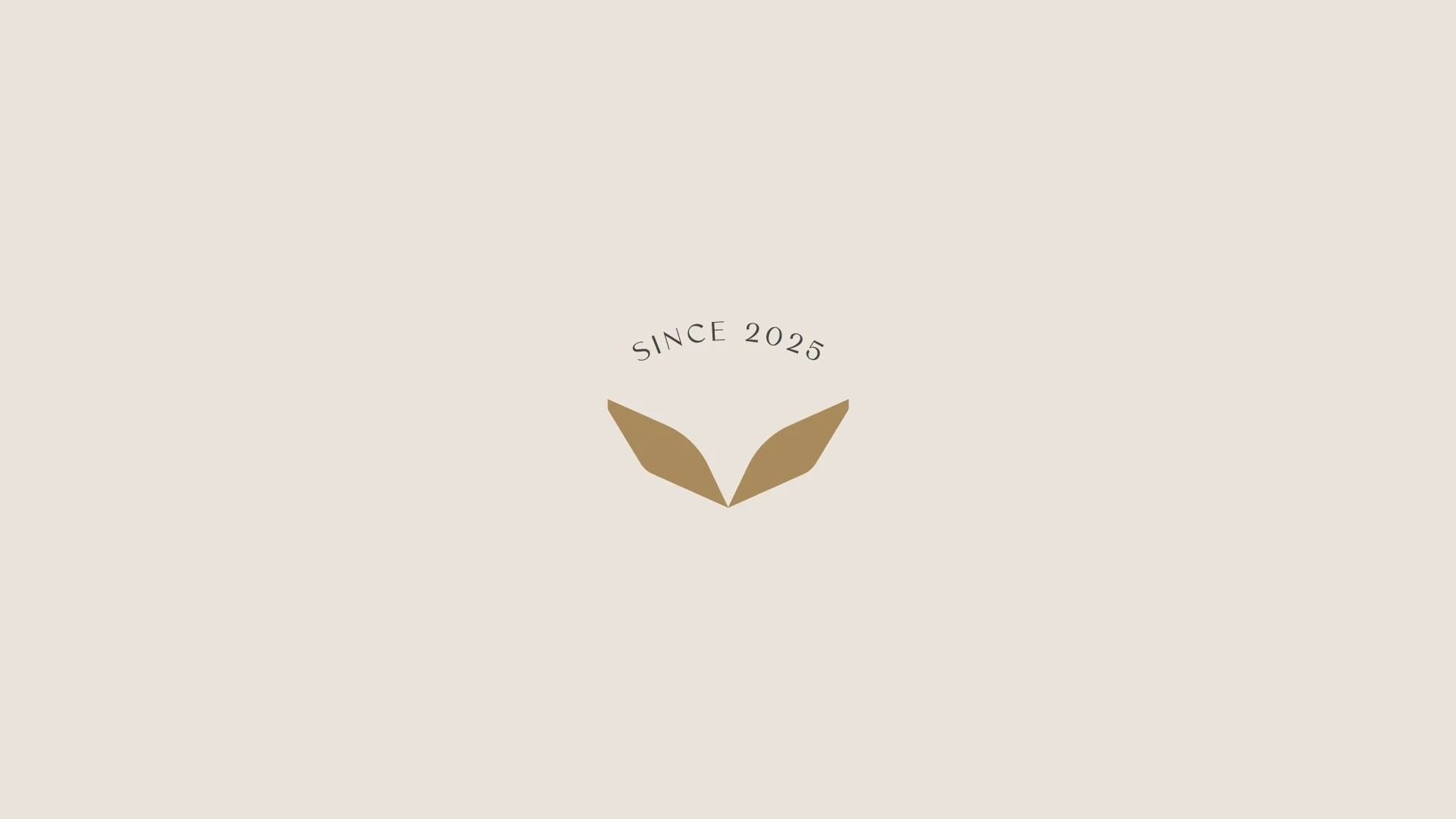
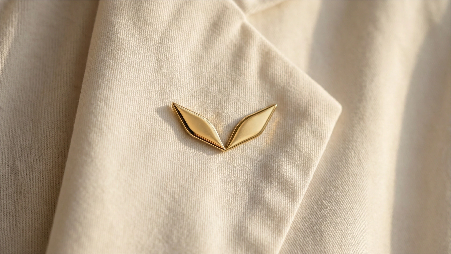
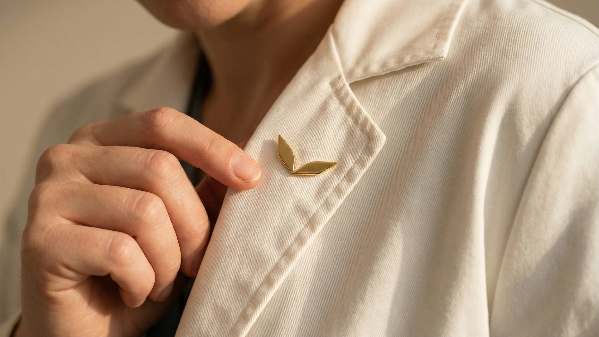
The symbol brings together a hummingbird and a leaf. The hummingbird adds lightness and a sense of care that keeps renewing itself. The leaf recalls the botanical origin. Together, they open up like wings.
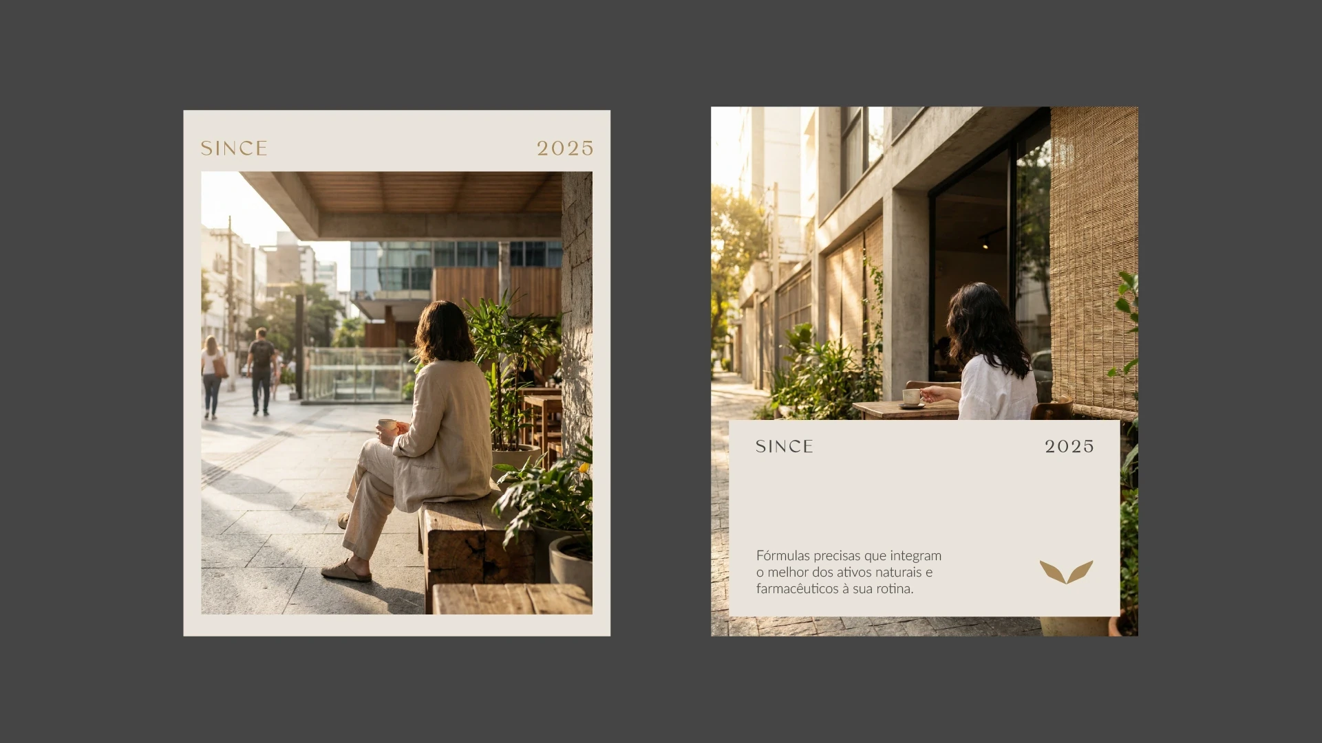
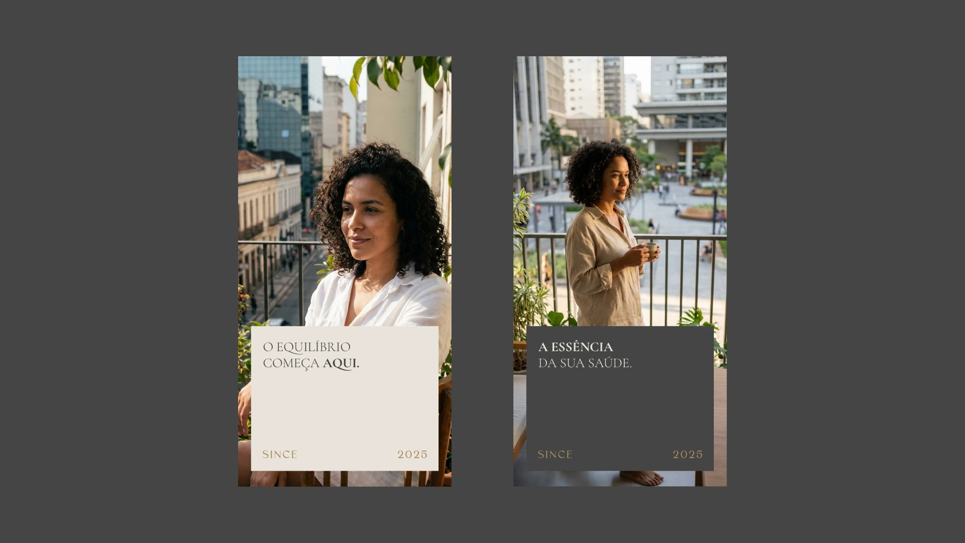
- The typeface.Sans serif, high contrast, in widely spaced capitals. A nod to the signs of old apothecaries.
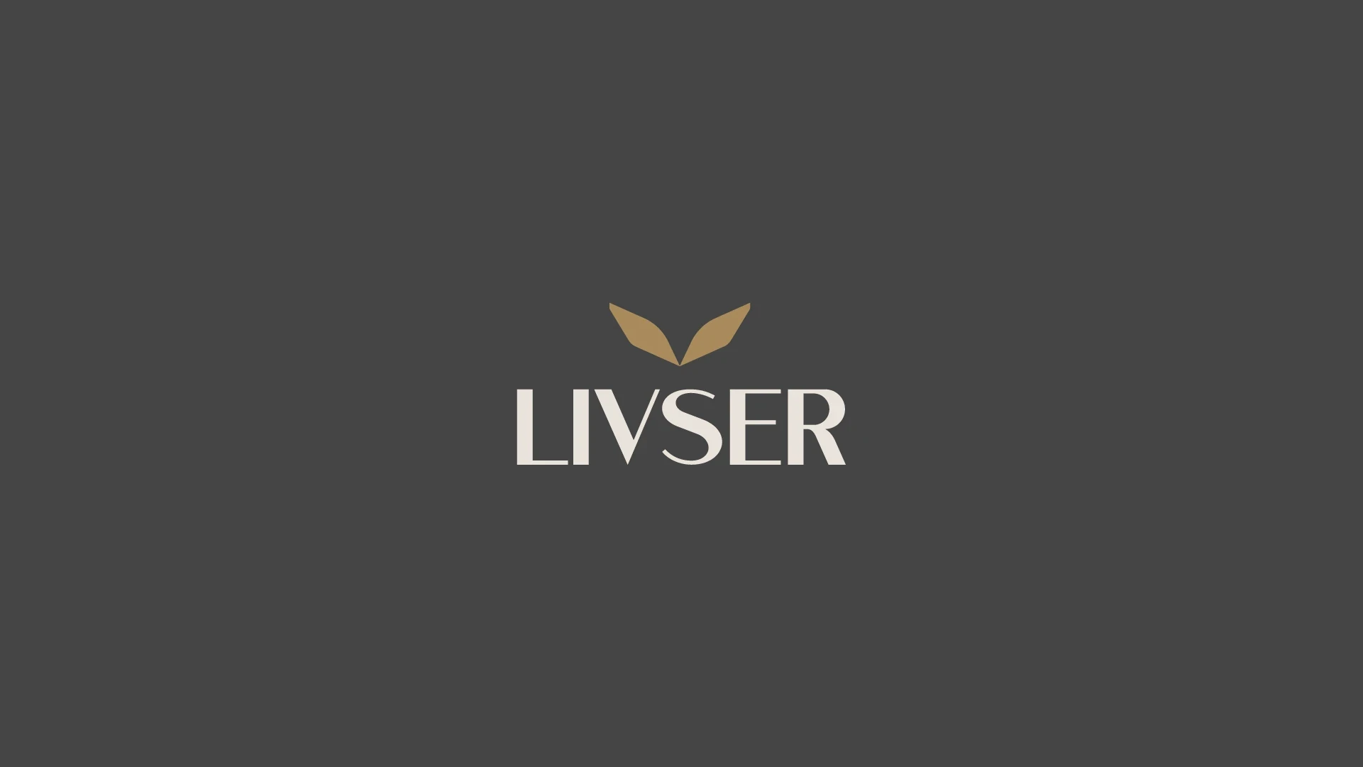
- The colors.Beige, warm white and graphite. Calm instead of hospital white.
The applications
From the label to the counter.
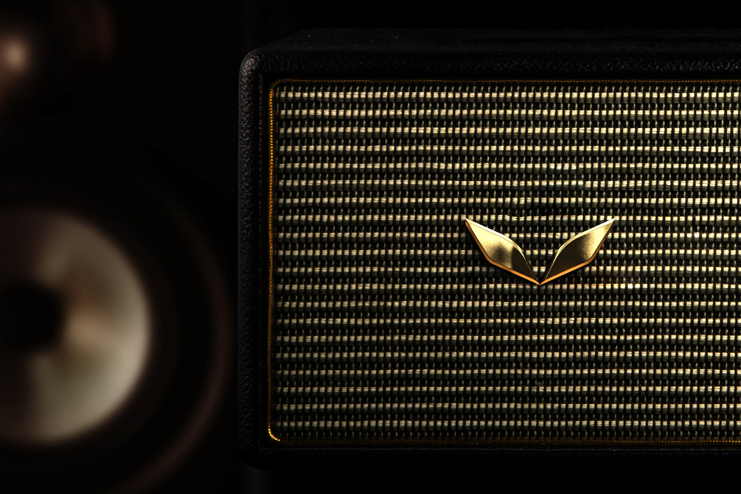
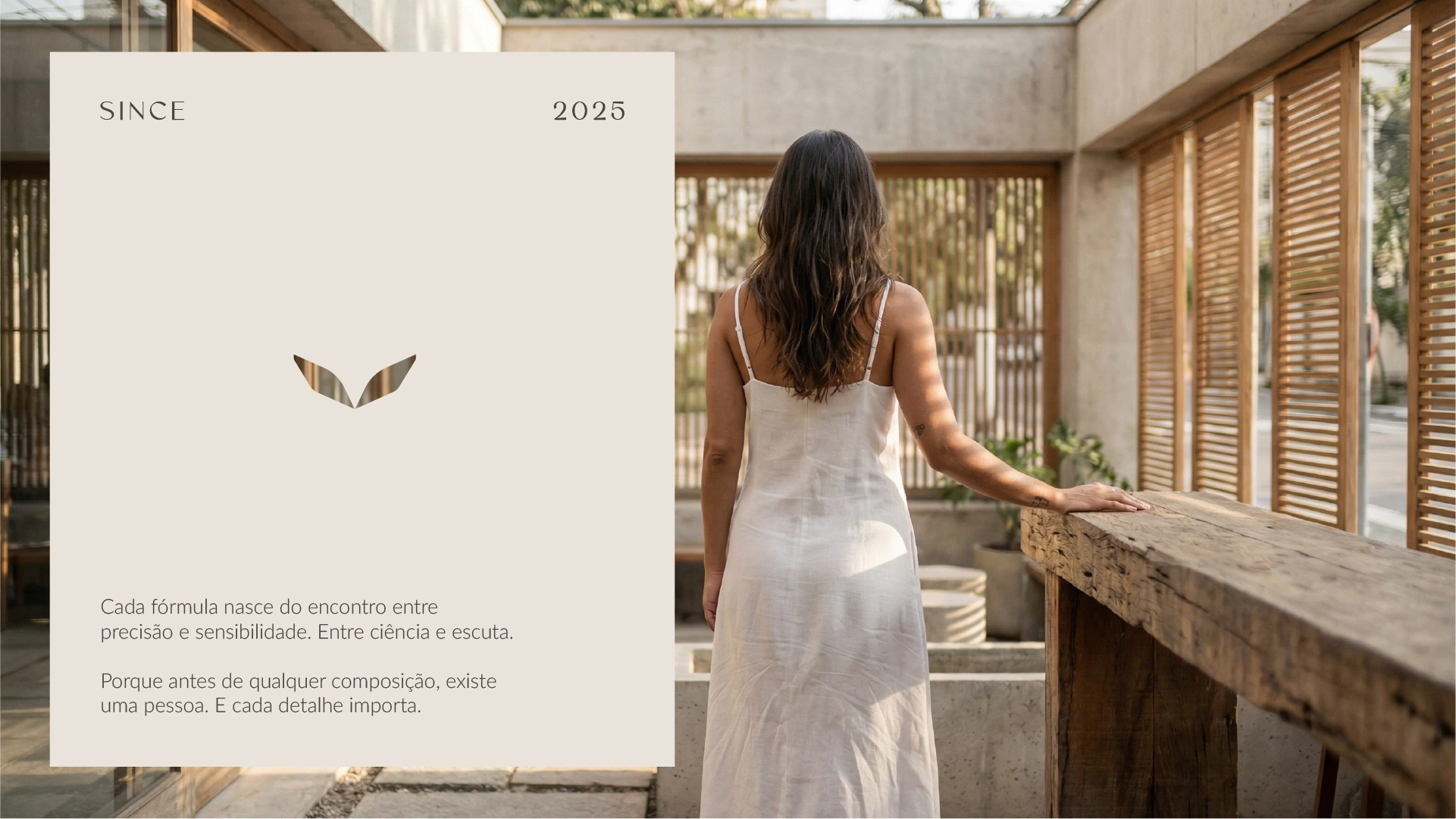
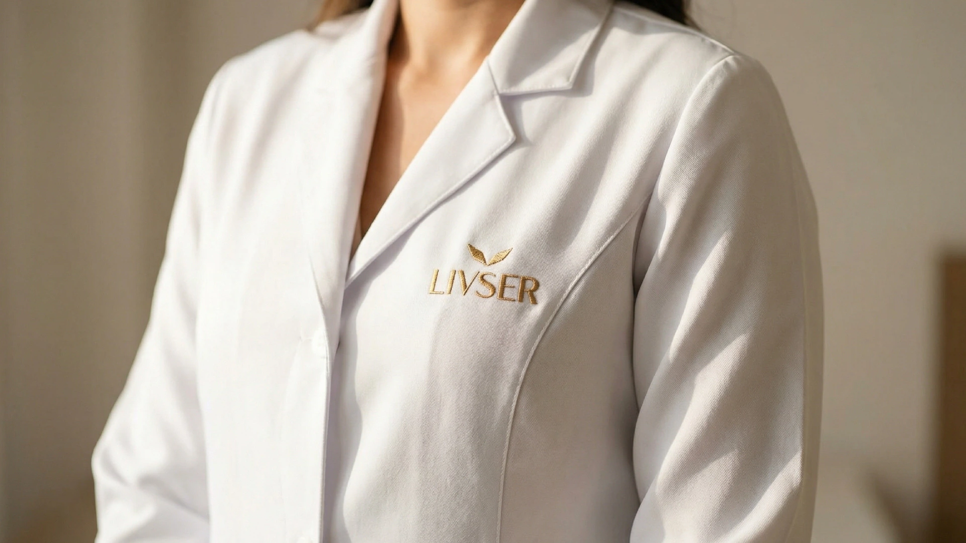
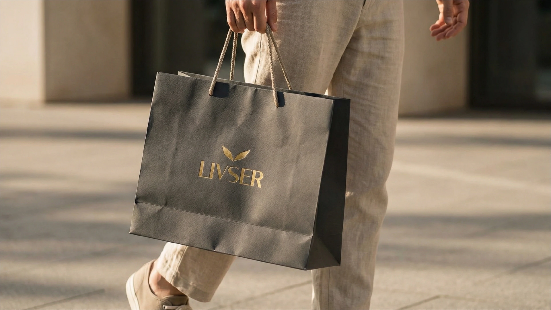
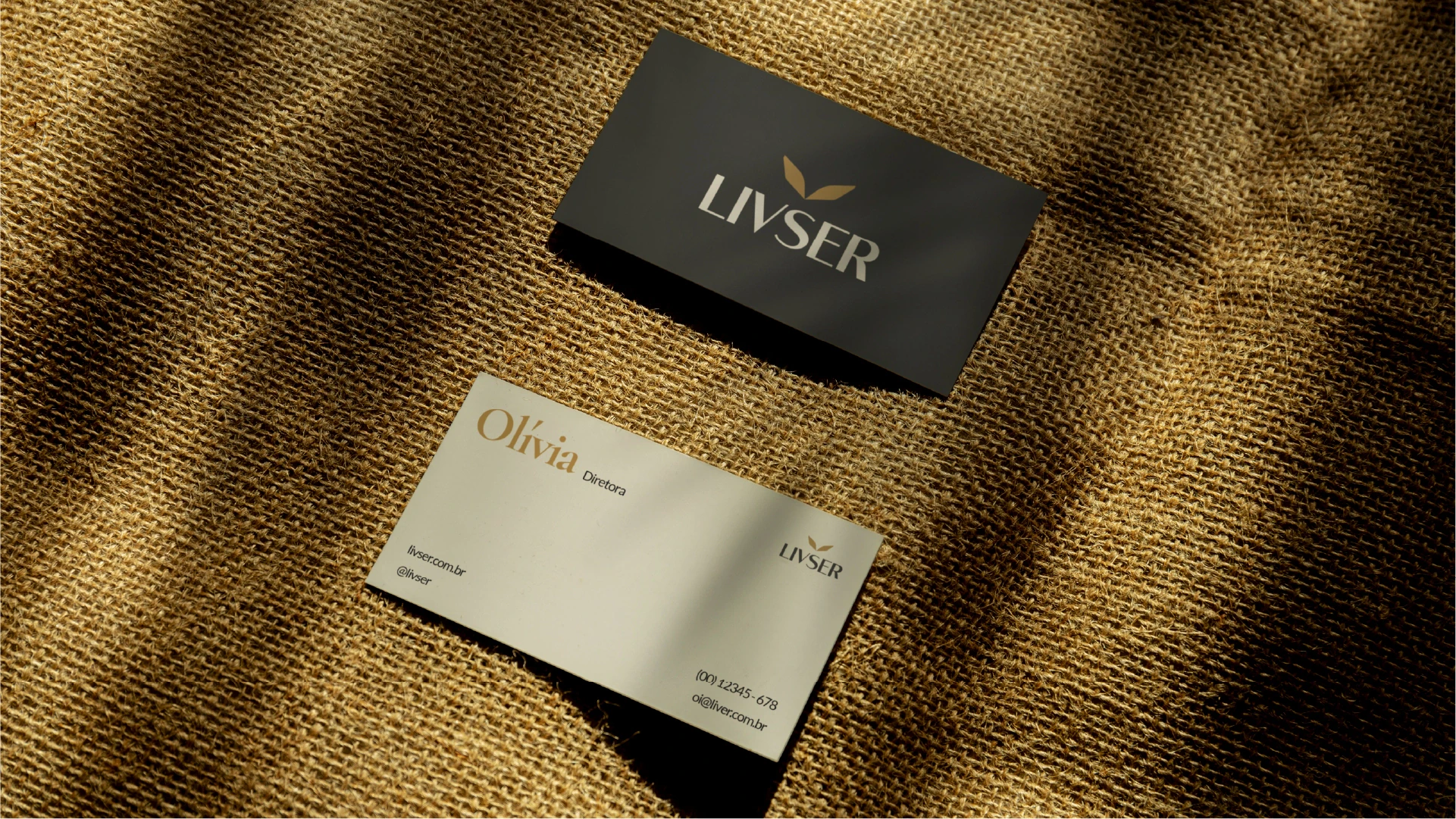
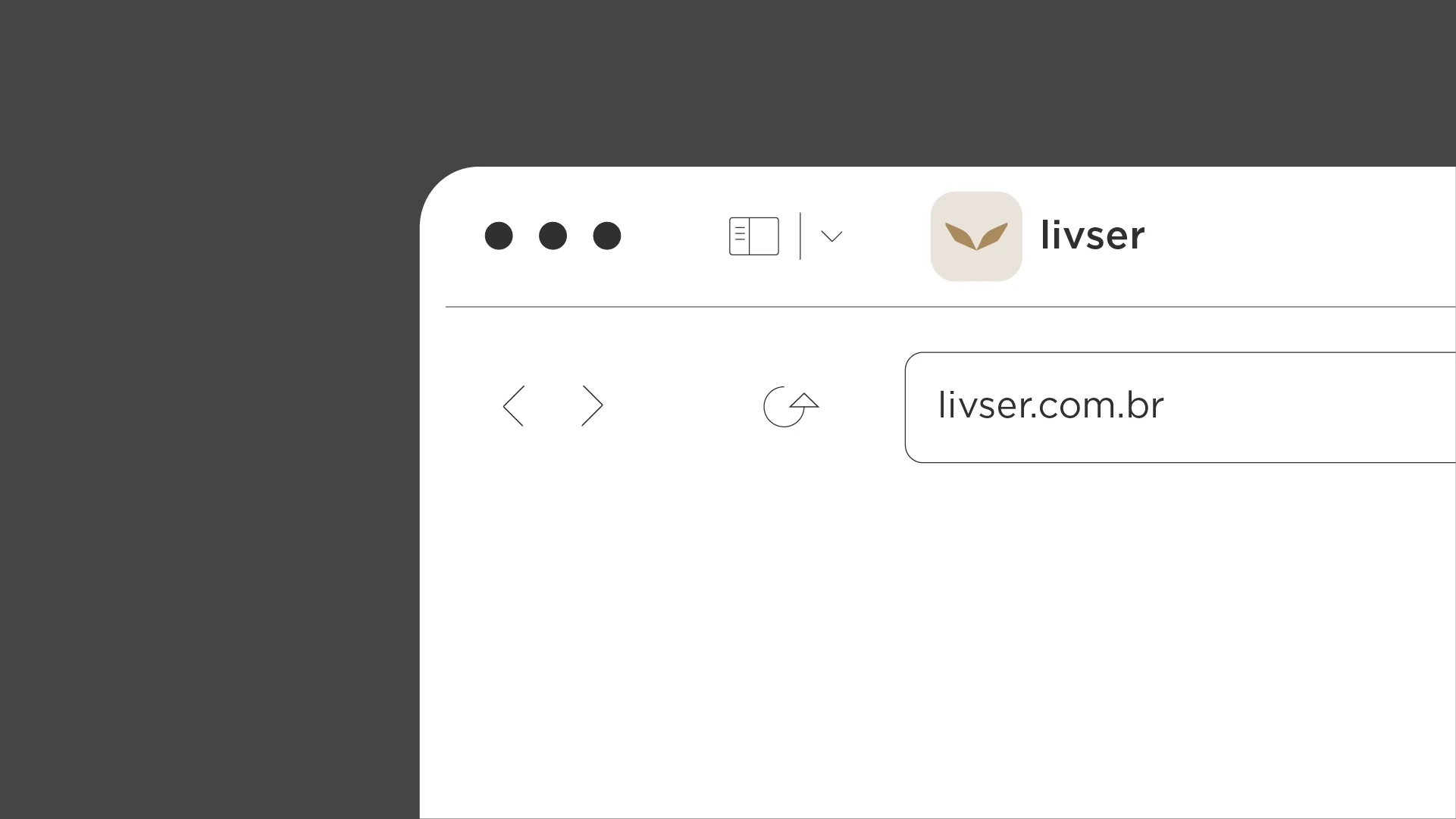
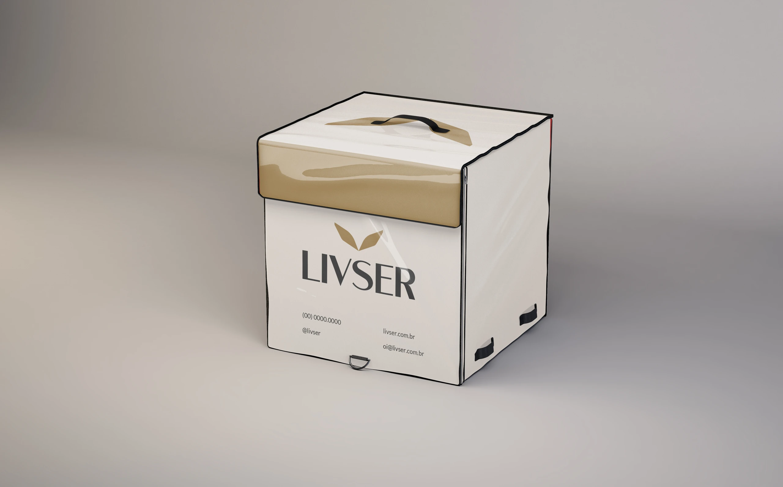
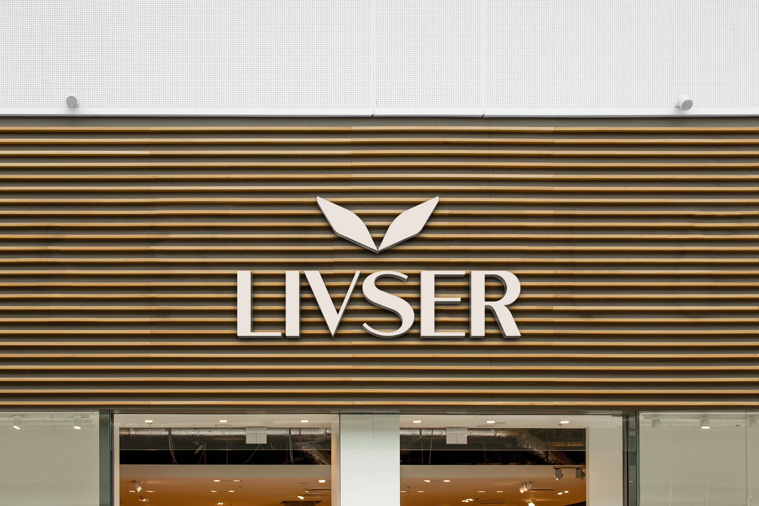
The project delivered the logo and its variations, colors, typography, stationery, digital applications and labels. The other pieces show how the brand can extend to the point of sale and to the team.

Does your brand look like what you do, or like what the whole industry does?
 Next projectDINU'S
Shall we take
a look at
your brand?
The review is a free online conversation. We'll get in touch within 1 business day.