Tradipar
The operation grew.
The brand was left behind.
- Industry
PPE and tools retail
- Location
Ipatinga, Brazil
- Year
2025
- Scope
Brand strategy, verbal identity and visual identity
The challenge
The operation grew and modernized. The brand didn't keep up.
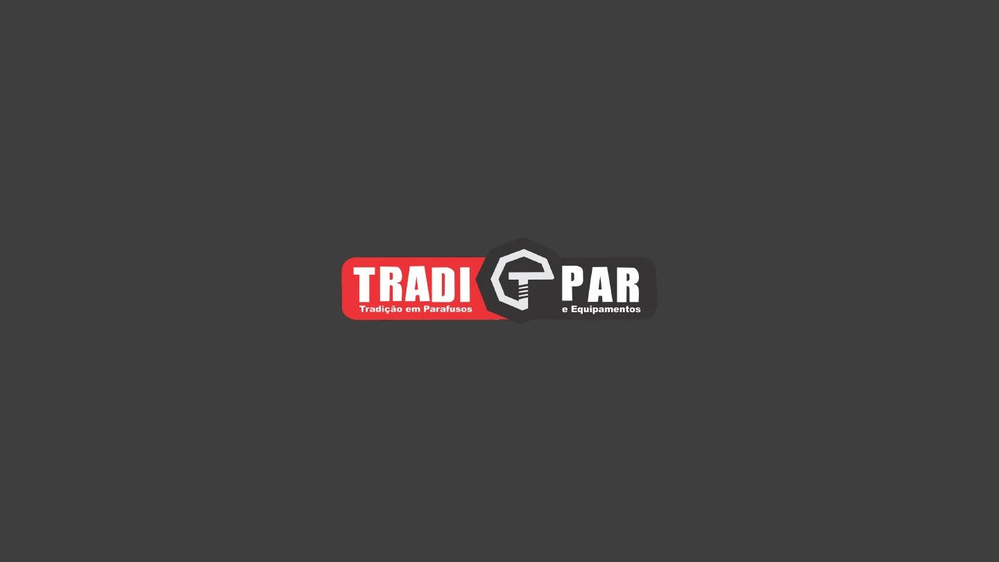
After 14 years, Tradipar still introduced itself as “Tradição em Parafusos” (Tradition in Screws), in a business that already ranged from PPE to tools and maintenance. The challenge was to make perception catch up with reality.
The strategy
In PPE and tools retail, almost everyone talks about the product. Very few talk about the people who use it.
That's where Tradipar stood out. What had carried it through 14 years wasn't just the catalog, it was the way it looked after working people and stood by them. That DNA became what the brand won't compromise on:
From there came the brand's purpose, personality and tone of voice.
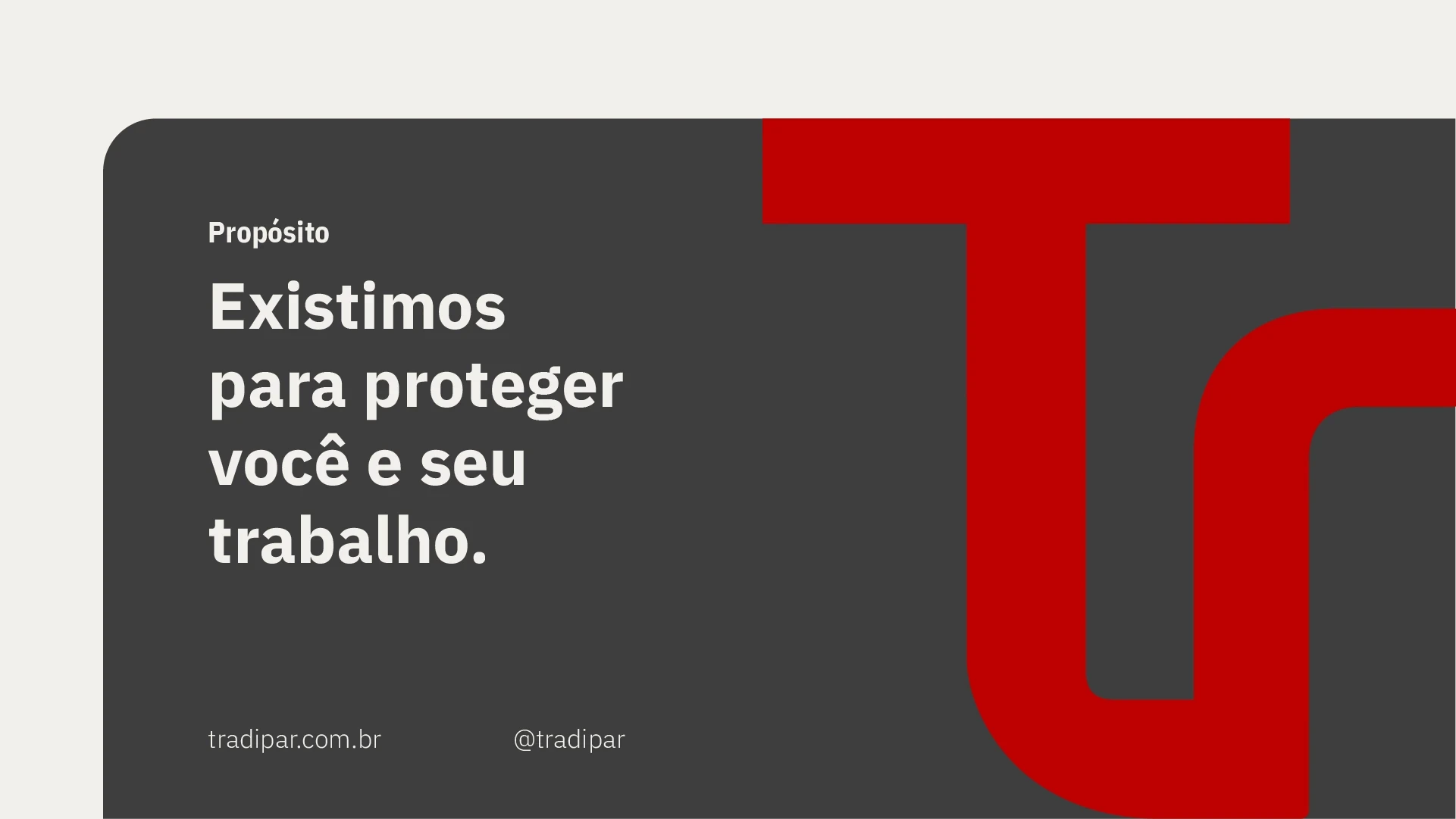
Purpose“We exist to protect you and your work.”
The identity
In an industry where almost everyone speaks the same way, Tradipar went the other way.
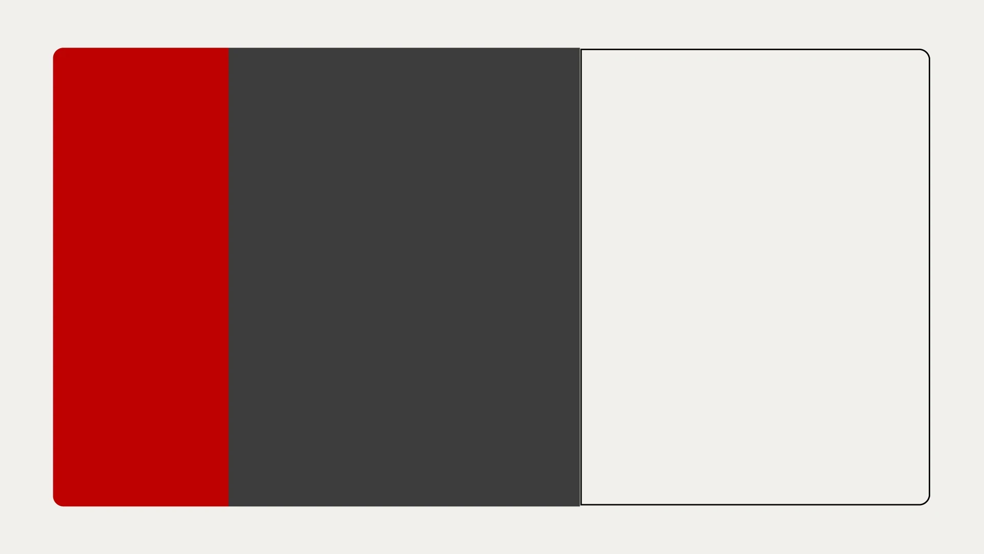
Category research showed the pattern: blue, a generic symbol and an all-caps name. The new brand swapped blue for a sober, warm red that's rarely used in the industry. And it made three choices:
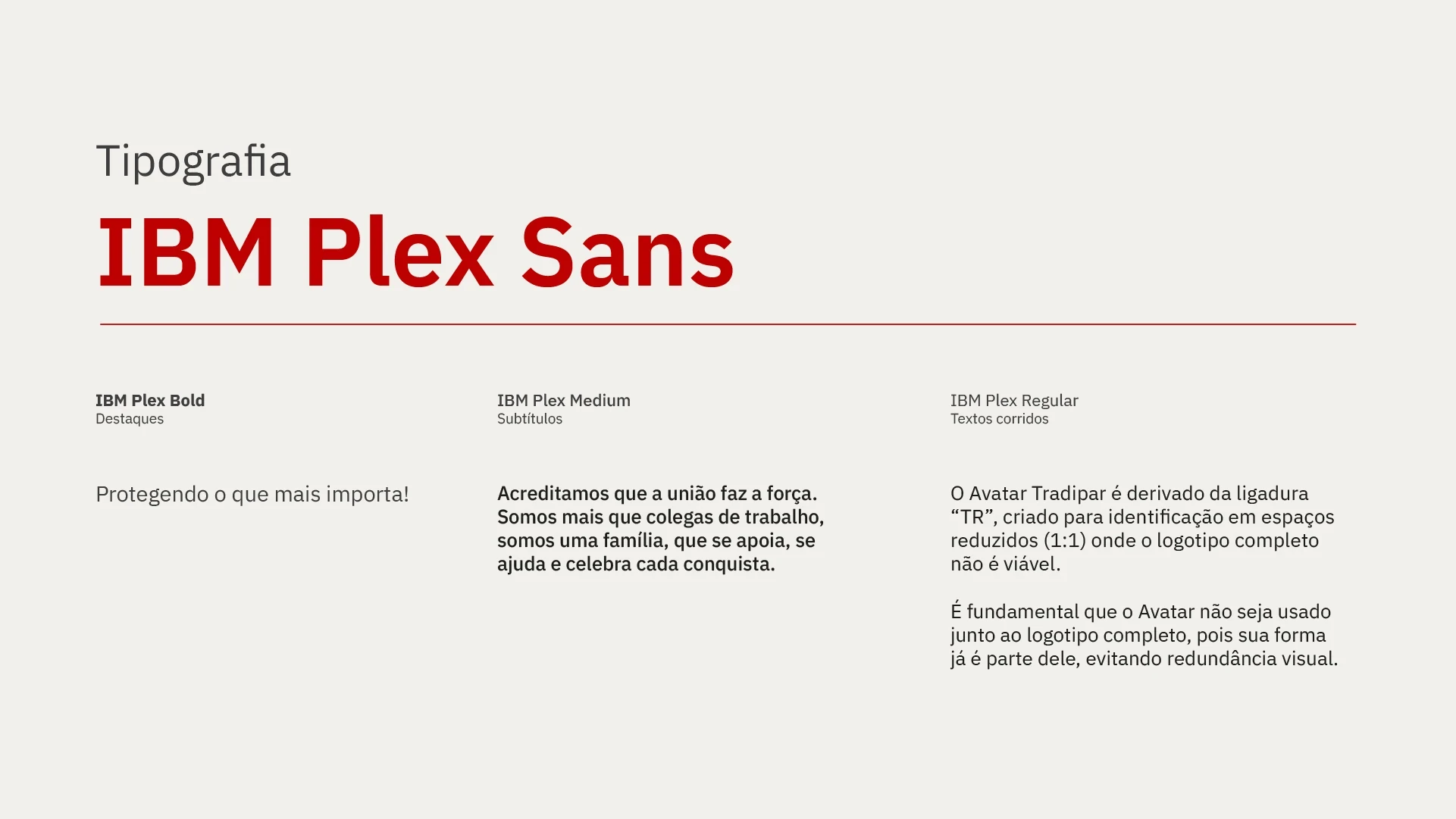
- The typeface.Upper and lowercase, sans serif, with rounded corners and tighter spacing. Solid enough to stand for doing it right, friendly enough not to sound like shouting.
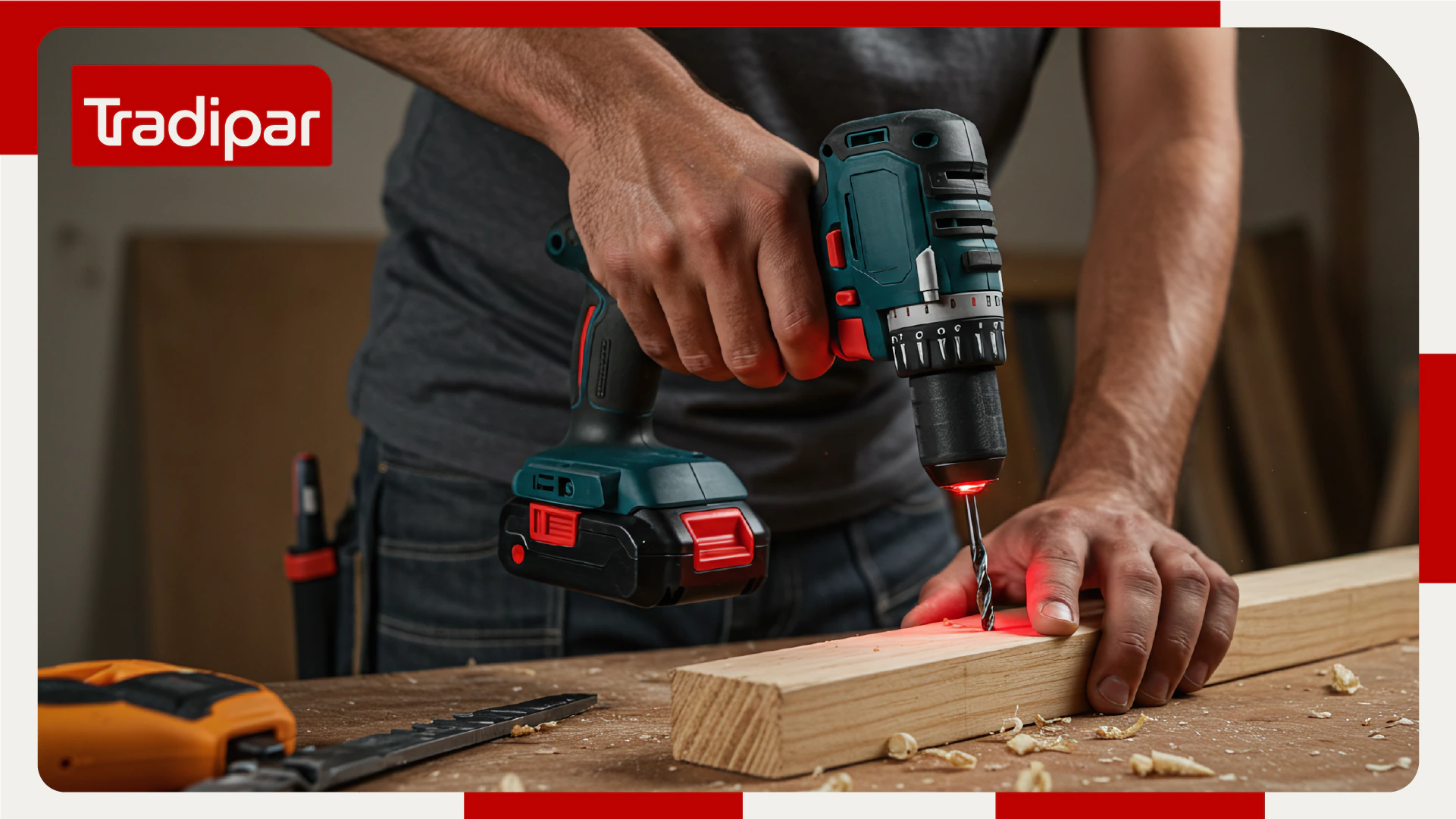
- The badge.A box that holds the name. It gives presence on the storefront, where the brand most needed to work, and stands out in an industry where almost no one uses one.
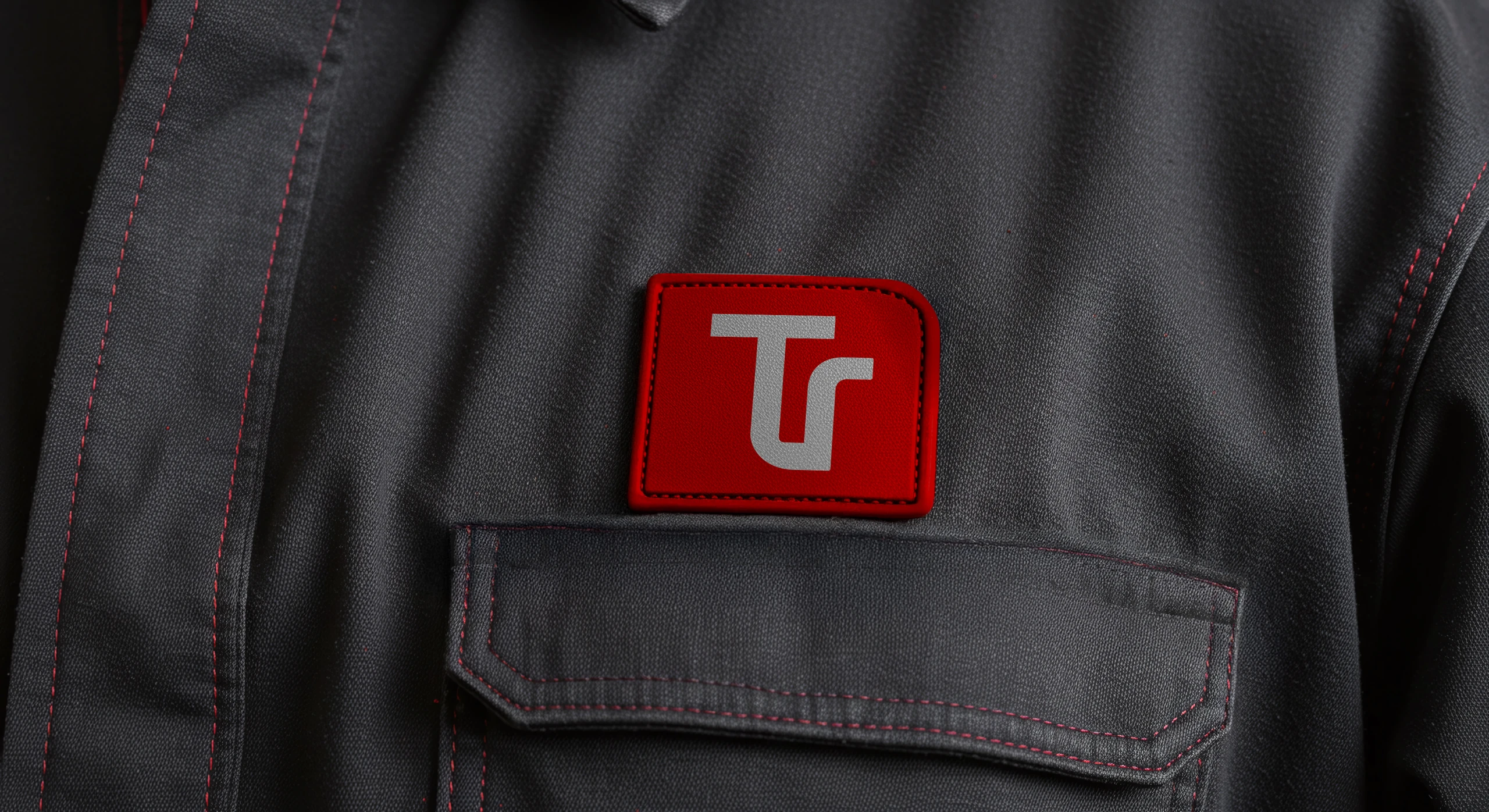
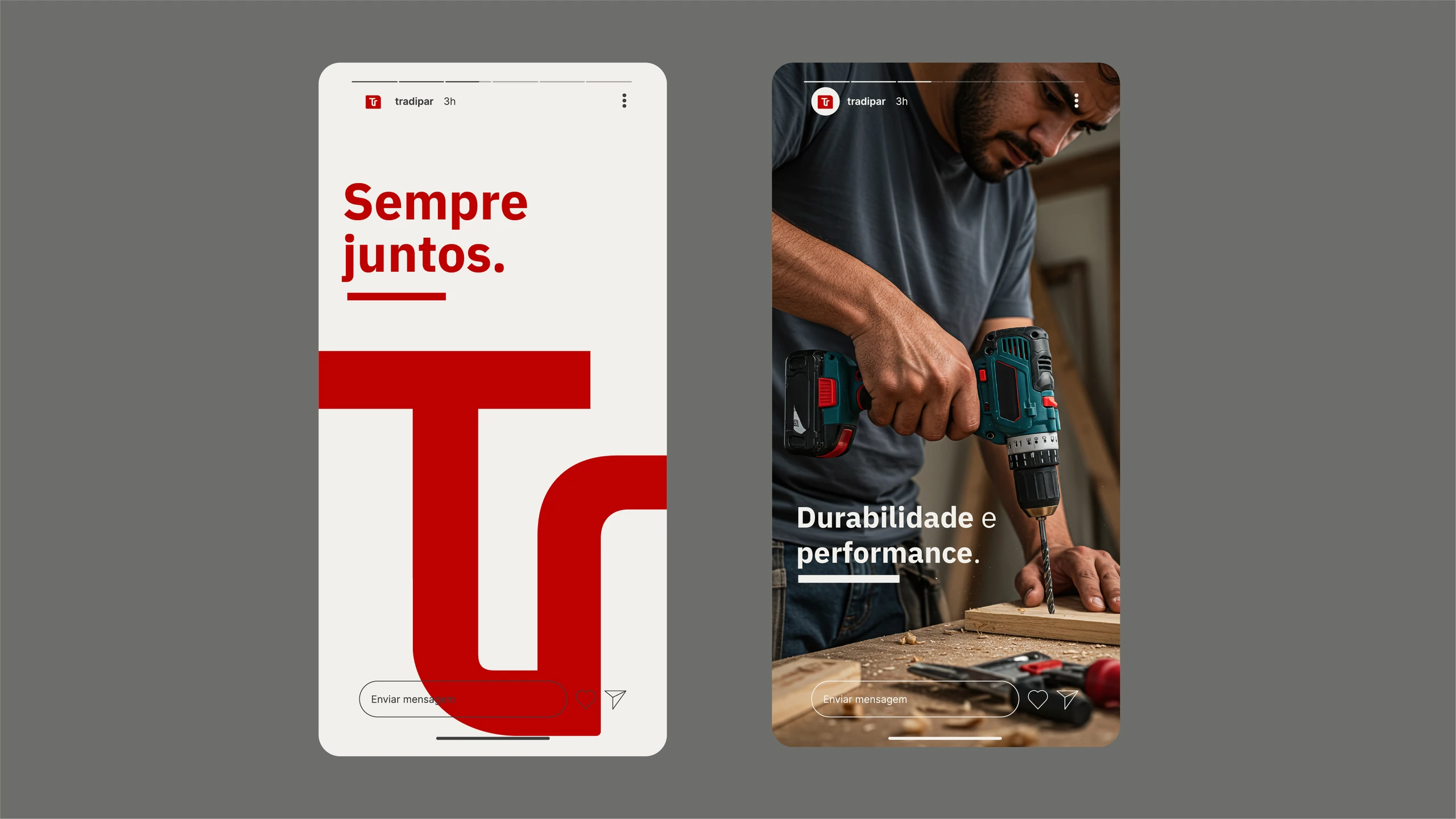
- The avatar.The link between the T and the r becomes a symbol of its own for social media and small spaces. And its shape draws the idea of always together.
The visual language
The badge and the avatar became a system.
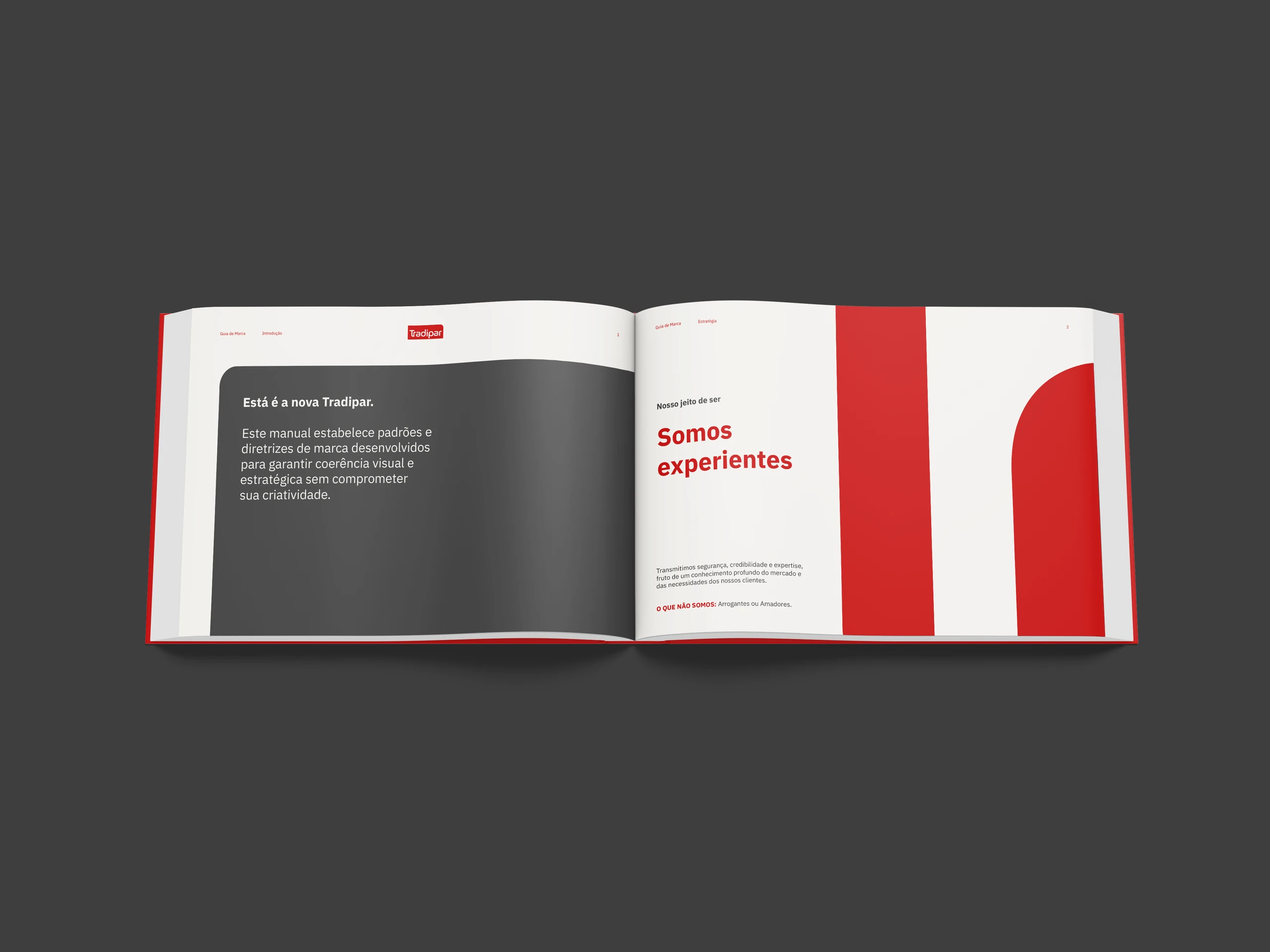
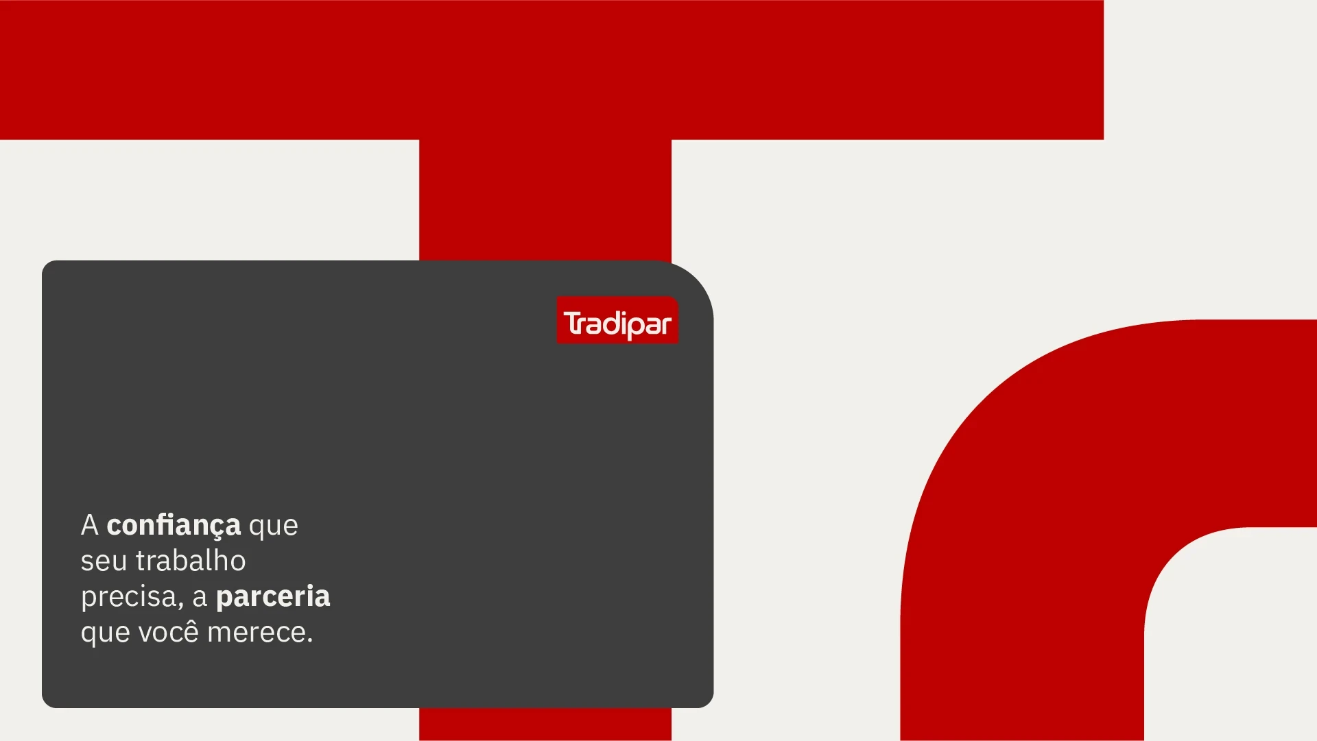
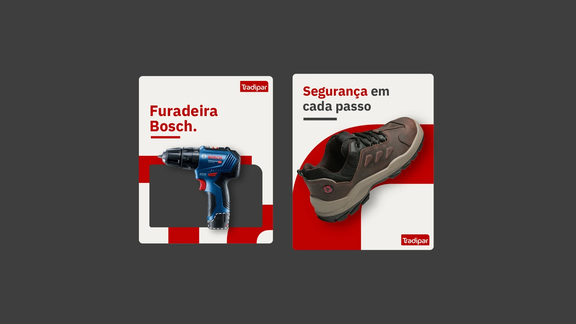
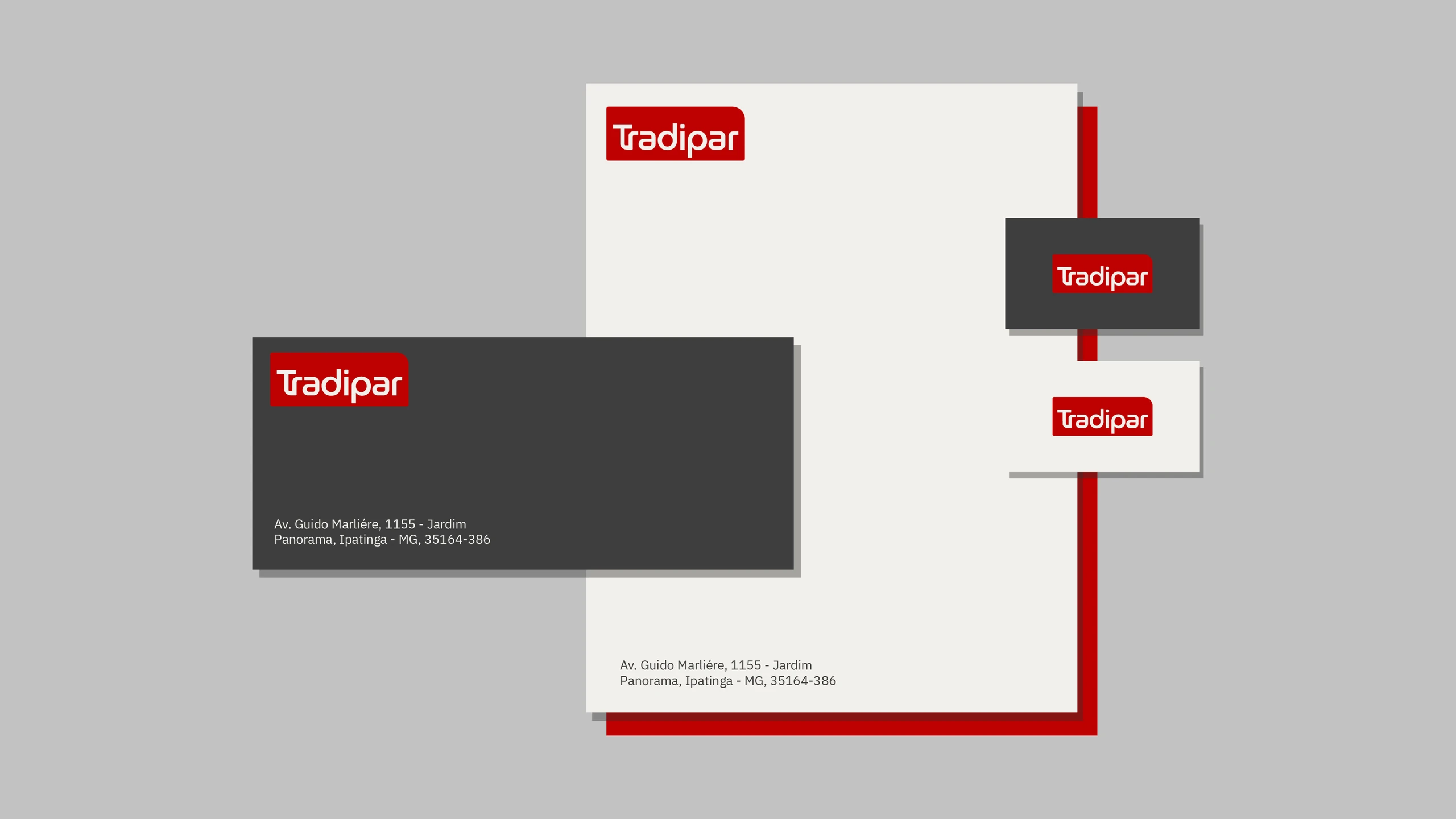
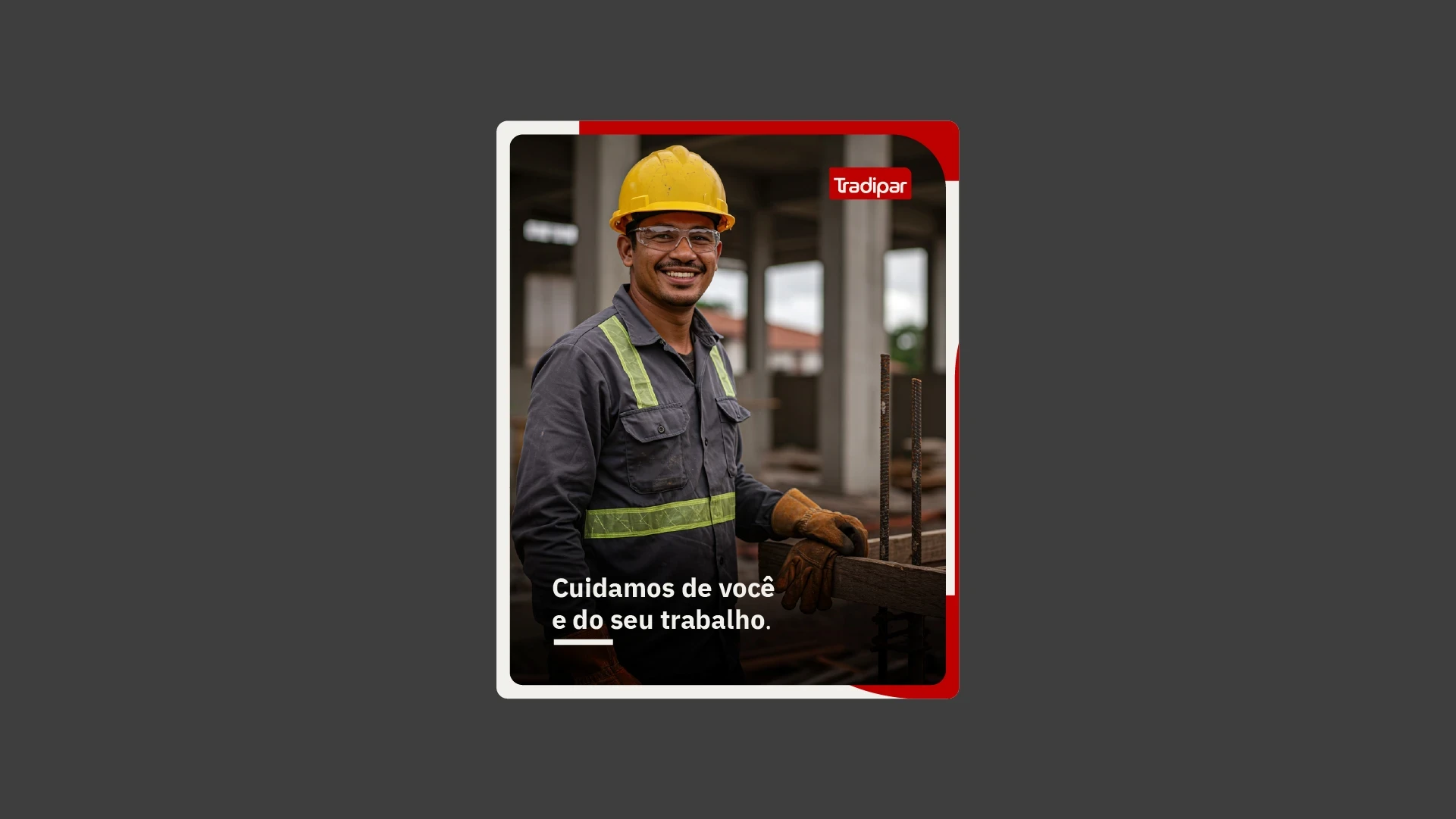
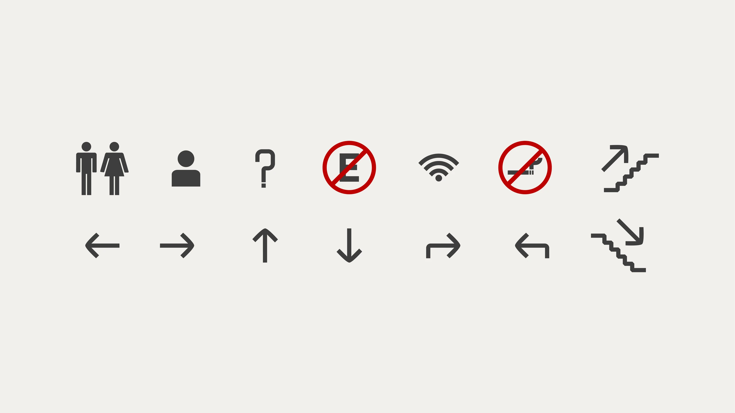
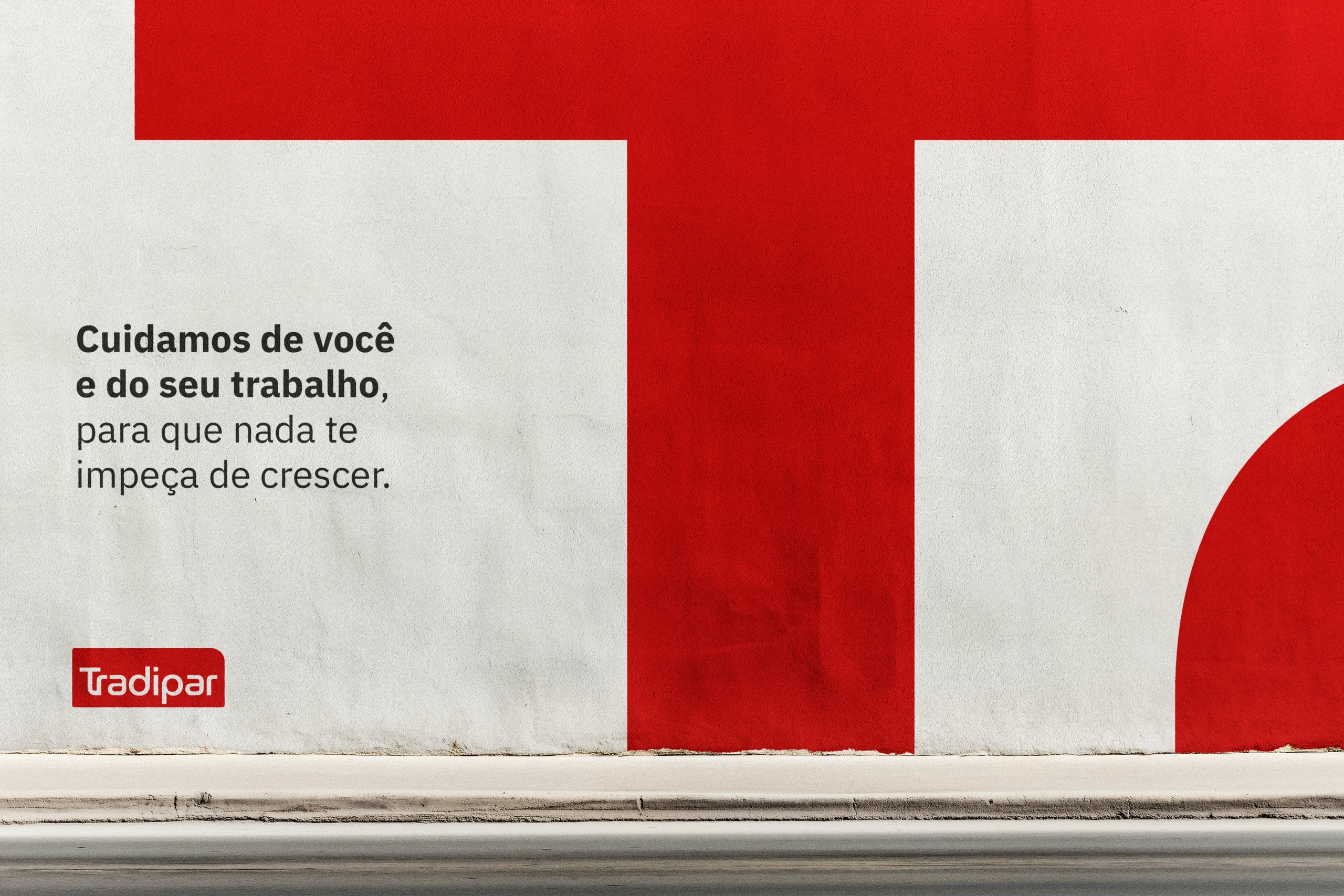
The “Tr” monogram shows up in layouts, on walls, vehicle wraps and interiors, and the box becomes a frame. All documented in the brand manual.

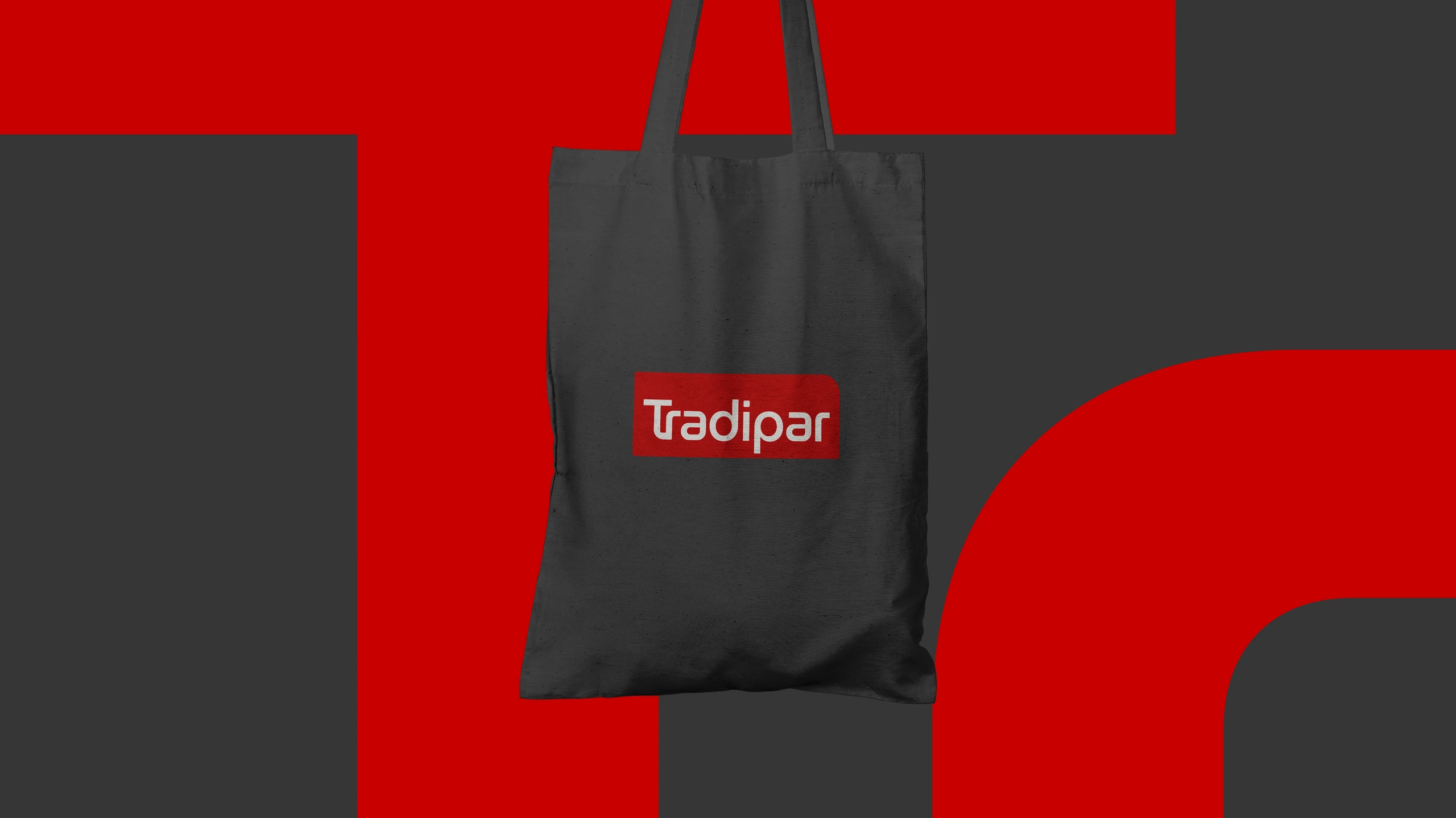
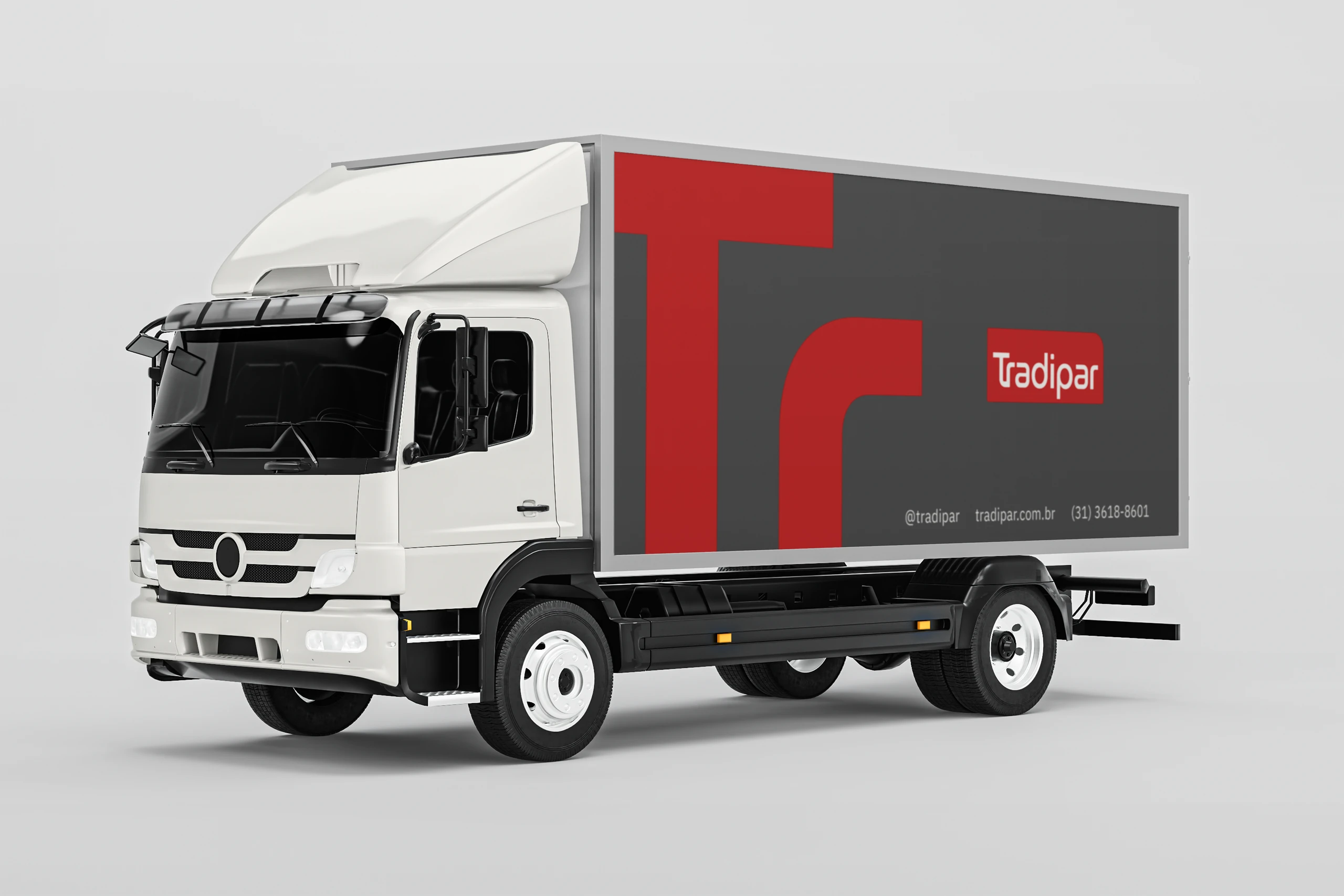
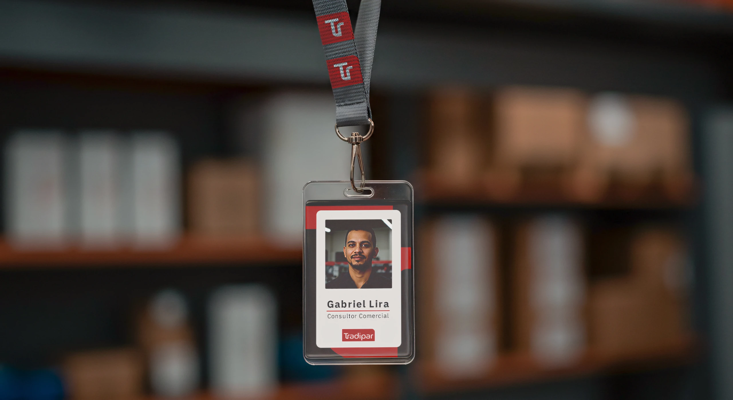
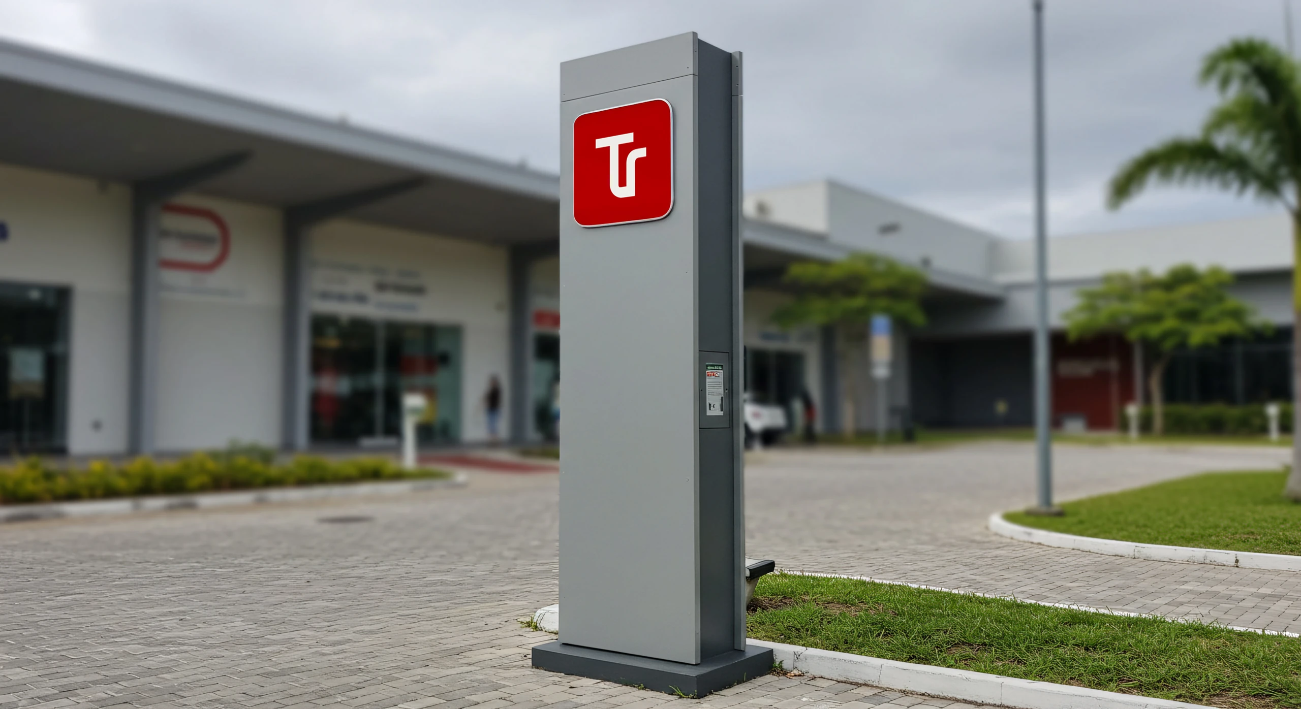
Where the brand lives
Storefront sign, store, headquarters, catalog and social media.
Both directors approved the project at the first presentation.
Has your company also grown faster than its brand?
 Next projectTia Pri
Shall we take
a look at
your brand?
The review is a free online conversation. We'll get in touch within 1 business day.